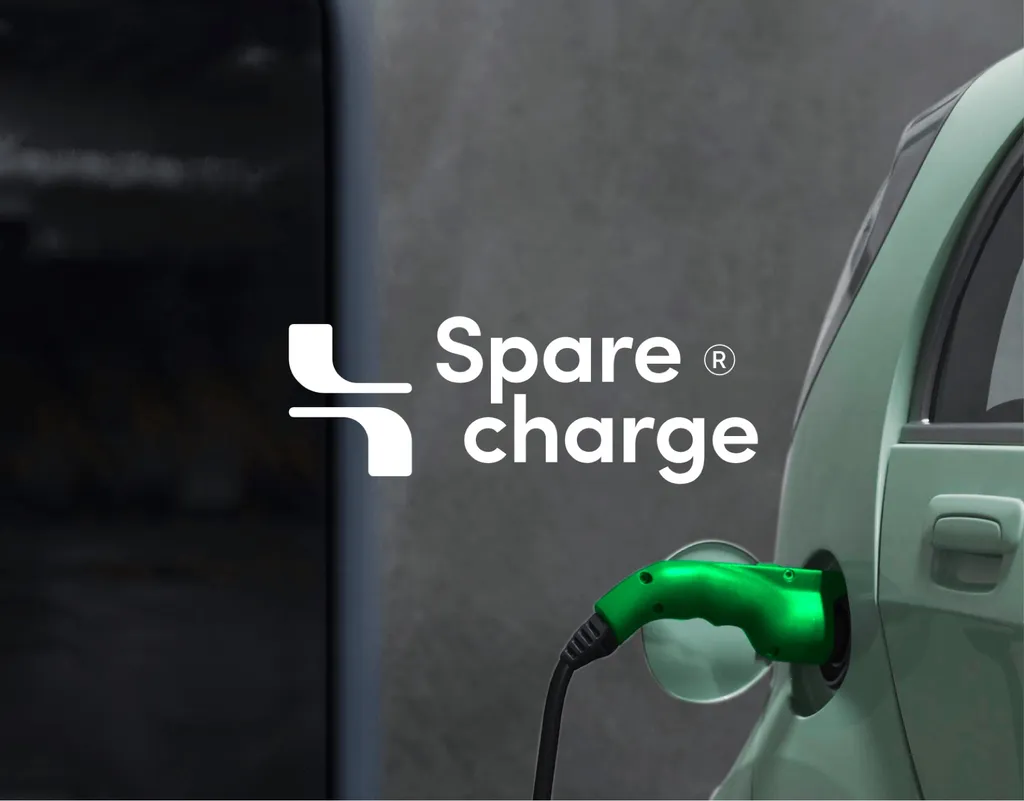
How a Logo Gets Made: The 7-Step Logo Design Process
The logo design process in seven steps, from the first call to the final files, shown step by step on one real project.

Summarize with AI
Key takeaways
- A good logo design process has seven steps: brief, research, strategy, sketching, digital concepts, refinement and handover. The first three decide whether the last four produce anything worth keeping.
- The client does real work at steps 1, 3, 5 and 6. If a designer never asks you anything, the process is missing its foundation.
- Rejected directions are not wasted work. For SpareCharge, the first ideas in the category (bolts and plugs) were set aside on purpose, and the reason became the brand.
- The deliverable is not one image. It is a family of marks, tested at every size, with vector files and ownership assigned in writing.
The logo design process has seven steps: brief, research, strategy, sketching, digital concepts, refinement and handover. Together they turn a company’s one defining idea into a mark that works everywhere it appears. Done properly it takes one to two weeks for a focused logo project, and most of the thinking happens before anything is drawn. This article walks through the seven steps I use, with the SpareCharge project as the example, so you know what to expect, what you will be asked for, and what a finished logo should include.
I’m Masuder Rahaman, a brand designer and the founder of Wolfpixel, where I lead the design team. In more than eight years and 350+ projects across 50+ countries, mostly for founders in the US, the UK, the UAE and Saudi Arabia, the process has settled into these seven steps. They do not change much between a $999 logo and a full identity; what changes is the depth at each step.
What are the steps in the logo design process?
| Step | What happens | What you do |
|---|---|---|
| 1. Brief | A call about your company, audience and the logos you like and dislike | Answer eight questions, bring competitor logos |
| 2. Research | Competitor audit, audience, every place the logo will live | Review and correct the findings |
| 3. Strategy | The one idea the mark should carry | Agree the one idea in writing |
| 4. Sketching | Dozens of rough ideas on paper and screen, most of them rejected | Nothing yet |
| 5. Concepts | Three directions shown on real uses: app icon, website, deck, sign | Pick one, give structured feedback |
| 6. Refinement | Three rounds on the chosen direction, tested from favicon to billboard | Feedback within each round |
| 7. Handover | Final logo family, color and type sheet, files for web and print, ownership | Final payment, then the files are yours |
A full brand identity runs the same steps with more research at step 2, a written strategy at step 3 and a full system at step 7.
How long does the logo design process take?
A focused logo project takes 1–2 weeks from the brief call to the final files; a full brand identity takes 2–3 weeks, with weekly check-ins in your time zone (see the branding timeline by scope). The biggest variable is on the client side: how fast feedback comes back at steps 3, 5 and 6, and whether one person makes the final decision.
Step 1: The brief
Everything downstream depends on this call. It is 30 minutes, in your time zone, and it is free, because I need the answers before I can tell you what to build. The UK’s Design Council makes the same point in its guide to commissioning a designer: the brief is the shared reference for both sides. The questions that matter most:
- What do you sell, and to whom? Two lines.
- Why now? A launch, a raise, a new market, a rebrand.
- Where will the logo appear in its first year: website, app, deck, packaging, signage, social, vehicles?
- Which markets and languages? In the Gulf, this decides whether we design Arabic and English together.
- Who are your competitors, and which brands do you admire, and why?
- What must stay, if anything?
- Who gives feedback, and who makes the final decision?
- When do you need it, and what is the budget?
Question 5 is the one founders underprepare. “Make it like Apple” tells me little; what you like about it (the simplicity, the weight, the color) tells me a lot. Bring three competitor logos and three logos you admire, and say in one sentence what draws you to each.
SpareCharge at step 1: a peer-to-peer EV charging marketplace. Drivers find idle private chargers on a map, request access, charge and pay in the app. Two audiences, drivers and charger owners, and a product that lives on a phone, a smartwatch and the charger screen itself. The brief call put the touchpoint list at the center: whatever we designed had to work at app-icon size first.
Step 2: Research
Research for a logo is narrower than research for a full brand strategy, but it covers three things every time.
The category. I collect every competitor’s logo on one board and look for what the category shares. Most categories have a visual cliché: a shield in security, a leaf in sustainability, a coin or a wave in fintech, a sparkle in AI. The audit tells us what to share with the category so you are recognizable as a member of it, and where to stand apart so you are not mistaken for someone else.
The audience. Who meets the logo, where, and what they need to feel. An enterprise buyer looking at a deck needs confidence. A consumer tapping an app icon needs recognition in half a second.
The touchpoints. The list from the brief becomes a test plan: favicon at 16 pixels, app icon at 1024, deck corner, website header at 32 pixels tall, social avatar in a circle crop, embroidery in one color, and, for Gulf clients, an Arabic version beside the Latin one. If the logo itself is round, circle logos covers the extra checks.
SpareCharge at step 2: the competitor board was full of lightning bolts and plugs. That is not a criticism of those brands; bolts and plugs are the first ideas in the category, which is exactly what makes them hard to own. The research also showed the product’s real story was not electricity. It was two people, a driver and an owner, connected by a request.
Step 3: Strategy, or the one idea
A logo identifies you; it does not have to explain you. So before sketching, we agree on the single idea the mark should carry. One sentence, written down, signed off by every decision-maker.

This is where founder disagreements get settled. When two co-founders argue about a logo later, the argument is almost always about strategy, not shapes. Settling the one idea first saves rounds of revision.
For a logo-only project this is a short written note. For a full identity it becomes a brand strategy document with positioning, personality and messaging.
SpareCharge at step 3: the one idea was “the connection between a driver and a charger owner,” not “charging.” That single decision ruled out every bolt and plug, and it is the reason the final mark still works if the hardware changes.
Step 4: Sketching and logo concept development
This is the step clients rarely see, and the one that produces the most rejected work on purpose.
Logo sketching
Dozens of rough ideas, fast, on paper or a tablet, none of them precious. The point is volume and range: wordmarks, monograms, abstract symbols, literal symbols, negative-space ideas (the types of logo are explained in what a logotype is). Quantity first, because the tenth idea is usually better than the first, and the thirtieth is sometimes the one.
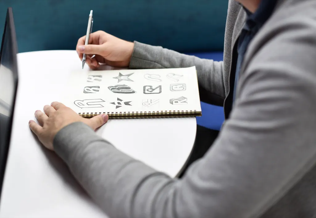
Three rules for the sketch phase:
- Draw in black only. If a shape only works in color, it does not work.
- Draw small. A mark that reads at the size of a thumbnail will read anywhere.
- Kill the clichés early. Anything already on the competitor board goes in the reject pile without further thought.
Narrowing to three
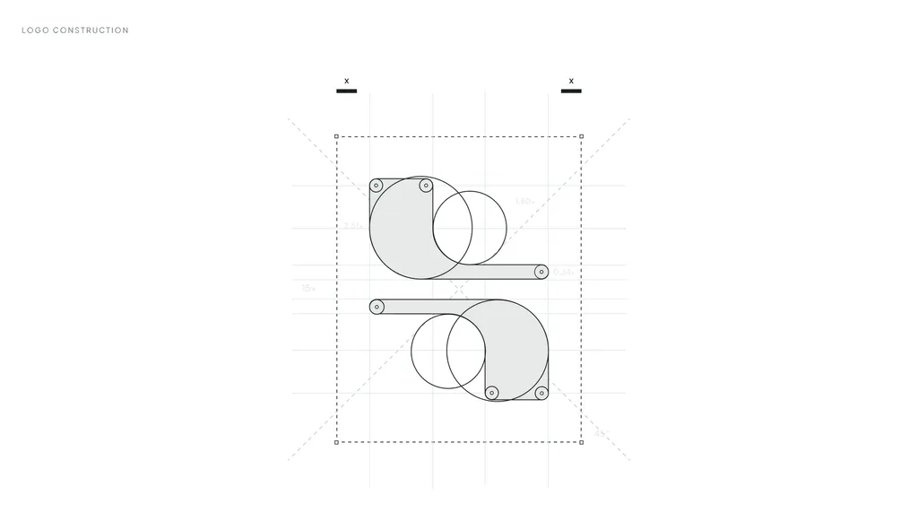
From the sketch wall, the strongest ideas are tested against the one idea from step 3 and the touchpoint list from step 2. Most fail one or the other. What survives gets rebuilt digitally on a construction grid, so the proportions are consistent and the mark can be reproduced at any size without drift.
SpareCharge at step 4: the surviving idea was two forms meeting around a central gap. The forms are a driver and a charger owner; the gap is the request that connects them; the flowing paths carry energy both ways, power to the driver and income to the owner. It was then built on a grid so the app icon, the smartwatch face and the charger screen could all use the same geometry. See the mark and its construction.
Step 5: Digital concepts and the logo presentation
You see three directions. Not one, because one gives you nothing to compare; not ten, because ten means I have not done my job of choosing. The full reasoning is in how many logo concepts a designer should present.
How the concepts are presented
Each direction is shown on the real uses from your touchpoint list, never floating on a white canvas. For a typical startup that means an app icon on a phone, the website header, the cover of a deck and one physical application such as a sign or a shirt. A logo that looks right only in isolation is a logo that has not been tested.
Each direction comes with a short rationale: which part of the one idea it carries, and what it does that the competitors do not. If I cannot write that paragraph, the direction is not strong enough to show you.
How to give feedback that moves the project forward
Pick one direction. Then give feedback in three buckets:
- What is working? So it stays.
- What is not working, and why. “The symbol feels aggressive next to our friendly tone” is useful. “I don’t like it” is not.
- Where it will be used that we have not seen. A new touchpoint is better discovered now than after launch.
What to avoid: combining elements from two directions. A mark is a system of proportions; stitching two together almost always produces something weaker than either.
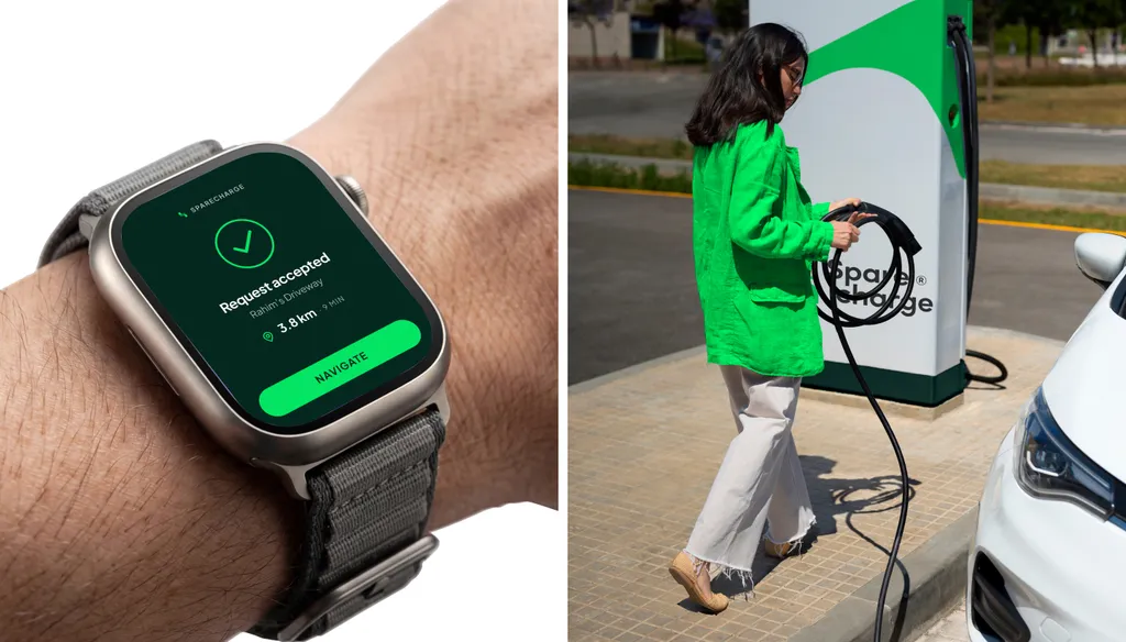
SpareCharge at step 5: the connection mark was shown as the app icon, on the charger screen, on a smartwatch face and on a highway billboard before any color decisions were final. Seeing it at every size settled the choice quickly.
Step 6: Refinement
The chosen direction goes through three revision rounds for a logo project; a brand identity has unlimited revisions within the agreed scope. Refinement is not polish for its own sake; it is the step where the mark is made to survive the touchpoint list. What gets done in refinement:
- Optical corrections. Curves that are mathematically correct often look wrong. Overshoots, stroke tapering and spacing are adjusted by eye.
- Small-size versions. A favicon may need thicker strokes or fewer details than the primary mark. The two should still read as the same family.
- The logo family. Primary logo, wordmark alone, symbol alone, horizontal and stacked lockups, one-color and reversed versions.
- Color and type. A primary palette and a typeface that work with the mark, chosen with licensing in mind. Some foundries license desktop, web and app use separately, so check before you fall in love with a font.
- Bilingual versions. For UAE and Saudi clients, the Arabic and English versions of the logo are designed together, matched in weight and rhythm, not typed in a default font afterwards. My guide to designing a bilingual brand explains why.
- The trademark check. Before final polish, your lawyer searches the chosen direction. The USPTO advises searching before you file, because applications are often refused for being too similar to a registered mark. I hand over clean files for the application; I do not file trademarks.
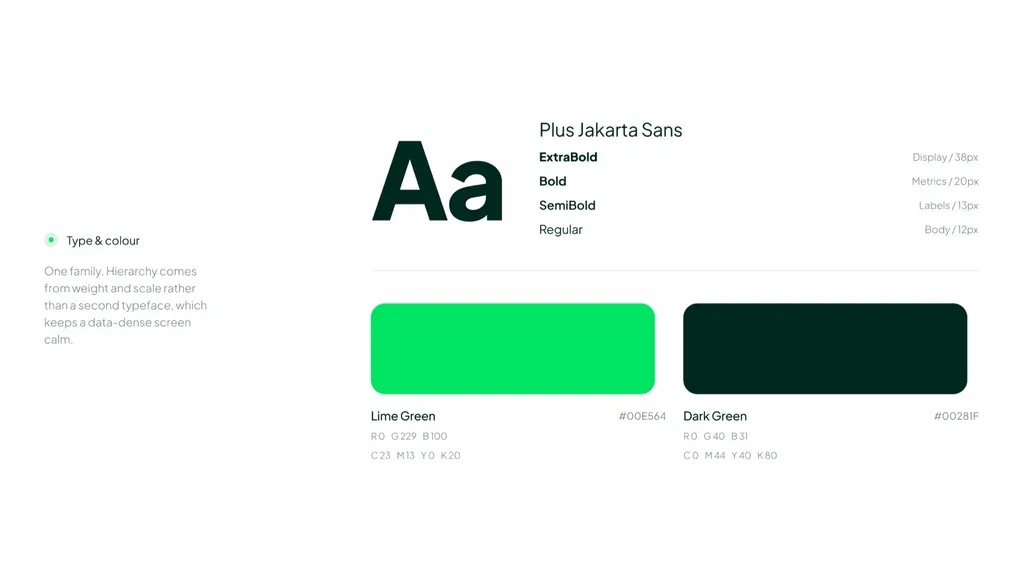
SpareCharge at step 6: one type family, Plus Jakarta Sans, with hierarchy from weight and size rather than a second typeface, so data-heavy charging screens stay calm. Two greens, Lime Green for highlights and actions and Dark Green for backgrounds and text, because a short palette stays consistent on a watch face and a billboard. A set of 16 product icons was drawn on the same grid as the mark so the app and the brand feel like one system.
Step 7: Handover
The project ends when you have everything you need to use the logo without me. For a logo project, that is:
- The logo family in color and in black and white
- Vector files (SVG and PDF) and PNG files, including reversed versions
- A one-page color and type sheet
- Written assignment of ownership on final payment
For a full identity, handover adds brand guidelines as PDF, PowerPoint and Illustrator files, and a Figma library with source files. The full list is in my brand identity deliverables checklist.
One habit worth building on your side: put the files in one shared folder with clear names, and make that folder the only source. Brand drift starts the day someone screenshots the logo from a slide.
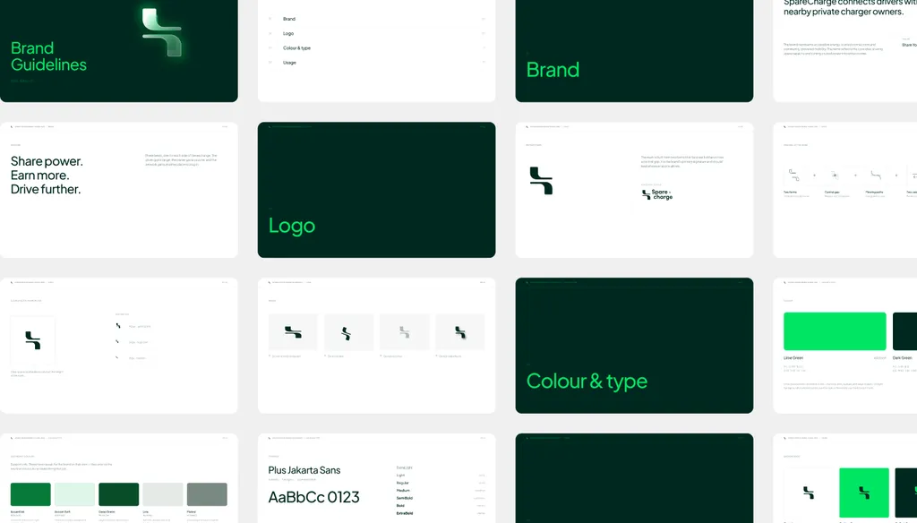
SpareCharge at step 7: because the brand, the app and the charger screen were designed together, handover included brand guidelines and design tokens, the color, type and spacing decisions stored in a form developers use directly. The whole project, brand plus product UI plus design system, took eight weeks. Read the full case study, or the six lessons in branding an EV startup.
Where do logo design projects go wrong?
After 350+ projects, the failures cluster in three places, and none of them is step 4.
- A skipped step 1. A designer who starts drawing without a brief is guessing. Three beautiful concepts that all miss the point cost more time than one good call. Before you hire, the questions to ask a brand designer show whether a brief is part of their process.
- An unsettled step 3. When founders have not agreed on the one idea, every revision round reopens the strategy. The project drifts, and the logo ends up as a compromise nobody loves.
- Feedback that mixes directions. “Take the symbol from A and the type from C” produces a mark that was never designed as a whole. Choose one and refine it.
And one that is not a process failure but a scope one: if you are launching a website, an app, a deck and packaging in the same quarter, a logo alone will be stretched past what it was built for. Logo, identity or guidelines covers how to tell which scope you need. If you already know you need a logo and want to know what it has to survive, startup logo design: a logo that scales is the next read, and logo design trends for 2027 covers which current styles are worth borrowing.
See if your project is a fit
The process above is what you get with the logo design package: $999, 1 to 2 weeks, three concepts, three revision rounds, full ownership. If your touchpoint list is longer than a logo can serve, the brand identity package runs the same seven steps at full depth. All packages are on the pricing page; for market prices, see how much a brand identity costs, and if you are still choosing who to work with, how to hire a brand designer.
Either way it starts with step 1. Book a free 30-minute call in your time zone. We will go through the eight brief questions, I will tell you which scope fits, and you will leave with a clear recommendation and a written quote if you want one. If your project is not a fit, I will say so on the call.
FAQ
What are the steps in the logo design process?
Brief, research, strategy, sketching, digital concepts, refinement and handover. The first three decide what the mark has to say and where it has to work; the last four produce it, test it and deliver it.
How long does the logo design process take?
A focused logo project takes 1–2 weeks with weekly check-ins. A full brand identity takes 2–3 weeks because research, strategy and the final system go deeper. Feedback speed is the biggest variable on the client side.
How many logo concepts should a designer show?
Three is the usual number: enough to compare, few enough to show the designer has already made choices. Each should be shown on real uses, with a short rationale, rather than floating on a blank page.
What is a logo construction grid?
A geometric framework the mark is built on, so proportions, angles and spacing are consistent and the logo can be reproduced at any size without drift. It also keeps the app icon, favicon and other versions in the same family.
Why are rejected logo concepts important?
Because the reasons for rejecting them define the brand. For SpareCharge, setting aside bolts and plugs forced the mark to tell the product’s own story, which is why it is distinctive in its category.
What should I receive at the end of a logo project?
The logo family (primary, wordmark, symbol, lockups) in color, black and white and reversed; vector files in SVG and PDF plus PNG; a color and type sheet; and a written assignment of ownership. A full identity adds guidelines and a Figma library.
Sources