Designing a bilingual brand in Arabic and English
How to make Arabic and English logos feel like one brand, not two.

Summarize with AI
Key takeaways
- Design the Arabic and English versions together as one system, matched in weight, contrast and visual size, instead of translating a finished English logo.
- Arabic has its own rules: it reads right to left, its letters join and change shape, it has no capitals, and it usually needs a slightly larger size and more line height.
- Never mirror the logo in right-to-left layouts, and decide early on the Arabic name, where each script sits, and whether you use 0–9 or ٠١٢٣٤٥٦٧٨٩.
A bilingual brand works when the Arabic and the English look like two voices of the same company, not two companies sharing a sign. That means designing both scripts together from the start: choosing typefaces made to work as a pair, balancing their size and weight by eye, planning how they sit side by side, and writing down the rules for screens, print and signage. This guide covers each step for founders building a brand for the UAE, Saudi Arabia or any Arabic-speaking market.
Why bilingual matters in the UAE and Saudi Arabia
In the Gulf, English and Arabic sit side by side on shop signs, packaging and apps, and customers move between the two. Labels are one place where Arabic is required. According to the US government’s export guides, food labels in the UAE must be in Arabic, or in Arabic and English (Arabic stickers are accepted), and toy warning labels need Arabic. In Saudi Arabia, food labels need Arabic, and safety warnings and manuals must be in Arabic, or in Arabic and English. These rules ask for Arabic text, not an Arabic logo, but if you sell physical products, your brand will sit next to Arabic, so plan for it.
Rules change and depend on the product, so check the current requirements for your category before you print.
How Arabic differs from Latin
Most bilingual problems come from treating Arabic like a translated version of English. It has its own logic:
- It reads right to left, but numbers inside Arabic text still read left to right.
- It’s cursive, even in print. Most letters join their neighbors and change shape depending on where they sit in a word: alone, at the start, in the middle or at the end.
- There are no capital letters. An all-caps English wordmark has no direct Arabic equivalent, and Arabic can look small next to it.
- Dots are part of the letters. Several letters share the same base shape and differ only by their dots, so dots can’t be dropped or merged for style.
- Short vowels are usually left out of everyday writing. Add them only where a word could be misread.
- You don’t space out joined letters. Letter-spacing breaks the connections. Arabic can be stretched with the kashida, a longer connection between letters, but it should be used sparingly.
Choose a type pairing made to work together
You have three routes:
- A family designed in both scripts. The Arabic and Latin share weights, proportions and spacing from day one. This is the safest choice for websites, apps and documents.
- Two typefaces matched by eye. This gives you more choice, but it needs careful testing at every size.
- A custom Arabic wordmark drawn to match the Latin logo, paired with a family above for everything else. This is the strongest option for the logo itself.
Some well-made families that cover both scripts:
- IBM Plex Sans Arabic, designed by Wael Morcos and Khajag Apelian with creative direction from IBM’s Mike Abbink, and free on Google Fonts.
- Readex Pro, an Arabic expansion of the Lexend family by Nadine Chahine and Thomas Jockin. Also free on Google Fonts.
- Cairo, a Kufi-inspired Arabic by Mohamed Gaber, paired with a Latin based on Titillium Web. We used it for the Arabic in Lacio’s identity, shown below.
- Frutiger Arabic (2007) and Neue Helvetica Arabic (2009), both designed by Nadine Chahine for Linotype.
- 29LT Bukra, with Arabic by Pascal Zoghbi, and Greta Arabic by Kristyan Sarkis from TPTQ Arabic, both commercial.
Check the license for both scripts and for every use: desktop, web and app. Our guide to what a brand identity includes explains font licenses.
Make two scripts feel like one
Set at the same point size, Arabic usually looks smaller than Latin. There’s no official ratio to fix it, so balance them by eye:
- Match visual size, not point size. Apple’s design guidelines suggest that, next to all-caps Latin, it often works to set the right-to-left text about 2 points larger. An article on the Khatt Foundation’s site suggests matching the Latin x-height to the height of the Arabic loops, with similar room above and below.
- Give Arabic more line height. Its tall ascenders and deep descenders need space. Google’s original Material Design guidance recommended extra line height for tall scripts such as Arabic.
- Match the stroke weight and contrast, so neither script looks bolder or lighter at a glance.
- Align optically. Check the baselines and the overall height of both lines together, not just the numbers in the design tool.
- Use spacing, not tracking, to balance the widths of the two names.
Lockups: where each script goes
Decide how the two names sit together and design each arrangement on purpose:
- Side by side, often with the Arabic on the right, following its reading direction.
- Stacked, with one script above the other.
- Single-script versions for places where only one language appears, such as an Arabic-only app screen.
Decide which script leads in each market and design those lockups, then document clear space and minimum sizes for every version.
The name itself needs a decision too. Transliteration keeps the sound of your name in the other script, and translation keeps its meaning. In a 2022 study of local brands’ shop signs in malls in Riyadh and Jeddah, most signs set the Arabic and English names at about the same size, and names were transliterated twice as often as translated. Whichever route you take, check the meaning and pronunciation with native speakers in each market before you commit.
Example: Lacio, a bilingual brand for a sewing shop
Lacio is a shop for sewing and tailoring supplies in Iraq, from threads and lace to tools, for beginners and professional tailors alike. Its name comes from “lace”, and we designed its identity in Arabic and English from the start. You can see it in use on Lacio’s Instagram.
- One lockup, two scripts. The symbol sits beside the English name and the Arabic name, divided by a thin line, with an Arabic tagline underneath: عالم الخياطة يبدأ هنا, “the world of sewing starts here”.
- A transliterated name. In Arabic the name is written لاسيو, so it sounds the same in both languages, while the tagline carries the meaning.
- A matched type pair. Montserrat sets the English text and Cairo the Arabic, both in light, regular, medium and bold.
- The same lockup everywhere: the shop sign, shopping bags, stationery, ID badges and social posts.
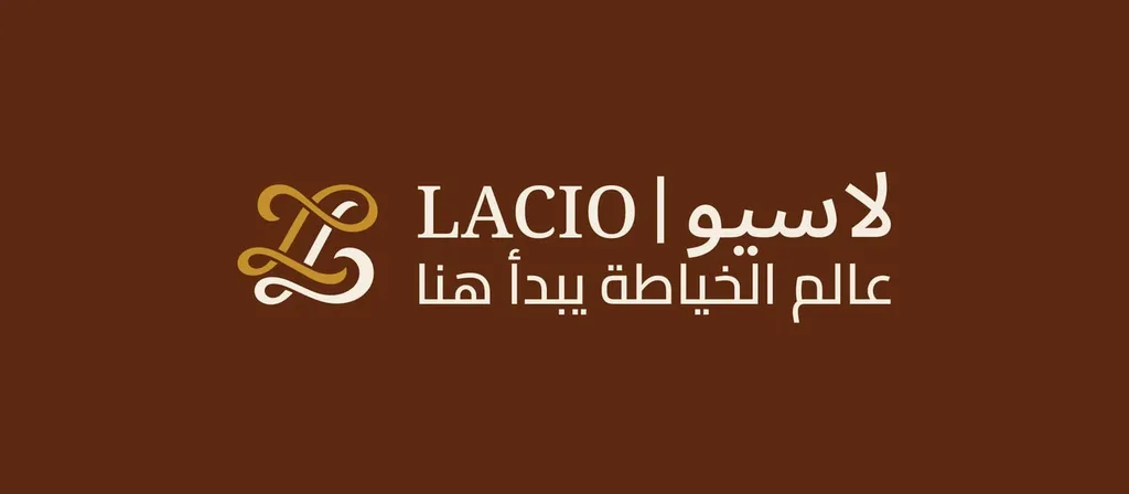
The Lacio lockup: symbol, English name, transliterated Arabic name and an Arabic tagline.
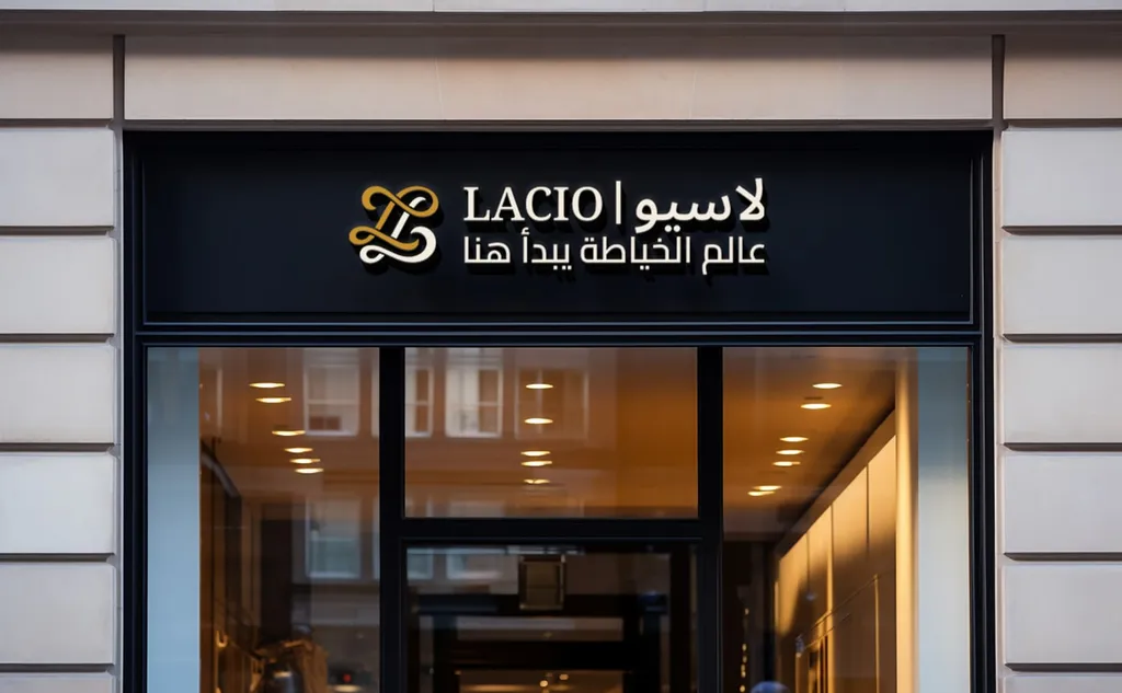
The same lockup on the shop sign.
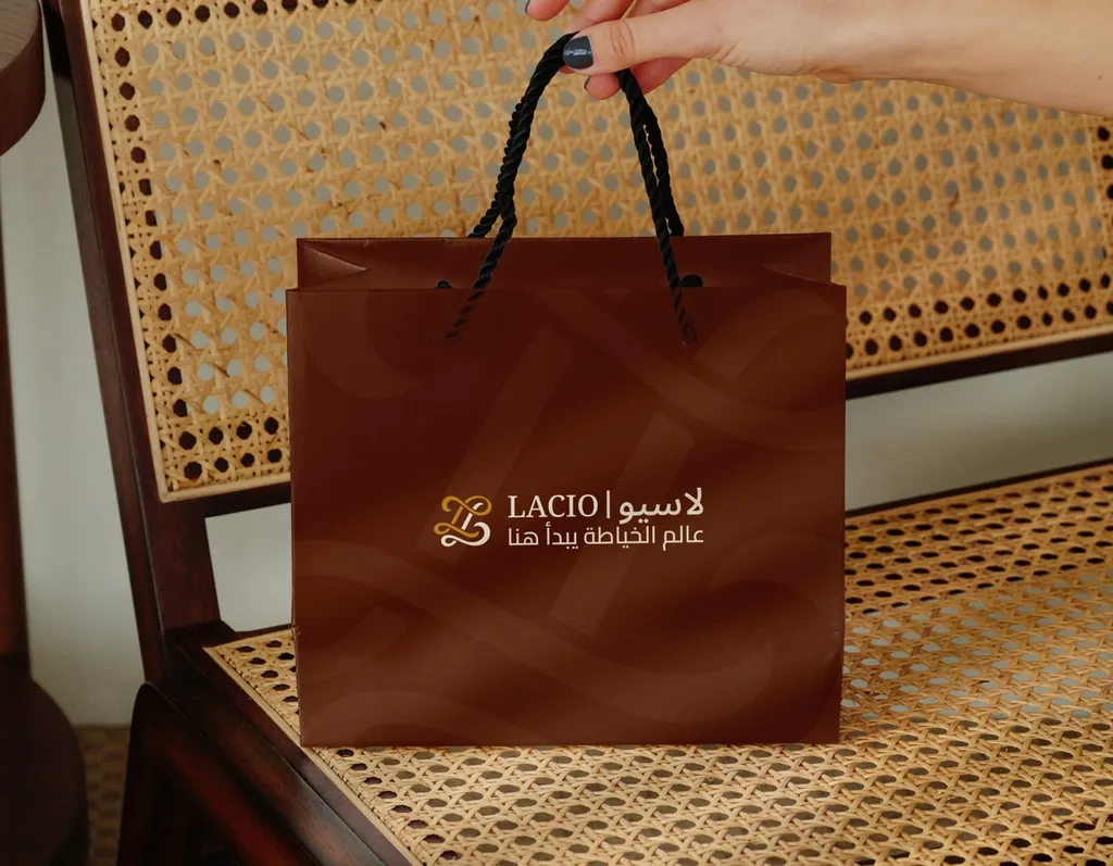
And on packaging.
Websites and apps: what mirrors in right to left
In an Arabic layout, the whole interface flips direction, but not everything mirrors:
- Mirror: the navigation order, back and forward arrows, and icons that show forward or backward motion.
- Don’t mirror: your logo, photos, checkmarks, media playback controls, and icons for clocks or refresh that turn clockwise.
- Never reverse the digits inside a number.
Apple’s guidelines say to show a logo in its original form even in right-to-left layouts, because a flipped logo confuses people and can have legal consequences.
Numerals: 0–9 or ٠١٢٣٤٥٦٧٨٩
In English, “Arabic numerals” means 0–9. Arabic text uses either those Western digits or Arabic-Indic digits: ٠١٢٣٤٥٦٧٨٩. Unicode’s locale data, which many phones and browsers build their defaults on, sets Arabic in Saudi Arabia to Arabic-Indic digits and Arabic in the UAE to Western digits. Choose per market, make sure your Arabic typeface includes both sets, and keep prices and phone numbers easy to read.
A checklist for a bilingual identity
- An Arabic and a Latin logo designed together, with side-by-side, stacked and single-script versions.
- A type pairing licensed for both scripts and every use.
- Size, line-height and spacing rules for both scripts in the guidelines.
- A numeral choice for each market.
- Right-to-left rules for the website and app.
- Native-speaker review of the name, tagline and key copy.
- Arabic on product labels, checked against the current rules for your category.
Bilingual work adds design time, which our brand identity cost guide explains. If you only need the logo in both scripts, see bilingual logo design; for a full brand for the Gulf, our brand identity service covers Arabic and English from the first sketch.
FAQ
Do I need an Arabic version of my logo in the UAE or Saudi Arabia?
Labeling rules in both countries ask for Arabic text on food labels, warnings and manuals, not for an Arabic logo. In practice, an Arabic version helps wherever your brand sits next to Arabic text: on packaging, signage, Arabic websites and app store listings. Check the current rules for your product category.
Should my brand name be translated or transliterated into Arabic?
Transliteration keeps the sound of the name in Arabic letters, so it stays recognizable in both languages: Lacio, for example, is written لاسيو. Translation keeps the meaning, which can work when the meaning is the point. Test both with native speakers before you decide.
How do you match Arabic and English fonts?
The easiest way is a family designed in both scripts, such as IBM Plex Sans Arabic or Readex Pro. Otherwise, match stroke weight, contrast and visual size, compare the Latin x-height with the Arabic loop height, and test both together at real sizes.
Why does Arabic look smaller than English at the same font size?
Arabic has no capitals, and much of its height goes into tall ascenders and deep descenders, so at the same point size it often looks smaller than Latin. Setting it slightly larger, often about 2 points next to all-caps Latin, and giving it more line height balances the two.
Should a logo be mirrored on an Arabic website or app?
No. Mirror the layout, the navigation and directional arrows, but always show the logo, photos and numbers in their original form.
Sources