What a brand identity actually includes
The parts of a brand identity, and which ones your startup needs first.

Summarize with AI
Key takeaways
- A brand identity is the system that makes your company recognizable: a logo system, color, typography, imagery, voice and the guidelines that tie them together.
- Ask for working files too: logos in SVG, PDF and PNG, color values for screen and print, fonts licensed in your company’s name and a signed copyright assignment.
- Most startups need the logo, colors, type and a short guide first. Full guidelines, templates and design tokens can follow as the team grows.
A brand identity is the set of visual and verbal tools that make your company recognizable wherever it appears. A complete one includes a logo system, a color palette, typography, imagery and graphic elements, a voice, and brand guidelines that explain how to use them all. It also includes the files and the rights you need to use it. This guide walks through each part, shows what to ask a designer for, and explains which parts a startup needs first.
Brand, brand identity and logo
The three words get mixed up, but they mean different things:
- Your brand is what people know, expect and feel about your company. You shape it, but customers decide it.
- Your brand identity is the set of tools you control to shape it: the logo, colors, type, imagery and voice. The American Marketing Association describes it as the visual and symbolic elements that represent a brand.
- Your logo is one part of the identity: the signature on everything you make.
A logo on its own can launch a small product. But once a website, an app, a pitch deck and social posts all need to look like the same company, you need the rest of the system.
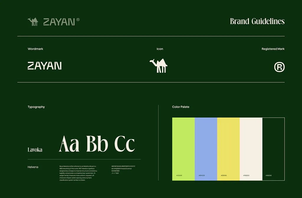
One page from the ZAYAN brand identity: wordmark, symbol, typography and color.
A logo system, not one logo
A logo is delivered as a small family, so it works from a billboard to a browser tab:
- Primary logo: the full version, usually the symbol and the name together.
- Secondary versions: stacked or horizontal layouts for tight spaces.
- The symbol on its own: for the app icon, the favicon and social profile pictures.
- Color versions: full color, one color, black, and white for dark backgrounds.
- Rules: clear space around the logo, a minimum size, and examples of what not to do, such as stretching or recoloring it.
A well-made mark is drawn on a construction grid, so anyone can rebuild it precisely at any size.
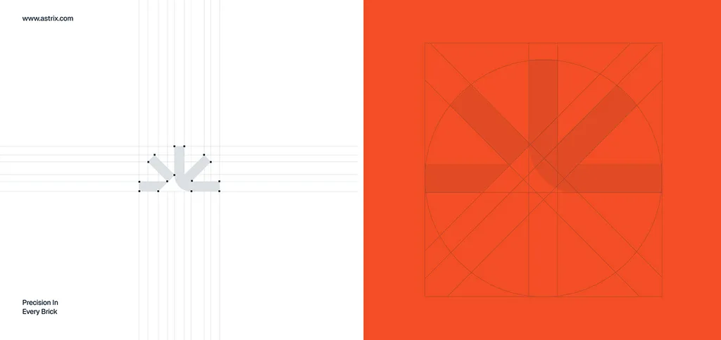
The Astrix Builders mark on its construction grid.
Color, with values for screen and print
A palette is more than a few swatches. It sets which colors lead, which support, and roughly how much of each to use. Each color then needs values for every medium:
- HEX and RGB for screens: websites, apps and social.
- CMYK for print, where four process inks are printed as tiny dots.
- Pantone (spot colors) when the color must match exactly on packaging or signage. A spot color is a premixed, standardized ink, so any printer can match the same exact color.
Some bright screen colors can’t be reproduced with CMYK inks, so your designer should choose print values that come as close as possible. Ask for both. Don’t let a printer guess from a HEX code.
Check contrast early too. WCAG 2.2, the web accessibility standard, asks for a contrast ratio of at least 4.5:1 for normal text and 3:1 for large text (about 24 px, or 18.5 px bold). The parts people need to see to find and use controls, such as input borders, icon-only buttons and focus states, and meaningful icons need 3:1 against the colors next to them. Logos are exempt, but brand colors used for text, icons and controls are not. Light colors such as yellow or lime usually work as backgrounds or highlights, not as text on white.
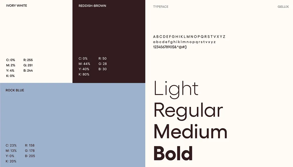
Screen (RGB) and print (CMYK) values side by side in the ROMO Logistics guidelines.
Typography, and the licenses behind it
The type system names one or two typefaces, the weights you use, and a clear hierarchy for headings, body text and small print. One family is often enough. For SpareCharge we used only Plus Jakarta Sans and built the hierarchy from weight and size, which keeps data-heavy app screens calm.
If you sell in Arabic and English, the identity also needs an Arabic typeface that matches the Latin one in weight and feel. We cover that in designing a bilingual brand in Arabic and English.
Fonts are software, so they come with licenses. Commercial fonts are usually licensed by use:
- Desktop: installed on computers to make designs and print.
- Web: embedded in your website.
- App: embedded inside your app or software.
Make sure your license covers every place the font will appear. Most Google Fonts are released under the SIL Open Font License, which allows commercial use, including in logos.
Imagery, icons and graphic elements
These make your brand recognizable even when the logo isn’t on screen:
- Photography or illustration style: subjects, light, color treatment and what to avoid.
- An icon set drawn in the same style. SpareCharge’s identity includes a set of 16 icons.
- Graphic elements: shapes, patterns, a layout grid and, where it matters, simple motion rules.
A voice, not just a look
Your verbal identity covers how the brand speaks:
- A one-line positioning statement: what you do, for whom, and why it matters.
- A tagline, if you want one.
- Three or four key messages.
- Voice traits with short do and don’t examples.
Mailchimp’s public content style guide makes a useful distinction: the voice stays the same, while the tone changes with the situation. A billing error and a product launch shouldn’t sound alike, but both should sound like you.
Brand guidelines that people actually use
Guidelines explain the rules: logo use, color values, the type hierarchy, imagery, voice, and examples on real applications such as social posts, decks and signage.
They don’t need to be a thick book. A short PDF or a web page works, as long as your team and partners can find it. At the other end of the scale is a famous complete manual: NASA’s Graphics Standards Manual for the “worm” logotype, designed by Danne & Blackburn in 1975 and issued in January 1976. It covered everything from stationery and forms to signage, vehicles and spacecraft. NASA retired the worm in 1992 and brought it back in 2020.
You may have read that consistent branding raises revenue by 23%. That number comes from a 2016 survey by Demand Metric, sponsored by Lucidpress, in which respondents at companies with off-brand materials estimated the effect, with answers from 5% to 50%. Nobody measured it. A more practical reason for guidelines: with the rules written down, your team can make on-brand work without asking the designer every time.
The files you should receive
At the end of a project, check that you have:
- Logo files in every version: SVG for the web (it scales without losing quality), PDF for print, and PNG with a transparent background for documents and slides. Add EPS only if a printer asks for it.
- A favicon and app icon. Google Search asks for a square favicon of at least 8×8 px and recommends larger than 48×48 px.
- Color values: HEX, RGB and CMYK, plus Pantone where print matters.
- Fonts, or links to license them, with the license terms.
- Templates that were part of the scope, such as social posts, a pitch deck or documents.
- Source files (Figma or Illustrator), if your contract includes them.
Who owns it
This is general information, not legal advice.
In the US, paying a freelancer or a studio doesn’t automatically make you the copyright owner. According to the US Copyright Office, a contractor’s work counts as a “work made for hire” only if it falls into one of nine specific categories and both sides sign a written agreement that says so. Because those rules are narrow, ask for a written, signed copyright assignment in your design contract. US law requires a transfer of copyright to be in writing and signed.
Copyright also doesn’t protect names, short phrases or typefaces, so your name and a simple wordmark rely on trademark protection. In the US, trademark rights start when you use the mark in business and become nationwide once the USPTO registers it. You can use ™ at any time, but ® only after registration. To register a trademark in the UAE, apply to the Ministry of Economy and Tourism. In Saudi Arabia, apply to the Saudi Authority for Intellectual Property (SAIP).
What your startup needs first
You don’t need every part on day one. A sensible order:
- Before launch: a logo and symbol, two to four colors with screen values, one or two fonts, a favicon and social avatar, and a one-page guide.
- At launch or when you raise: the full logo system, print values, an imagery style and icons, voice basics, deck and social templates, and brand guidelines.
- As the team grows: detailed guidelines, design tokens for the product team, motion rules and an AI-ready brand system for teams that create with AI tools.
To see what each scope usually costs, read how much a brand identity costs in 2026. If you’re not sure whether to start with a logo or the full system, read logo, identity or guidelines: what to ask for first, or see our brand identity design service.
FAQ
What are the main elements of a brand identity?
A logo system, a color palette with screen and print values, typography, an imagery and icon style, a brand voice, and brand guidelines that explain how to use them. A complete project also hands over the files, the fonts to license in your company’s name, and a signed copyright assignment.
Is a logo the same as a brand identity?
No. A logo is one part of a brand identity. The identity is the whole system around it: color, type, imagery, voice and the rules that keep them consistent on a website, an app, packaging or a pitch deck.
What should a brand identity package include?
Logo files in every version (SVG, PDF and PNG), a favicon and app icon, HEX, RGB and CMYK color values (plus Pantone if you print), the fonts or links to license them in your company’s name, any agreed templates, brand guidelines and a written copyright assignment.
How long does it take to create a brand identity?
A focused logo project usually takes 2–4 weeks. A full brand identity usually takes 4–10 weeks, depending on how much strategy, how many design rounds and how many applications are included.
Does a small startup need brand guidelines?
Yes, but they can be short. A one-page guide with the logo versions, colors, fonts and a few do’s and don’ts is enough to start. Expand it when more people or agencies start making things for the brand.
Sources