Startup Logo Design: Built for a Favicon, a Deck and an IPO
What a startup logo has to survive, the three logo routes that suit startups, real examples, and what a good one costs.

Summarize with AI
Key takeaways
- A startup logo is not judged on a slide. It is judged at 16 pixels in a browser tab, as an app icon, on a deck in a dim boardroom and on a hoodie. Test it everywhere before you approve it.
- Three routes suit startups: a wordmark, a monogram, or a symbol plus wordmark. Pick by how much reach you have, not by taste.
- Clear the name before you fall in love with any mark. A trademark conflict is the only logo mistake design cannot fix.
- A good startup logo takes one to two weeks. If a provider promises it in 48 hours with no questions asked, that is the price of starting over later.
A startup logo has one job: identify you, clearly, in every place a stranger meets your company, from the favicon in a browser tab to the cover of a term sheet. Most early logos fail not because they are ugly but because they were only ever checked on a slide. This guide shows you what the logo has to survive, which of the three logo routes fits your stage, and what to expect when you commission one.
I’m Masuder Rahaman, a brand designer and the founder of Wolfpixel, where I lead the design team. In more than eight years of design and 350+ projects, most of my clients have been founders in the US, the UK, the UAE and Saudi Arabia, and the logo is usually the first thing they ask me for. Here is how I think about getting it right the first time.
What a startup logo has to survive
Before any sketching, write down every place the logo will live in the next twelve months. For almost every startup, the list looks like this.
| Where it lives | Size | What breaks |
|---|---|---|
| Browser favicon | 16 × 16 and 32 × 32 px | Thin lines vanish, wordmarks turn to a smudge, detail disappears |
| App icon | 1024 × 1024 px canvas, scaled down to the home screen | The system adds the rounded corners and, since iOS 26, glass effects and dark, clear and tinted versions; fine detail turns to mush at home-screen size |
| Social avatar | Circle crop, around 40 to 180 px | Wide wordmarks get clipped; off-center symbols look broken |
| Pitch deck | Cover slide and the corner of every slide | Low-contrast colors die on a projector; a busy mark competes with the headline |
| Website header | Around 24 to 40 px tall | Stacked lockups are too tall; horizontal ones need a tight version |
| Email signature and invoices | Tiny, often grayscale | Gradients and multiple colors stop working |
| Merch and swag | Embroidery, one color, sometimes reversed | Gradients, hairlines and photographic effects cannot be stitched |
| Signage and trade shows | Meters wide | Soft edges and low-resolution files look cheap at scale |
| Arabic and English (Gulf markets) | Two scripts in one mark | A Latin wordmark with Arabic typed in a default font reads as two brands |
Two consequences follow. First, the logo needs a family: a primary logo, a wordmark on its own, a symbol or monogram on its own, and horizontal and stacked lockups. Second, every one of those needs a one-color and a reversed version, in vector, because you will be asked for “the logo in white as an SVG” within a week of launch. If a designer shows you a single beautiful mark on a dark gradient and nothing else, ask for it at 16 pixels before you say yes.
The three logo routes that suit startups
Logo taxonomies list seven or more types. For a startup, three cover nearly every case. Choose by how much reach you have, because a symbol only becomes recognizable through repetition you may not be able to afford yet.
Route 1: The wordmark (name as the logo)
Your name, set in carefully adjusted lettering, with a small monogram cut from it for the favicon and app icon. If the lettering is drawn rather than typed, it’s a logotype; what a logotype is explains how it differs from a wordmark and a lettermark.
Choose it when: nobody knows you yet, the name is short and distinctive, and most of your touchpoints are digital. This is the default for pre-seed and most seed-stage companies, and it is what I recommend in the startup branding playbook for the earliest stage.
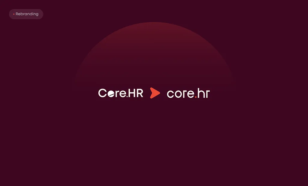
Example from my work: Core.hr. The old logo was a busy, capitalized logotype that could not carry the “people-first HR” positioning. The rebrand moved it to a calm lowercase wordmark under a rising red sun, on deep burgundy. The wordmark does the identifying; the small sun becomes the app icon and favicon. See the before and after.
Watch out for: long names (three or more syllables get cramped at header size), and names that need a symbol to be pronounceable in a second market.
Route 2: The monogram or lettermark
One, two or three letters built into a geometric mark, with the full name set beside it.
Choose it when: the name is long or descriptive, the logo has to work in a square (app icon, avatar, truck door), or you sell to industries where a solid, engineered mark signals reliability.
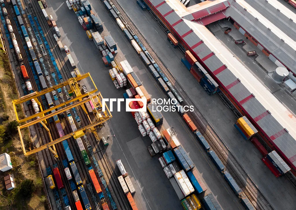
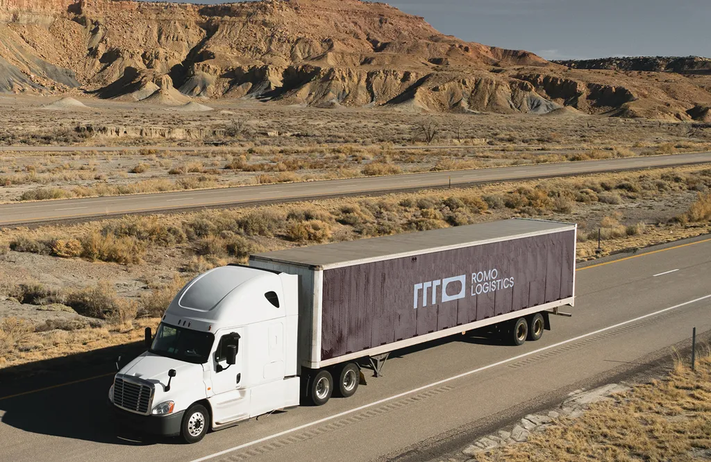
Example from my work: ROMO Logistics, where a geometric monogram carries the brand on truck livery, signs, packaging and the website in brown and blue. A monogram scales from a 16-pixel favicon to the side of a trailer without losing its shape. See the monogram in use.
Watch out for: monograms are crowded territory. Two-letter marks in blue circles are easy to confuse with a hundred others, so the construction has to be distinctive, not just tidy.
Route 3: The symbol plus wordmark (combination mark)
A standalone symbol that tells a story about the product, locked up with the name, and designed to work alone once people know you.
Choose it when: you have a product with a story worth a shape, you will have enough reach (an app in people’s pockets, physical signage, paid media) to make the symbol recognizable, or you are branding a marketplace or consumer product.
Example from my work: SpareCharge, a peer-to-peer EV charging app. Bolts and plugs are the first ideas in that category, which makes them hard to own. The SpareCharge mark instead shows two forms, a driver and a charger owner, meeting around a central gap that stands for the request connecting them. It works as an app icon, on a smartwatch face, on the charger screen and on a highway billboard, all from one construction grid. See the mark and how it is built.
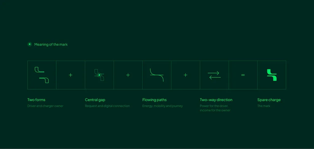
Watch out for: a symbol that illustrates the product literally dates fast and limits you when the product changes. The SpareCharge mark is about the connection, not a charger, so it survives a change in hardware.
Which route is yours?
| Your situation | Route |
|---|---|
| Pre-seed, short distinctive name, mostly digital | Wordmark |
| Long or descriptive name, needs a square mark, B2B or industrial | Monogram |
| Product with a story, consumer or marketplace, real reach coming | Symbol plus wordmark |
| Entering the UAE or Saudi Arabia | Any route, with Arabic and English versions of your logo designed together, not one after the other |
Still unsure whether you need a logo at all or a full identity? Logo, identity or guidelines: what to ask for first settles that in six minutes.
What makes a startup logo “modern” (and what makes it dated)
Founders often ask for a “modern startup logo”. What they usually mean is one that will not embarrass them in three years. These are the properties that hold up:
- One idea. The logo identifies you; the website explains you. A mark that tries to show the product, the mission and the city at once becomes a smudge at favicon size.
- Built on a grid. Geometric construction keeps the mark consistent across every size and makes the Arabic version, the monogram and the app icon feel like one family.
- Works in one color first. If it only works with a gradient, it does not work on an invoice, a stitched polo or a stamp.
- Distinctive in your category. Bring your competitors’ logos to the brief. If everyone in your space uses a blue shield or a green leaf, the brief is to decide what to share with the category and where to stand apart.
- A short palette. One primary color, one or two neutrals and an accent. SpareCharge runs on two greens; Core.hr on burgundy and red. Short palettes stay consistent on a watch face and a billboard.

What dates a logo: the “corporate swoosh”, a 3D bevel, a gradient that only exists on screen, a trend typeface everyone else chose that year, and anything an AI generator produced for a thousand other companies with similar prompts. For AI products in particular, see AI startup logo design; for what is changing next, see logo design trends for 2027.
Startup logo ideas: where good concepts actually come from
Galleries of “startup logo ideas” show you what already exists, which is useful for one thing: knowing what to avoid. Good concepts come from three places.
- The name. Core.hr’s lowercase wordmark and SpareCharge’s “share your spare” both start from how the name reads and sounds.
- The product’s one true idea. For SpareCharge it was the connection between two people, not the electricity. For a security startup, it is rarely the padlock.
- The category’s blind spot. Every fintech uses a shield or a coin. Every AI startup uses a sparkle or a node graph. The gap is the opportunity.
A brief that answers “what is the one thing this mark should say?” produces better concepts than a mood board of twenty logos you like. My logo design process shows how that brief becomes concepts, step by step.
Clear the name before you approve the mark
Everything in this article can be fixed with design work except one thing. If your name or mark infringes an existing trademark, you throw the logo away and often the name with it. Before you fall in love with a concept:
- Search the USPTO’s trademark records for the US, WIPO’s Global Brand Database for other countries, and the UAE Ministry of Economy and Tourism and Saudi Authority for Intellectual Property (SAIP) registries if you sell in the Gulf.
- Check the domain and the main social handles. You do not need the exact .com on day one, but you need a clean path to it.
- Get a trademark attorney’s clearance before you file or print anything. A clean search is a filter, not a green light.
Your lawyer files the trademark. A designer’s job is to hand over clean vector files for the application. If you do not have a name yet, brand naming includes a preliminary trademark search.
What a startup logo should cost, and what you should get
A custom startup logo ranges from a few hundred dollars with a freelancer to several thousand with a studio; the market ranges are in how much a brand identity costs. What matters more than the number is what arrives at the end. A startup logo project should deliver, as a minimum:
- Primary logo, wordmark and symbol or monogram, in color and in black and white
- Horizontal and stacked lockups
- A basic color palette and typeface choice to go with the mark
- Vector files (SVG, PDF) and PNG, including reversed versions for dark backgrounds
- Full ownership of all files, assigned in writing on final payment
What it should not require: a 48-hour turnaround with no brief call, a “complete brand” for the price of a logo, or a provider who never asks who your customers are.
The startup logo checklist
Before you approve any logo, run it through this list. Every “no” is a revision, not a compromise.
- Reads clearly at 16 px as a favicon
- Works as a square 1024 × 1024 app icon, with nothing important cut off by the rounded corners, and still reads in the dark, clear and tinted versions
- Survives a circle crop as a social avatar
- Works in one color, black on white and white on black
- Fits a 32 px-tall website header without a special version
- Looks deliberate on a projector in a bright room
- Can be embroidered or printed in one color
- Has an Arabic version designed alongside it, if you sell in the Gulf
- Is distinctive next to your three closest competitors
- Passed a trademark search in every market you sell in
- Comes with SVG, PDF and PNG files and a written assignment of ownership
The logo design package: $999, 1 to 2 weeks
If you want this done once and done right, my logo design package covers everything in the checklist above.
| Package | Logo design |
|---|---|
| Price | $999, fixed in USD, no change mid-project |
| Timeline | 1 to 2 weeks, with weekly check-ins in your time zone |
| Concepts | 3 logo concepts, each shown on real uses like an app icon, a website and a sign |
| Revisions | 3 rounds on the chosen concept, tested from favicon to billboard |
| You receive | Primary logo, wordmark and symbol; horizontal and stacked lockups; a color and type sheet; SVG, PDF and PNG in color and black and white |
| Ownership | 100% yours on final payment |
| Arabic and English | Same package price |
| Upgrade | If you move up to the brand identity package later, the $999 is credited |
Every project starts with a free 30-minute call in your working hours. Book the call or read the full package details. If what you really need is strategy, voice and a full visual system, the brand identity package is the better fit, and I will tell you that on the call.
FAQ
What makes a good startup logo?
One clear idea, built on a grid, that works in one color at 16 pixels and at billboard size, is distinctive in its category and has passed a trademark search. Everything else (color, style, trend) is secondary.
Should a startup use a wordmark or a symbol?
Early on, usually a wordmark with a small monogram for the icon, because nobody knows your name yet and a symbol only gains meaning through repetition. Move to a symbol plus wordmark once you have real reach: an app in people’s pockets, signage or paid media.
Will an AI-generated logo scale with my startup?
Fine for testing an idea on a landing page. Risky as your real brand: generators produce generic marks that other companies also receive, the files are rarely production-ready vectors, and in the US, logo artwork generated entirely by AI, without enough human creative input, may not be protected by copyright (trademark rights are separate: they come from using the mark, not from who drew it). Once you are raising or selling, get a distinctive, cleared logo.
How much does startup logo design cost?
Market prices range from a few hundred dollars from a freelancer to several thousand from a studio. My fixed logo design package is $999 and takes 1 to 2 weeks, with three concepts and three revision rounds.
What files should I get with my logo?
Vector files (SVG and PDF) that scale to any size, PNG files for everyday use, versions in color, black and white, and reversed for dark backgrounds, plus a sheet with your colors and typefaces. Ownership of all of it should be assigned to you in writing.
Do I need an Arabic version of my logo for the UAE or Saudi Arabia?
In most cases yes, if you sell to local consumers, enterprises or government. Design the Arabic wordmark alongside the Latin one so they match in weight and rhythm, rather than typing the name in a default Arabic font later.
Sources