AI Startup Logo Design: Beyond the Sparkle and the Brain
Why AI startup logos all look the same, why the sparkle, the brain, the swirl and the gradient fail, and where better ideas come from.

Summarize with AI
Key takeaways
- The sparkle is a user-interface convention that means “this feature uses AI.” Putting it in your logo makes your brand look like a button in someone else’s product.
- Brain, neuron and node-graph marks describe the technology, not your company. So do swirling hexagons and glowing gradients, and they date fast.
- Good AI logos come from the name, the product’s one idea, the buyer, or the gap in the category, in that order of usefulness.
- Test every concept in the places an AI product actually lives: favicon, app icon, chat avatar, dark-mode UI, next to customer logos.
- Have a person draw the final mark. Prompt-only artwork may not be protected by copyright in the US, and a name built on “AI” or “GPT” is hard to protect as a trademark.
AI startup logos should identify your company, not the category. The four marks most AI startups reach for, the sparkle, the brain or node graph, the swirling hexagon and the glowing gradient, all say “AI” and nothing else, and going into 2027 “AI” is the one thing every competitor already says. A better logo starts from what your product does, who buys it, and where the mark has to live: a 16-pixel favicon, a chat avatar, an app icon and a deck slide next to your customers’ logos.
I’m Masuder Rahaman, a brand designer and the founder of Wolfpixel, where I lead the design team. In more than eight years and 350+ projects, most of them for startup founders in the US, the UK, the UAE and Saudi Arabia, AI and B2B software founders are among the people I work with, and their brief call often includes a version of the same sentence: “we want it to feel AI, but not like everyone else.” This article is how I answer that.
Why AI company logos all look the same
Line up the marks of recently funded AI startups and the pattern is hard to miss. In 2023 James I. Bowie, writing in Fast Company, named the first wave: the swirling hexagon, often with an implied rotation around a central point. By 2025 the look had moved on to soft, circular forms, which a widely shared post mocked for all looking alike, and Creative Bloq summed up most AI company logos as “boring, corporate and wholly lacklustre.”
The causes are not mysterious.
- The category leaders set the template. OpenAI’s knot, Google’s Gemini sparkle and Apple Intelligence’s glowing loop are among the most visible AI marks in the world. When investors and buyers recognize those shapes as “AI,” copying them feels safe.
- Everyone is using the same references. Dribbble searches, Behance galleries and AI logo generators draw on the same small pool of images, so the output converges.
- The brief is usually “look intelligent, look futuristic, look trustworthy.” Those three words have a small set of visual translations, and every studio lands on them.
- The crypto precedent. The 2020 to 2022 crypto boom produced a sea of hexagons, cubes and isometric illusions. Many of those brands are gone, and the look now reads as a date stamp. Bowie made the same link: AI companies took the hexagon from crypto. The AI swirl is the same mechanism a few years later.
None of this makes the category leaders’ logos bad. It makes copying them pointless, because a mark that looks like OpenAI tells a buyer only that you are not OpenAI.
The four defaults and why each one fails
1. The sparkle
The four-pointed star became the universal AI marker almost by accident. Google adopted it for AI features across its products; Google’s design team reports that nearly 100 Google system icons include the sparkle, and that users recognize it as a sign of AI features in Google products.
That is exactly the problem for a logo. The sparkle is a functional icon, like a magnifying glass for search or a gear for settings. Inside your own product it will sit on buttons and menus marking AI actions. If it is also your logo, your brand is competing with its own interface.
Worse, outside a product it is ambiguous. When Nielsen Norman Group showed people the sparkle icon on its own, many were simply unsure what it meant, and about 17% read it as “favorite” or “save,” the meaning of a plain star. A logo that means something different to a sixth of viewers, and nothing at all to many more, is not doing a logo’s job.
2. The brain, the neuron and the node graph
These describe the technology: neural networks, connected nodes, “intelligence.” They were already common before the current boom, and they fail two practical tests. At favicon size a node graph becomes a cluster of dots, and a brain becomes a smudge. And they say nothing about you. A fraud-detection product, a legal-research assistant and a video generator can all put a brain in their logo, and none of the three is better identified for it.
3. The swirling hexagon and the circular portal
The knot, the spiral, the ring with a hole in the middle. Each reads as “portal,” “orbit” or “network,” which is a flexible metaphor and therefore an empty one. The joke about these marks stuck because the resemblance between them is so strong. Many well-funded companies share the form. Yours would be one more.
4. The glowing gradient
Purple-to-blue, teal-to-violet, with a soft glow. This one is not a shape but a finish, and it is the hardest of the four to live with. Gradients cannot be embroidered, stamped or printed in one color; they shift on cheap screens and in dark mode; and at 16 pixels the glow turns into noise. A logo that only works as a full-color, full-size render on a dark landing page has not been tested.
| Default | Where it breaks | Why it will date |
|---|---|---|
| Sparkle | Inside your own UI; confused with a star for favorites | It is becoming a generic icon, not a brand asset |
| Brain / node graph | Favicon, app icon, one-color print | It pre-dates the boom and already looks dated |
| Hexagon swirl / portal | Distinctiveness; many near-identical marks | Same lifecycle as the crypto hexagons |
| Glowing gradient | Print, embroidery, dark mode, 16 px | Finish trends date quickly |
Where good AI logo ideas actually come from
The alternative is not “be weird.” It is to answer a different question. Instead of “how do we look like AI,” ask “what is the one thing this mark should say about us,” and then look in four places.
The name
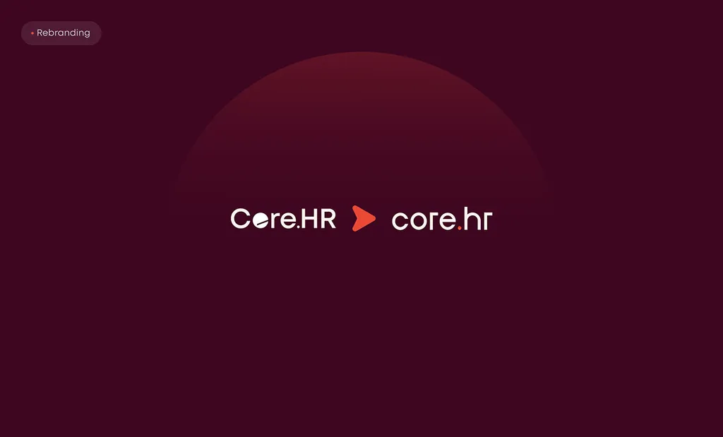
Many of the strongest AI marks are the name, set well, with a monogram cut from it for the icon. For a company nobody knows yet, a wordmark does the identifying and a symbol is a cost you pay later. The Core.hr rebrand, for HR software, moved from a busy capitalized logotype to a calm lowercase wordmark under a small rising sun; the wordmark carries the brand and the sun becomes the app icon. If the name is short and distinctive, start here.
The product’s one idea
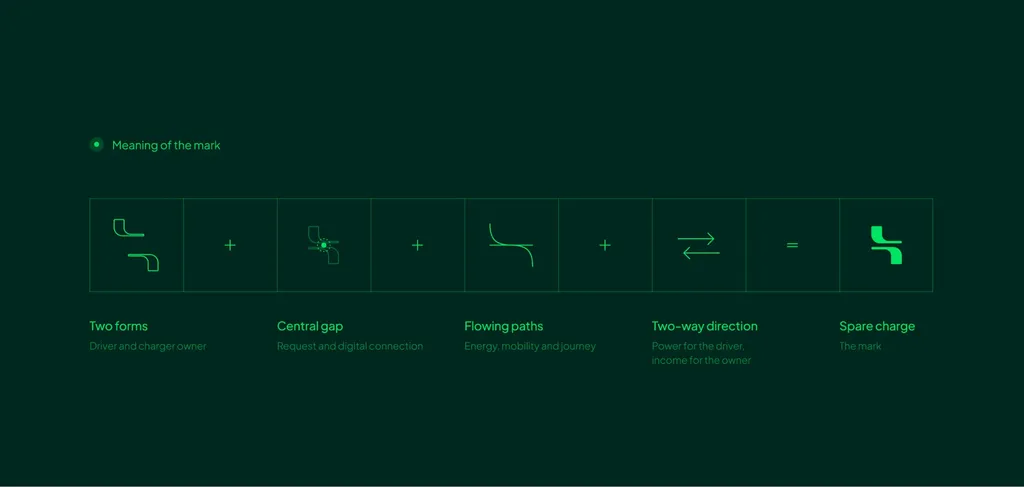
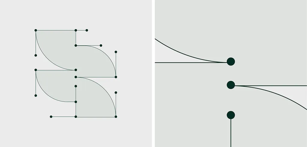
What does the product do that the category does not? Not “AI-powered X” but the actual mechanism or outcome. SpareCharge is a peer-to-peer EV charging app, not an AI product, but it had the same problem: a category full of bolts and plugs. Its one idea was the connection between a driver and a charger owner, and the mark shows two forms meeting around the request that links them. The same move works for an AI product: a document assistant’s one idea might be “the answer is already in your files”; a sales agent’s might be “it never forgets a follow-up.” Draw the idea, not the technology.
The buyer
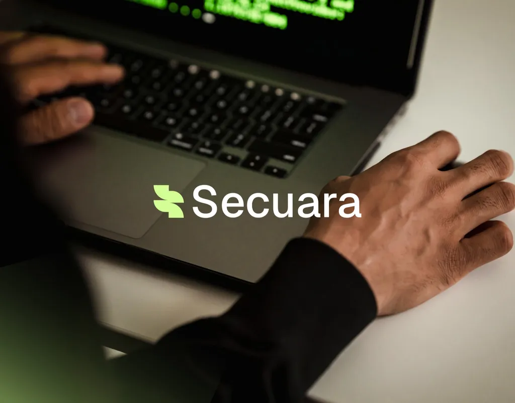
An enterprise security buyer looking at your deck needs calm and competence. A solo creator tapping your icon needs warmth and speed. The Secuara cybersecurity brand identity, which my team designed in 2025, is a useful example from an adjacent category with the same cliché problem (shields, padlocks, blue everywhere). The brief asked for a security brand that felt bold and human rather than cold and technical. The mark is an S built from two leaf-like quarter circles joined like nodes in a network; in motion the two shapes lock together like a shield. It suggests protection without a stock symbol, and it sits in deep green and lime rather than the category’s blue, set in Inter for clear technical reading. Nothing about it says “security” the way a padlock does, and that is why it is recognizable.
The category’s blind spot
Collect every competitor’s logo on one board before any sketching. If the board is twenty hexagons and sparkles, the gap is a wordmark, a monogram, a literal object, or a mark with a human-drawn quality. Two of the better-known AI brands found it: DeepSeek’s whale and Midjourney’s sailboat are things rather than abstractions, and they stand out on any board of AI logos for exactly that reason. You do not need a mascot, but you do need a reason the mark is yours.
Three logo routes that suit AI startups
The three routes I recommend for any startup apply here with one adjustment: for AI products, the icon matters earlier than usual, because the mark will live as a chat avatar and an app icon from day one.
| Route | Choose it when | AI-specific note |
|---|---|---|
| Wordmark plus monogram | Pre-seed or seed, short distinctive name, mostly digital | Cut the monogram from the wordmark so the avatar and favicon feel like the same family |
| Monogram | Long or descriptive name, needs a square mark, enterprise buyer | Two-letter monograms in rounded squares are crowded; the construction has to be distinctive |
| Symbol plus wordmark | A product with a story worth a shape, real reach coming | The symbol must survive next to the sparkle icon inside your own UI without being mistaken for it |
For the full breakdown of the three routes, with examples, see startup logo design: a logo that scales. For the styles shaping logos beyond AI products, see logo design trends for 2027.
AI logo trends in 2027: what is a trend and what is a cliché
Trend lists are opinions, including this one. But three things are visible in the work published through 2026, and they’re the ones to plan around for 2027.
- A counter-trend toward visibly human marks. Brands are pushing back against prompt-generated sameness with hand-drawn lines, irregular geometry and marks that are obviously made by a person. For an AI company this is a strong move: it signals that humans are in the loop, which is the thing buyers are most anxious about.
- Marks built for tiny contexts. AI assistants and search answers increasingly show brands as a small icon beside a line of text. Logos that read at 16 to 24 pixels are being designed first, with the large version derived from the small one, not the other way round.
- The sparkle fading as a brand asset. As AI features become ordinary, the sparkle is on its way to being as generic as the gear icon. A logo that depends on it will lose its meaning as the icon loses its novelty.
What is not a trend: the hexagon swirl, the gradient glow and the brain. Those are the defaults the trend is reacting against.
Two legal edges specific to AI logos
General information, not legal advice. Confirm with your lawyer.
A logo made by prompts alone may not be yours. In January 2025 the US Copyright Office concluded that AI output is protected by copyright only where a human author determined enough of the expressive elements, and that prompts alone are not sufficient. Use generators for mood boards and exploration if you like; have a person draw the final mark and symbol so the core assets have a human author. If you already launched with a generated logo, how to fix an AI-generated logo walks through the redraw. Trademark rights are separate (they come from use and registration, not from who drew the mark), but you want both.

A name that just says “AI” or “GPT” is weak. The USPTO treats descriptive marks as weak and often not registrable, and it refused OpenAI’s own application for “GPT” as merely descriptive. OpenAI’s brand guidelines also do not permit its GPT brand in app, product, developer or company names. If your name is “SomethingAI,” the logo has to carry all the distinctiveness, because the name carries almost none. If you have not named yet, name first.
The AI startup logo checklist
Run every concept through this before approving it. Each “no” is a revision.
- Reads clearly at 16 px as a favicon and at 24 px beside a line of text
- Works as a square app icon with nothing important cut off by rounded corners
- Works as a circular chat avatar, in light and dark mode
- Sits inside your own product UI without being mistaken for the sparkle “AI feature” icon
- Works in one color, black on white and white on black, with no gradient
- Looks deliberate on a deck slide next to three customer or partner logos
- Is distinctive on a board of your ten closest competitors’ marks
- Says something about your product or buyer, not only about “intelligence”
- Was drawn by a person, with the source files in your contract
- Passed a trademark search in every market you sell in
- Has an Arabic version designed alongside it, if you sell in the UAE or Saudi Arabia
- Will still look like you if you change the underlying model next year
That last item is the quiet test. The model you build on today will not be the model you build on in two years. A mark that illustrates the technology ages with it; a mark that identifies the company does not.
What to bring to the brief
The brief decides whether you get three concepts that fit or three that miss. For an AI startup, bring:
- One sentence on what the product does and for whom, with no “AI-powered” in it.
- Your three closest competitors’ logos, and the three AI brands you admire, with one line each on why.
- Every place the logo will live in the first year: app icon, chat avatar, deck, website, docs, badges, event banner, swag.
- Which claims you can prove. The brand should not promise accuracy or autonomy the product does not deliver, and the logo should not either.
- Whether you need Arabic and English, and which markets you sell in, for the trademark search.
- Who gives feedback and who makes the final call.
How I work with AI startups on this
A logo on its own is $999, takes one to two weeks, and includes three concepts shown on real uses (app icon, website, a sign or a slide), three revision rounds and files for web and print; see the logo design package. If you need the full system, the brand identity package is $3,499 over two to three weeks, with four concepts, strategy and positioning, a color and type system, voice, guidelines and a Figma library. Teams that create content with AI tools can add an AI-ready brand system: design tokens, an AI image style guide and brand voice rules those tools can follow.
The industry page for startups and AI brands covers the rest: naming, claims you can back up, EU labeling rules and app store naming limits. Every project starts with a free 30-minute call in your time zone. If your logo is already fine and only the name is the problem, I will say so on the call.
FAQ
Should an AI startup logo have a sparkle?
Usually not. The sparkle has become a functional icon meaning “this feature uses AI” inside products, so it will appear on your own buttons and menus. A logo that uses it competes with the interface, and on its own it is easily read as a star for favorites. Keep the sparkle for UI, if you use it at all, and give the brand a mark of its own.
What makes a good AI company logo?
One that identifies the company rather than the category: built from the name, the product’s one idea or the buyer, drawn by a person, distinctive on a board of competitors, and tested at favicon, app icon and chat-avatar size in light and dark mode. Shape and color are secondary to those tests.
What colors work for an AI startup?
Any palette you can own. Purple-to-blue gradients are the category default and are hard to reproduce in print or at small sizes. Look at your competitor board first; if it is all blue and violet, a single confident color with one accent (Secuara’s deep green and lime, SpareCharge’s two greens) will stand apart. Check text contrast against WCAG 2.2 before you commit.
Can I use an AI logo generator for my startup?
For a landing-page placeholder, yes. For the brand you will raise and sell on, it is risky: generators produce marks that other companies also receive, the files are often not production-ready vectors, and in the US a logo generated entirely from prompts may not be protected by copyright. Have a person draw the final mark.
Should our company name include “AI”?
It is a weak choice for trademark purposes. The USPTO treats descriptive terms as weak and refused “GPT” as merely descriptive. An invented or suggestive name is easier to protect and outlasts the model you build on. If you are not yet named, brand naming comes before the logo.
How much does an AI startup logo cost and how long does it take?
Market prices run from a few hundred dollars with a freelancer to several thousand with a studio. My fixed logo design package is $999 and takes one to two weeks; a full brand identity is $3,499 over two to three weeks.
Sources
- Google Design: All that sparkles is AI (research on the sparkle icon)
- Nielsen Norman Group: The proliferation and problem of the sparkles icon
- James I. Bowie, Fast Company: The AI boom is creating a new logo trend, the swirling hexagon
- US Copyright Office: Copyright and Artificial Intelligence, Part 2: Copyrightability (January 2025)
- TechCrunch: No “GPT” trademark for OpenAI (February 2024)