Fixing an AI-Generated Logo: Redraw, Test, Secure
An AI logo is a sketch, not a finished file. A five-question test for fixing it or starting over, then nine steps: redraw, lettering, geometry, tests, trademark, rights and files.

Summarize with AI
Key takeaways
- An AI-generated logo is a sketch, not a finished file. It’s a pixel image, its lettering is usually invented, and its curves and spacing are rarely even. Fixing it means rebuilding it, not touching it up.
- Decide first whether it’s worth fixing. Then the fix has nine steps: pick the version to keep, redraw it as vectors, replace the lettering, correct the geometry, simplify it, make and test its versions, check it isn’t someone else’s mark, secure your rights and get a proper file set.
- Auto-trace and AI upscalers don’t fix it. They copy the flaws into a bigger file.
- Run the five-question test below before you spend anything. If the idea itself is weak or looks like another company’s logo, starting over costs less than fixing it.
- A person’s redraw also matters legally. The US Copyright Office has said prompts alone don’t make you the author of AI output, but human modifications can be protected.
To fix an AI-generated logo, treat the image as a reference and rebuild it: redraw it by hand as clean vector shapes, replace the AI’s lettering with a real typeface or custom-drawn letters, even out the curves, weights and spacing, remove effects that won’t print, then create small, one-color and reversed versions and test them where the logo will live. Before you finalize it, check that it isn’t confusingly similar to an existing trademark. If the logo’s idea is weak or generic, start over instead.
I’m Masuder Rahaman, a brand designer and the founder of Wolfpixel, where I lead the design team. Redrawing logos that are blurry, uneven or only exist as a screenshot is a service I offer on its own: logo refinement. This guide covers the same steps I follow, so you can do the simple parts yourself and know what to ask for when you hand over the rest.
Should you fix an AI logo or start over?
Fix it only when the idea is worth keeping. Answer these five questions honestly before you redraw anything.
| Question | Fix it if… | Start over if… |
|---|---|---|
| Does the logo have one clear idea? | You can say what it shows in one sentence | It’s a pile of details, or you can’t say what it means |
| Is it yours? | Nothing in your category looks like it | It resembles a competitor’s or a well-known logo |
| Does it suit the business? | It fits your name, audience and price level | It looks like a different kind of company |
| Does the shape survive simplification? | Without gradients and glow, a clear silhouette remains | Take away the effects and nothing is left |
| Do people already know it? | Customers, signs or packaging already use it | Nobody has seen it yet, so there’s no recognition to protect |
If you get three or more “fix it” answers, the logo is worth rebuilding. If most answers land in the right-hand column, a redraw will only give you a sharper version of the wrong logo. In that case, read why AI startup logos all look the same before you brief a new one.
What’s usually wrong with an AI-generated logo?
Most AI logos fail in the same seven ways. Knowing which ones apply to yours tells you how much work the fix is.
- It’s a raster image, not a vector. Image generators output pixels. That’s fine for a social post, but the image blurs when enlarged and can’t be cut for signs, vinyl or embroidery.
- The lettering is invented. Letters often wobble, merge or change shape from one to the next, and some aren’t real letters at all. You also can’t license a typeface that doesn’t exist.
- The geometry is uneven. Curves have bumps, strokes change thickness for no reason, and “circles” aren’t round.
- It relies on effects. Gradients, glows, shadows and fake 3D hide weak shapes and disappear in one-color printing.
- It has too much detail. Fine lines and small parts that look good at full size turn into a smudge on a browser tab.
- It looks like other logos. Generators learn from existing images, so results tend toward the familiar: the same swooshes, leaves, shields and monograms many other businesses use.
- Its rights are unclear. Who owns it, whether it’s protected by copyright and whether it can be registered as a trademark all need checking.
Step 1: Which version should you keep, and why?
Generators give you many variations. Choose one, then save the largest version the tool offers, without compression. Next to it, write two short lists:
- Keep: the parts that make it yours, such as the overall silhouette, a particular letter shape or the color.
- Fix: everything that bothers you, such as the uneven “S”, the glow or the lettering.
This short note does more than any other step to keep the redraw on track. It’s also the first thing I ask for on a refinement project, because recognition usually rests on two or three details, and those are the parts that must survive.
Step 2: How do you turn an AI logo into a vector file?
Redraw it. A vector logo is made of mathematical shapes, so it stays sharp at any size and every printer can use it. There are three ways to get from an AI image to a vector file, and only one of them actually fixes the logo.
| Method | What it does | Result on an AI logo |
|---|---|---|
| AI upscaler | Adds pixels to make the image larger | Still a raster image. Edges look smoother, but upscalers can also change letters and small details. |
| Auto-trace (Image Trace and similar) | Converts pixel edges into vector paths automatically | Copies the flaws into vector form: lumpy curves, hundreds of stray points, uneven strokes |
| Manual redraw | A designer rebuilds each shape with clean curves, using the image as a guide | A real vector logo, with even curves, consistent weights and few points |
Auto-trace can be a fair starting point for a very simple, flat, high-contrast shape. For anything with lettering, curves or gradients, a manual redraw is the only route to a clean file.
Why the size matters. Many printers ask for artwork at 300 pixels per inch of the printed size. A 1,024-pixel-wide image therefore prints sharply at only about 3.4 inches wide. A vector file has no such limit, which is why sign makers, embroiderers and packaging printers ask for one.
Step 3: How do you replace the AI’s lettering?
The lettering is the part people read, and in AI logos it’s usually the weakest part. You have two options:
- Set the name in a real typeface that matches the feel of the AI version, then adjust the spacing between letters by eye. A designer will often modify one or two letters as well, so the wordmark doesn’t look like plain type.
- Draw custom lettering, using the AI version only as a mood reference. This takes longer but gives you letters nobody else has.
Check the font license. Font licenses are often separate for desktop, web, app and logo use, and some free fonts don’t allow commercial use or modification. Read the license before you commit to a typeface, because the logo will be used everywhere for years. On my projects the client buys the font licenses, so we check them together before the wordmark is final.
Step 4: How do you fix the geometry and balance?
This is where the logo starts to look professional. The main corrections:
- Even out curves. Smooth any bumps and use as few points as possible.
- Make stroke weights consistent, so lines with the same role have the same thickness.
- Correct by eye, not only by numbers. Round and pointed shapes need to be slightly larger than square ones to look the same size, and horizontal lines need to be slightly thinner than vertical ones to look equal.
- Balance the symbol and the name, so neither overpowers the other and the spacing between them is deliberate.
- Build it on a simple grid, so the proportions can be explained and repeated.
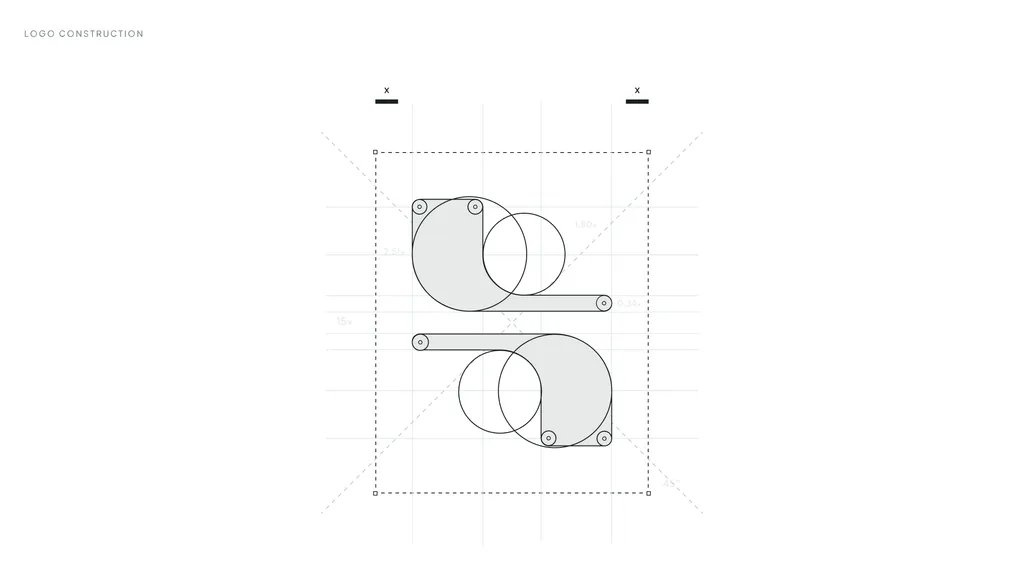
A redraw is many small corrections like these. They’re why a redrawn logo looks “the same, only better.”
Step 5: Why should you simplify it and remove the effects?
Strip the logo down to flat shapes in solid colors. Then look at what’s left:
- If a clear shape remains, that’s your logo. Gradients can return later as an optional version for screens, but the flat version is the master.
- If the shape falls apart without its effects, the logo was relying on decoration. Go back to the fix-or-start-over table.
Remove fine details that will disappear when the logo is small, and reduce the palette to the colors you actually need. Write down each color as HEX and RGB for screens, CMYK for print and, if you print brand colors on packaging, a Pantone match.
Step 6: Which versions do you need, and how do you test them?
One logo file isn’t enough. A usable logo set has a primary version, a compact or stacked version, the symbol on its own and a simplified version for small sizes, each in full color, one color and reversed (white on dark).
Then test them:
| Test | How to run it | Pass if |
|---|---|---|
| Browser tab | Use the symbol as a 16 × 16 and 32 × 32 pixel favicon next to other open tabs | You can find your tab at a glance |
| Search results | Check the favicon against Google’s favicon guidelines | It’s square and still recognizable; Google recommends a favicon larger than 48 × 48 pixels |
| App icon and avatar | Place it in a circle and a rounded square | Nothing important is cut off |
| One color | Print it in black only | The shape still reads |
| Reversed | Put it white on a dark photo and on your darkest brand color | It looks designed, not just inverted |
| Large size | View it full screen or print it on A3 or tabloid paper | No bumps, gaps or wobbles show |
| Real uses | Mock it up on your website header, a business card and a sign | It fits each one without squeezing |
Step 7: How do you check it isn’t someone else’s logo?
Because generators learn from existing images, an AI logo can end up close to a mark that’s already in use. Under US trademark law, the test is likelihood of confusion: whether your mark is similar to another in sound, appearance, meaning or commercial impression and used for related goods or services, so that customers might think the two come from the same company. The USPTO says it’s the most common reason it refuses a trademark application.
How to check before you invest further:
- Run a reverse image search of the AI image and your redraw, using a tool such as Google Lens or TinEye. It’s quick and catches obvious matches.
- Search the trademark register. For logos, the USPTO uses design search codes to find marks with similar images; its search system doesn’t support reverse image search. In the UAE the register is with the Ministry of Economy & Tourism, and in Saudi Arabia with SAIP.
- Ask a trademark lawyer to run a proper clearance search before you file or print in volume. A designer or a search tool can’t replace that.
Step 8: How do you make the logo legally yours?
Two separate questions matter here: copyright (who owns the artwork) and trademark (who may use it as a brand).
Copyright. In Part 2 of its AI report, published in January 2025, the US Copyright Office concluded that AI output can be protected only where a human has determined enough of its expressive elements. Prompts alone don’t count, but human creative arrangements or modifications of the output can be protected. A manual redraw, new lettering and deliberate corrections are exactly that kind of human contribution. Keep your working files, sketches and dated versions as a record.
Trademark. Trademark rights come from using a distinctive mark in business and, more securely, from registering it. A redrawn logo that passes a clearance search can be registered like any other. Your lawyer files the application; a designer hands over clean final files for it.
The AI tool’s terms. Generators set their own rules on who owns the output, whether commercial use needs a paid plan and whether your images are visible to other users. These terms change, so read the current terms of the tool you used and keep a copy of the version that applied when you made the logo.
This section is general information, not legal advice.
Step 9: Which files should you end up with?
When the logo is finished, you should have:
- Vector masters: SVG, PDF and AI or EPS, for designers, printers and sign makers
- PNG files with transparent backgrounds, in several sizes, for everyday use
- Every version: primary, compact, symbol and small-size, each in full color, one color and reversed
- A favicon and app icon set
- A color and type sheet: HEX, RGB, CMYK and Pantone values, the typeface names and where to license them
- Full ownership of all of it, in writing
If someone fixes the logo for you and you don’t receive vector masters, the job isn’t done. Logo file formats explains which file to use where, and my brand identity deliverables checklist covers the larger file set for a full identity.
Should you fix it yourself or hire a designer?
You can do step 1, the testing in step 6 and the first searches in step 7 yourself in an afternoon. The redraw, the lettering and the balancing in steps 2 to 5 are where skill shows, and where DIY fixes with auto-trace usually go wrong.
| You have… | A reasonable path |
|---|---|
| A simple, flat logo you’re happy with and only need a vector file | A careful vector redraw |
| A logo people already know, but it’s blurry, uneven or unreadable at small sizes | Logo refinement: a redraw, new versions and master files, keeping what people recognize |
| An AI logo with a weak or generic idea, or one that looks like another mark | A new logo design, using what you liked about the AI version as part of the brief |
What does logo refinement include?
If you’d rather hand the fix over, this is what my logo refinement service covers:
- A clean redraw of your logo as precise vectors, with smooth curves and consistent weights
- Spacing and balance corrected by eye, not just by numbers
- Small-size versions of the symbol and wordmark for browser tabs, app icons and social avatars
- Color versions: full color, one color, black and white
- Master files in SVG, PDF and PNG, with a before-and-after comparison
- Full ownership of all final files
It usually takes 1 to 2 weeks and includes three revision rounds. You don’t need the original files: a clear image of the logo is enough to start. It doesn’t include a new logo concept, full brand guidelines or trademark filing.
If the five questions above point to starting over, the logo design package gives you three new concepts, three revision rounds and files for web and print in 1 to 2 weeks. My guides to startup logo design and how many logo concepts to expect explain how that process works.
Common mistakes when fixing an AI logo
- Upscaling and calling it done. A bigger image is still an image, not a logo file.
- Auto-tracing a blurry PNG. You get the same flaws, now harder to edit.
- Keeping the AI’s lettering. It can’t be licensed, matched or extended, and it’s usually the first thing people notice.
- Fixing the details before deciding on the idea. Run the fix-or-start-over test first.
- Skipping the trademark search because the logo “came from a tool.” Tools don’t check for you.
- Approving it only at full size. Most of a logo’s life is spent small.
How I can help
Send me your AI logo before a free 30-minute call in your time zone, and I’ll tell you plainly whether it’s worth refining or better replaced. If we work together, you get a fixed written proposal with one price, one timeline and a clear list of deliverables, and the price doesn’t change mid-project. You can see the current packages on the pricing page.
FAQ
Can I fix an AI-generated logo myself?
You can choose the version, test it at small sizes and in one color, and run the first trademark and reverse image searches yourself. The redraw, the lettering and the balancing take vector software and design experience. Auto-trace tools won’t do that part for you.
How do I convert an AI logo to a vector file?
Redraw it in a vector program such as Adobe Illustrator, Affinity Designer or Inkscape, using the AI image as a guide, then export SVG, PDF and EPS files. Auto-trace works only for very simple, flat shapes; for anything with lettering or curves, a manual redraw gives a clean file.
Why does my AI logo look blurry when printed?
Because it’s a pixel image with a fixed number of pixels. At the 300 pixels per inch many printers ask for, a 1,024-pixel-wide image is sharp only up to about 3.4 inches wide. A vector version prints sharply at any size.
Can I copyright an AI-generated logo?
Not the parts made only by prompting. The US Copyright Office has concluded that prompts alone aren’t enough for copyright, but human creative modifications of AI output can be protected. A manual redraw with new lettering adds that human authorship. Ask a lawyer about your specific case.
Can I trademark an AI-generated logo?
A logo can be registered as a trademark if it’s distinctive and not confusingly similar to an existing mark for related goods or services. Because AI logos can resemble existing marks, run a clearance search with a trademark lawyer before you file.
How long does it take to fix an AI-generated logo?
A logo refinement with me usually takes 1 to 2 weeks, including the redraw, new versions, three revision rounds and the final files. Starting over with a new logo design also takes 1 to 2 weeks.
Sources
- US Copyright Office: Copyright Office Releases Part 2 of Artificial Intelligence Report (NewsNet 1060, January 29, 2025)
- US Copyright Office: Copyright and Artificial Intelligence, Part 2: Copyrightability
- USPTO: Likelihood of confusion
- USPTO: Design search codes
- Google Search Central: Define a favicon to show in search results