Logo Variations: The Versions Your Business Needs, and Where
Logo variations explained: the primary lockup, secondary or stacked logo, submark, wordmark, favicon and one-color versions, where each one goes, minimum sizes, how many you need, and how to check you got them.

Summarize with AI
Key takeaways
- Logo variations are versions of one logo, rearranged or simplified for different spaces. They aren’t different logos, and they should never compete with each other.
- Most businesses need five or six: a primary lockup, a stacked secondary, an icon or submark, a wordmark, and one-color and reversed versions of each.
- Every version needs a minimum size. Spotify, for example, never shows its full logo below 70 px or its icon below 21 px.
- The icon does the most work online: the favicon, app icon and social avatar are all square and small, so design it for its smallest size.
- Check the handover against a list: every version, in color, black and white, as SVG, PDF and PNG, with written rules for size and spacing.
Logo variations are the different versions of one logo: a primary lockup for wide spaces, a stacked or secondary version for narrow ones, a small icon or submark for avatars and favicons, a wordmark, and one-color and reversed versions for print and dark backgrounds. Each one is the same design rearranged or simplified to fit a space, so your brand stays recognizable from a billboard to a browser tab. Most businesses need five or six, each with a minimum size written down.
| Version | What it is | Where it goes | Switch away when |
|---|---|---|---|
| Primary lockup | Symbol and name side by side, the full logo | Website header, signs, decks, letterhead | The space is narrow or square |
| Secondary (stacked) | Symbol above the name | Business cards, packaging fronts, posters, merch | The name gets too small to read |
| Icon or submark | The symbol, a monogram or a badge alone | Favicon, app icon, social avatar, stickers | Almost never: it’s the smallest version |
| Wordmark | The name alone, in its lettering | Footers, partner logo walls, documents | You need something square |
| One-color | Every version in a single flat color | Embroidery, engraving, stamps, single-color print | Full color is possible and looks right |
| Reversed | Every version in white or a light color | Dark photos, dark slides, dark packaging | The background is light |
I’m Masuder Rahaman, a brand designer and the CEO and founder of Wolfpixel. The logo versions in this guide are the ones I design and hand over in my logo and identity projects, and the examples come from that work. Platform sizes and other companies’ rules link to their sources.
What are logo variations?
Logo variations are one logo, adapted to the space it has to fit. Think of them as a family that shares the same symbol, lettering and colors, arranged differently.
A wide website header has room for the full logo. A square avatar doesn’t, and a 16-pixel browser tab has room for one simple shape. Instead of squeezing the full logo into each space, you get a version made for it.
Variations are not a second logo. If your stacked version uses a different typeface or symbol, customers see two brands.
Big brands use the same idea. In January 2019, Mastercard announced that it was dropping its name from its brand mark in select contexts, using just the two interlocking circles, after its research found more than 80 percent of people recognized the symbol without the word. That’s an icon-only variation earned over decades; a new business still needs its name next to the symbol in most places.
What is the difference between a primary and a secondary logo?
The primary logo is the full version you use whenever there’s room; the secondary logo is a rearranged version for spaces where the primary doesn’t fit.
- Primary logo. Usually the symbol and name side by side (a horizontal lockup), because website headers, email headers and slide footers are wide and short.
- Secondary logo. Usually the symbol stacked above the name, for square or tall spaces: a business card, a poster, the front of a box, a T-shirt.
Which one is primary depends on where you’re seen most. A café with a square main sign might make the stacked version primary; for most startups, the website header decides.
A secondary logo can also be a different composition, such as a round badge with the name set around the symbol. A badge is a useful extra for stickers and seals, but it shouldn’t replace the main logo; the circle logo guide explains why badges are harder to read small.
What is a submark, and do you need one?
A submark is the smallest version of the logo: a monogram, the symbol alone, or a simple badge. You need one if your logo will ever appear in a square under about 100 pixels, and almost every logo will.
The three common forms:
- The symbol alone. If your logo has a symbol, it’s usually the icon.
- A monogram. One or two letters cut from the wordmark. If your logo is only a name, a monogram gives you something square without inventing a new symbol.
- A badge. The symbol or initials inside a circle or shape, sometimes with a short line of text. Good for stamps, stickers and packaging seals; too detailed for a favicon.
Reva7, a resort brand I designed, has a wordmark logo. The R monogram cut from it works wherever the full name won’t fit, such as key cards, soap and the side of a box, and reads as the same brand because it’s the same lettering.
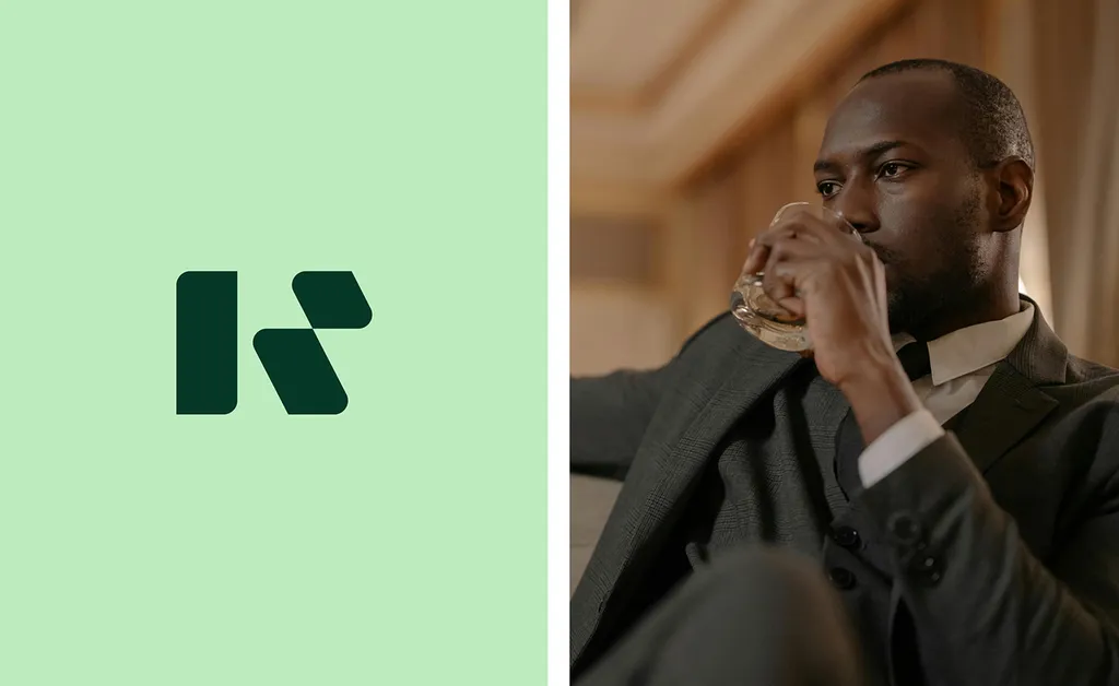
People also call it the icon, brandmark or logomark. The test matters more than the name: shrink it to browser-tab size and check it still reads.
Do you need a wordmark-only version?
Yes, if your logo includes a symbol. The wordmark (your name in its designed lettering, without the symbol) is the version for places where the symbol would be repetitive or where someone else controls the layout.
Use it in:
- Footers and documents where the symbol already appears at the top of the page.
- Partner and sponsor logo walls, where every logo sits in a box of the same height and a symbol plus name ends up tiny.
- Co-branded materials where you sit next to another company’s logo.
If your logo is a wordmark already, you don’t need a separate version. What a logotype is covers when a name-only logo is the right choice in the first place.
Which version goes on a favicon, app icon and social avatar?
The icon or submark, on a square background, every time. These three places are small, square and often cropped to a circle or rounded square, so the full logo turns into a smudge.
| Place | Size to supply | Source |
|---|---|---|
| Favicon (browser tab and search results) | Square, at least 8 × 8 px; larger than 48 × 48 px recommended | Google Search Central |
| iOS, iPadOS and macOS app icon | 1024 × 1024 px master, square; the system rounds the corners | Apple Human Interface Guidelines |
| Google Play icon | 512 × 512 px, 32-bit PNG, full square; Google applies a corner radius of 30% of the icon size | Google Play icon specifications |
| YouTube channel picture | Square upload; it renders at 98 × 98 px | YouTube Help |
Three things to get right:
- Supply square artwork, without your own rounded corners. Apple and Google both round the corners themselves. If you round them too, you get a double curve or a cramped mark.
- Leave room for a circle crop. Most social platforms show profile pictures as circles. Keep the icon inside the middle of the square so nothing important is cut off.
- Use a solid background. Google Play notes that a transparent icon shows the background color of its own interface. Choose the background yourself, usually your brand color.
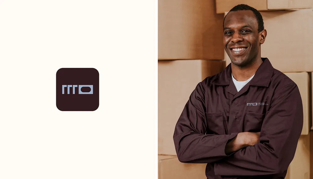
ROMO Logistics, a transport brand I designed, uses the same monogram for the app icon and the work uniform.
Why do you need one-color and reversed versions?
Because a lot of the places your logo appears can’t print, stitch or cut full color, and many backgrounds are dark.
- One-color (usually black). For embroidery, engraving, rubber stamps, laser-cut signs, single-color print on boxes and tape, and fax-quality documents. It should be one flat color with no gradients or tints; if your logo relies on two colors touching to show a shape, that shape needs redrawing.
- Reversed (white). For dark photos, dark slides, dark packaging and video. It isn’t just the color logo inverted; check that small gaps and thin lines still read when the logo is light on dark.
You need these for every version, not just the primary: a white icon for a dark splash screen and a black wordmark for a stamp are common early requests.
What minimum size should each logo version have?
Each version needs its own minimum size, in pixels for screens and millimeters for print, written into your guidelines. Below that size, you switch to the next, simpler version.
Spotify’s published guidelines are a clear example. Its developer design guide says the full logo should never be smaller than 70 pixels in digital or 20 mm in print, and the icon never smaller than 21 pixels or 6 mm. It uses the icon alone only when there isn’t room for the full logo, and sets the clear space around it at half the height of the icon.
Your numbers depend on your lettering and symbol. To find them:
- Shrink the primary lockup on screen until the name starts to fill in or the symbol loses detail. Note the width in pixels, then add a margin.
- Repeat for the stacked version and the wordmark. Thin letters and tight spacing fail first.
- Print each version at a few sizes on an office printer and read it at arm’s length. Note the smallest clear size in millimeters.
- Check the icon at 16 pixels, the size of a browser tab, and in a circle crop.
- Write it down: a minimum width for each version, the clear space around it, and which version to use below each size.
How many logo variations do you need?
Most businesses need five or six versions, each in full color, one color and reversed. The mix depends on where you’re seen most.
| Business type | Versions you need | Why |
|---|---|---|
| Service business or consultant | Primary, stacked, icon, wordmark | Website, proposals, LinkedIn and a business card cover most uses |
| Ecommerce or Etsy shop | Primary, stacked, icon or monogram, a badge for stickers and seals | The shop avatar, packaging stickers and the parcel each need a small version |
| App or SaaS product | Primary, icon, wordmark, plus app icon masters | The icon is on the home screen and in every browser tab |
| Café, restaurant or food truck | Stacked or badge as primary, horizontal for the fascia, icon, one-color | Signs, cups, menus and vehicles are often square or round |
| Arabic and English brand in the Gulf | Every lockup in Arabic alone, English alone, side by side and stacked | Each language appears alone in some places and together in others |
For the bilingual case, the Arabic and English brand guide shows how the lockups are built.
More isn’t better: each extra version is another file someone can pick by mistake. If a version has no clear place to live, leave it out.
How do you check that your designer delivered every variation?
Check the files against a list the day you get them, while changes are still part of the project.
- Primary lockup (usually horizontal)
- Secondary lockup (usually stacked)
- Icon, symbol or monogram
- Wordmark (if the logo has a symbol)
- Each version in full color, black and white
- Each one as SVG, PDF and transparent PNG
- A square icon file for the favicon and app icon, with a solid background
- A minimum size for each version, in pixels and millimeters
- Clear space rules and which version to use where
- Source files (Illustrator or Figma) for future edits
The logo file formats guide explains which format goes where and how to check the files are real vectors. The brand identity deliverables checklist covers everything beyond the logo.
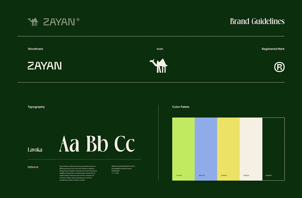
ZAYAN, a solar brand I designed, shows how this looks when it’s written down: the wordmark, the camel icon and the registered mark on one guidelines page, with type and color.
What are the common mistakes with logo variations?
- Making the icon last. If the symbol was designed at billboard size, it often fails at 16 pixels. Test the small version while the logo is still being designed; the logo design process builds this into the refinement stage.
- A secondary logo that’s a different logo. A new font or a new symbol splits the brand. Rearrange, don’t redesign.
- No rules. Without a minimum size and clear space, people squeeze the primary lockup into a square avatar.
- Only a color version. The first embroidered shirt or rubber stamp shows the gap.
How I can help
My logo design package is $999 and takes 1–2 weeks: three concepts, three revision rounds, and the primary logo, wordmark, symbol, and horizontal and stacked lockups, in color and in black and white, as SVG, PDF and PNG files, with a color and type sheet. If you also want the rules written down and the system around the logo, the brand identity package is $3,499 and takes 2–3 weeks, with brand guidelines included. Arabic and English versions cost the same as the package. You can book a free 30-minute call or compare the packages on the pricing page.
FAQ
How many logo variations does a small business need?
Usually five or six: a primary lockup, a stacked secondary version, an icon or monogram, a wordmark, and one-color and reversed versions of each. A business seen mostly on signs, cups or packaging may make the stacked or badge version its primary.
Is a submark the same as a favicon?
Not quite. The submark is the small version of your logo, such as the symbol or a monogram. The favicon is a file made from it: a square image, at least 8 × 8 pixels and ideally larger than 48 × 48, that browsers and Google show next to your site name.
Can I use my secondary logo instead of the primary?
Yes, wherever it fits the space better. That’s what it’s for. The primary is the default when there’s room; the stacked version takes over in square or tall spaces. Just don’t switch between them in the same layout.
What is a responsive logo?
A set of logo variations that swap by size: the full lockup on a wide screen, a shorter or stacked version on a phone, and the icon alone in the smallest spaces. Each version has a minimum size, and below it the next version takes over.
Do logo variations cost extra?
It depends on the designer, so check the quote. In my $999 logo package, the primary logo, wordmark, symbol, and horizontal and stacked lockups are included, in color and in black and white, as SVG, PDF and PNG files.
Should every logo variation use the same colors?
Yes, from the same palette, plus a one-color version and a reversed white version of each. A variation in new colors looks like a different brand. If the icon needs a background for an app or avatar, use a brand color.
Sources
- Google Search Central: Define a favicon to show in search results
- Spotify for Developers: Design guidelines
- Android Developers: Google Play icon design specifications
- Apple Human Interface Guidelines: App icons
- YouTube Help: Manage your channel branding
- Mastercard newsroom: Mastercard Evolves Its Brand Mark by Dropping its Name (January 7, 2019)