What Is a Logotype? With Wordmark and Logomark Examples
What is a logotype? A logo made from the brand’s name in designed lettering. How it differs from a wordmark, lettermark and logomark, with real examples.

Summarize with AI
Key takeaways
- A logotype is a logo made of letters. The name is the design, so people read it and recognize it at once.
- In everyday design use, “logotype” and “wordmark” are the same thing. A lettermark or monogram is the narrower case of initials.
- A logomark is a symbol with no text, and it identifies you only after people have seen it beside your name many times.
- Most new businesses do well with a logotype first, plus a small mark cut from one letter for app icons and favicons.
- A name typed in a free font isn’t a logotype anyone can own. Custom spacing, adjusted letters and one distinctive detail make it one.
- In the US, a stylized logotype is filed as a special form drawing; the name in any font needs a standard character filing.
A logotype is a logo made from the brand’s name, or its initials, set in designed lettering with no separate symbol. Coca-Cola’s script, Google and Disney are logotypes. Most designers use “logotype” and “wordmark” for the same thing; a logomark is the opposite, a symbol that works without any letters.
| Term | What it is | Well-known example |
|---|---|---|
| Logotype | The name drawn as lettering, no symbol | Coca-Cola, Google, Disney |
| Wordmark | Usually the same as a logotype (the full name in type) | FedEx, Google |
| Lettermark or monogram | Initials only, or one letter, built into a mark | “CA,” used by a French bank, a Dutch retailer and a US software firm |
| Logomark | A symbol with no letters | Apple’s apple, Nike’s swoosh |
| Combination mark | A logomark and a logotype locked up together | Amazon’s wordmark with its arrow |
| Logo | The umbrella term for all of the above | Any of the examples above |
The brand examples in this table are the ones named by the sources cited in the sections below.
I’m Masuder Rahaman, a brand designer and the founder of Wolfpixel, where I lead a design team for founders in the US and the Middle East. I design logos and brand identities, and “logotype or logomark?” comes up early on almost every logo project, often with the words used loosely. This article sets out what a logotype is, where the word comes from, how it compares with each related term, examples from my own work, and how a logotype is filed as a trademark in the US.
What is a logotype? Meaning and definition
A logotype is a logo built only from letters, numbers or both: the company’s name, or its initials, drawn so that the lettering itself becomes the identifying mark. There is no separate picture or symbol. Vistaprint’s guide draws the line simply: a logotype is text-first, and a logomark is image-first.
The word is older than modern branding. In metal typesetting, a logotype was a single piece of type carrying a whole word or several letters, cast together so a printer could set a common word in one move. Dictionary.com dates the word to 1810–20 and still gives that printing sense first, followed by “a trademark, company emblem, or similar device.” Wikipedia’s entry on logos explains that “logo” itself is short for logotype. In type founding, the word meant one word cast as one piece, unlike a ligature, which joins letters that don’t form a word.
The printing sense is still a good way to remember the meaning: a logotype is a word treated as one unit, not a string of separate letters.
What a logotype is not:
- Not a typed name. Setting your name in a font from a menu gives you text, not a logotype. A logotype has spacing, letter shapes or details adjusted for this one name.
- Not a symbol. If the logo includes an icon, a shape or a picture that could stand alone, it is a combination mark (more on that below).
- Not always the whole identity. A logotype is one part of a logo family, which usually also includes a small mark, horizontal and stacked versions, and one-color and reversed files.
Logotype vs wordmark vs lettermark: are they the same?
Mostly, yes. The terms overlap, and design guides don’t fully agree on where one ends and the next begins. Vistaprint treats logotype, wordmark and lettermark as one family. BrandLoom defines a logotype as a text-based logo that spells out the brand name or an acronym. Other guides treat lettermarks and monograms as a separate type.
Here is how I use the words, and how most designers you brief will understand them:
| Term | Made from | Typical use |
|---|---|---|
| Logotype | The name as designed lettering (full name) | The primary logo for most new brands |
| Wordmark | The name as designed lettering (full name) | Interchangeable with logotype |
| Lettermark | Initials as designed lettering (2–4 letters) | Long names, or names people already shorten |
| Monogram | One or more letters built into a compact, often geometric mark (1–3 letters) | App icons, stamps, patterns, small spaces |
If one proposal says “logotype” and another says “wordmark,” you are comparing the same deliverable. If one says “lettermark,” ask whether you’re getting your full name, your initials or both. The answer changes how the logo works in a website header and as a 24-pixel app icon.
Logotype vs logomark: which should carry your brand?
Once the vocabulary is settled, the real decision is whether letters or a symbol will carry your brand.
A logomark is a symbol with no text. It can be literal (Apple’s apple) or abstract (Nike’s swoosh), as Logo Design Valley and others list them. A logomark can be very compact and memorable, but it has a cost: a symbol means nothing until people have seen it next to your name many times.
| Compare | Logotype | Logomark |
|---|---|---|
| What it is | Your name as designed lettering | A symbol with no letters |
| Recognition on day one | Immediate: people read the name | Low: the symbol has to be learned |
| Small sizes (favicon, app icon) | Long names shrink to a smudge; needs a short version | Works well if the shape is simple |
| Wide spaces (website header, signage) | Natural fit | Usually needs the name beside it anyway |
| Names that are hard to say or spell | Helps: people see the spelling | Doesn’t help |
| Across languages and scripts | Needs a version per script | One symbol can travel |
| Trademark filing (US) | Special form drawing for the lettering; the name can be filed on its own | Special form drawing |
| Suits | New brands, short distinctive names, formal sectors | Known brands, apps, products with a story worth a shape |
The combination mark sits between the two. It locks a symbol and a logotype together, as with Amazon’s stylized wordmark and its smile-shaped arrow, an example Eckert Mathison uses. Many growing brands end up here: the logotype identifies the business while people learn the name, and the symbol takes over in small spaces once they have.
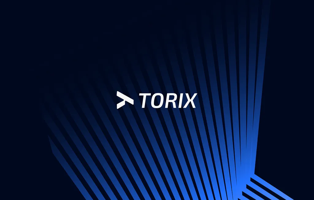
For the airline brand TORIX, the angular arrow mark sits beside a slanted TORIX wordmark, set out on a measured grid. The wordmark tells you the name; the arrow alone carries the brand on an app icon, where the full name would be too small to read.
Logotype examples: famous brands and real projects
Well-known logotypes
- Coca-Cola. The name is written in Spencerian script. Wikipedia’s logo article notes that people can identify the Coca-Cola name even when it is written in other alphabets.
- Google and Disney. Both are named as logotypes by BrandLoom and Eckert Mathison. The name is the entire logo.
- FedEx. Listed by Logo Design Valley as a logotype: two short syllables in bold type, with no symbol.
- Chanel. Eckert Mathison cites Chanel, along with Dolce & Gabbana and Rolls-Royce, as luxury brands that moved their logotypes toward simpler type.
These brands share a short, distinctive name, lettering nobody else uses and decades of exposure. The lettering is ownable even though the logo is “only” a name.
Logotypes and lettermarks from my work
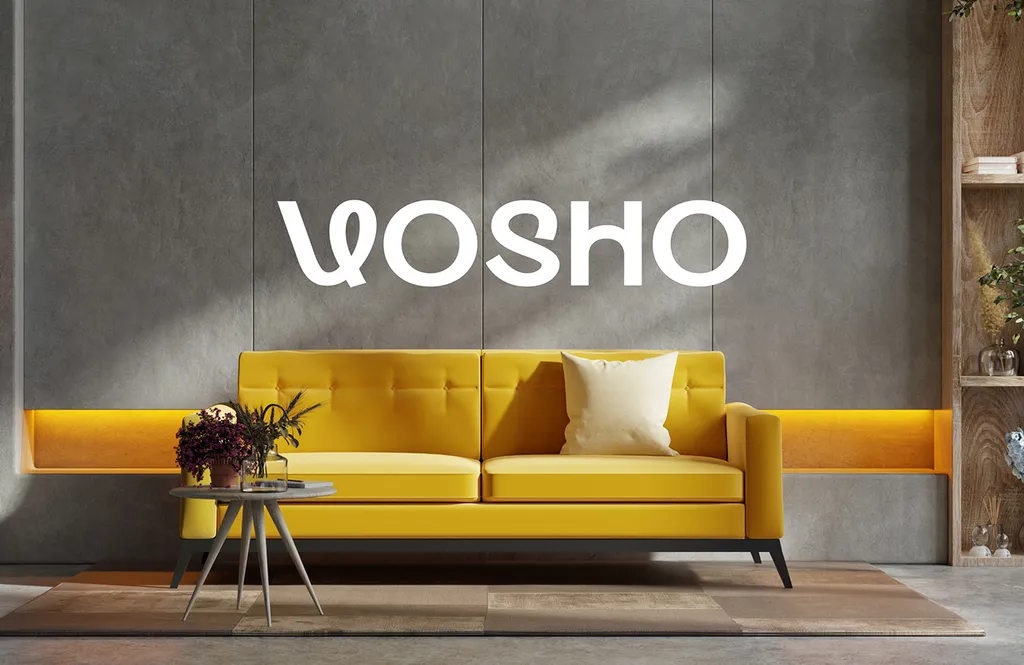
- Vosho (furniture). The whole identity is a logotype with a looped V, paired with CS Belia, a curly display face, and Sen for reading text. It appears on stationery, a tote bag, posters, the online store and a concrete wall above a sofa (the photo at the top of this article). There’s no separate symbol, because the looped V already does that job.
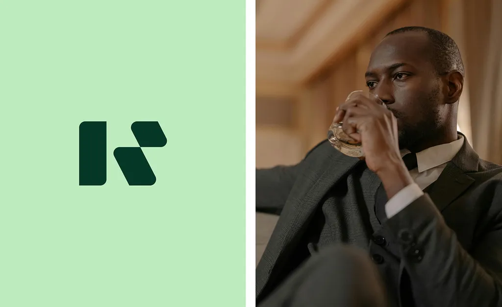
- Reva7 (resort). A logotype for the full name and a bold R monogram built from simple shapes, used alone or with the wordmark. The Reva7 case study shows why both exist: the full name works on the box and the website, and the R fits on a key card, a soap bar and a pair of slippers.
- TORIX (airline). The combination-mark example above: a slanted logotype with an arrow symbol for small spaces.
When should you use a logotype?
Choose a logotype as your primary logo when:
- Nobody knows your name yet. A logotype teaches the name every time someone sees it, which a symbol can’t do.
- Your name is short and distinctive. It has one to three syllables and a spelling that is worth seeing.
- Your sector rewards seriousness. Vistaprint points to formal industries like finance and law, where a clear name reads as credible.
- Most of your touchpoints are wide. Website headers, decks, documents, invoices and shopfronts all suit a name.
- Your budget for exposure is small. A symbol needs years of repetition that you may not be able to pay for.
Think again, or plan a combination mark, when:
- The name is long or descriptive. “Northside Family Dental Associates” won’t read as a 32-pixel-tall header. Consider a lettermark, or a short logotype plus a monogram.
- The logo has to live in a square. App icons, social avatars and embroidery on a cap all need one. Plan the square version at the start, not after launch.
- You’ll sell in two scripts. For an Arabic and English brand, the logotype has to be designed twice, as one family. Typing the second script in a default font makes it look like a second brand.
- The name is generic. If ten companies in your category have similar names, the lettering alone may not be distinctive enough, and a symbol helps.
If you’re a startup, my guide to startup logo design covers the three routes that suit early-stage companies and when each one fits.
What makes a good logotype?
A logotype has fewer parts than a symbol, so every part shows. These are the checks I use:
- Drawn, not typed. Start from a typeface or from scratch, then redraw: adjust the spacing between each pair of letters, tune the weight and fix awkward joins. Vosho’s looped V is the kind of single change that turns a typed name into a logotype.
- One ownable detail. Choose one looped letter, cut, ligature or angle, not five. Mojomox recommends making one letter distinctive, ideally the first, so it can double as an app icon.
- Legible at small sizes. Logo Design Valley suggests testing at around 24 pixels and 12 pixels. If the name blurs, open up the spacing or plan a shorter version.
- Works in one color. Check it black on white and white on black, with no gradient or shadow. A logo that only works in color fails on a stamp, an invoice or a stitched label.
- Fits the name’s length. Long names need a stacked version and a short cut. Short names can run larger and looser.
- Font license checked. If the logotype starts from a commercial typeface, check that the license allows use in a logo before you approve it. On my projects, the client buys any font licenses.
The full sequence from brief to final files is in my logo design process guide.
Can you trademark a logotype?
Yes, and this is where the logotype vs logomark difference has a legal side. In the US, the USPTO asks you to choose one of two drawing types for each application:
| Drawing type | What it protects | When it’s used |
|---|---|---|
| Standard character | The words themselves, in any font, style, size or color | Registering the name |
| Special form | Only the particular design you submit | Stylized lettering, designs, logos or color |
The USPTO says a standard character drawing gives “the broadest form of protection,” and that you can’t choose both in one application. A stylized logotype is filed as a special form drawing, so it protects that particular lettering. Protecting the name in any font takes a separate standard character filing, which is one reason businesses often file the name and the logo separately. Ask your trademark lawyer which filings you need. Trademark filing isn’t part of my packages, but I hand over clean files for the application.
Clear the name before you fall in love with any logotype. A conflict with an existing trademark is the one logo problem design can’t fix.
How I design a logotype
My logo design package is $999 and takes 1–2 weeks. It includes 3 logo concepts and 3 revision rounds, and you own the final files. For a logotype, the concepts explore different lettering directions, and each one is shown in real use, not on a blank page. Whoever designs yours, ask for the logotype as a family: a short mark for small spaces, horizontal and stacked versions, and one-color and reversed files.
If you sell in the UAE or Saudi Arabia, the Arabic and English versions of the name and logo are designed together at the same package price.
Get a logotype designed for your brand
Book a free 30-minute call in your time zone. Bring your name, your competitors’ logos and a list of where the logo will appear in its first year, and I’ll tell you whether a logotype, a lettermark or a combination mark suits it. The package details are on the logo design page.
FAQ
What is a logotype in simple words?
A logo made of the company’s name, or its initials, in designed lettering, with no separate symbol. The lettering itself is the logo. Coca-Cola, Google and Disney are well-known examples.
Is a logotype the same as a wordmark?
In everyday design use, yes. Both mean a logo made of the brand name in designed type. Some designers use “lettermark” or “monogram” for the narrower case of initials only.
What is the difference between a logotype and a logomark?
A logotype is made of letters and is read as your name. A logomark is a symbol with no letters, such as Apple’s apple or Nike’s swoosh, and has to be learned before it identifies you. A combination mark uses both.
Is a logotype better than a logomark?
Neither is better in general. A logotype suits new brands with short, distinctive names because it teaches the name, while a logomark suits known brands or products that need a compact symbol. Many brands start with a logotype and add a symbol later.
Can I trademark a logotype?
In the US, a stylized logotype is filed with the USPTO as a special form drawing, which protects that particular design. The name on its own is filed as a standard character mark. A trademark lawyer can tell you which filings you need.
How much does a logotype cost?
My logo design package, which can be a logotype, is $999 for 3 concepts and 3 revision rounds, delivered in 1–2 weeks. Prices elsewhere vary widely with scope and who designs it.
Sources
- USPTO: Mark drawings for trademarks
- Wikipedia: Logo
- Dictionary.com: Logotype
- Vistaprint: Logotype vs. logomark vs. logo
- BrandLoom: Logotype vs. Logomark vs. Logo (February 2023)
- Logo Design Valley: Logotype vs. Logomark vs. Logo
- Eckert Mathison: What is a logotype and how to use it?
- Mojomox: Logotype design