Why Circle Logos Are Popular, and When Round Marks Don’t Work
Circle logo examples, styles, colors and the industries they suit, what the research on round logos shows, when a round mark is the wrong choice, and how to design one that holds up as an avatar or app icon in 2027.

Summarize with AI
Key takeaways
- A circle logo is built on, inside or out of a circle: a mark in a ring, a solid disc, a badge or seal, or a symbol drawn from circles, in styles from minimal ring and vintage seal to monogram and geometric.
- Research links round logos with softness and angular logos with hardness: in one study, the same running shoe was rated more comfortable with a circular logo and more durable with an angular one.
- Circles suit healthcare, travel, fintech and brands that live as avatars and app icons; they suit long names, wide spaces, round-badge categories and brands that need to feel tough less well.
- Draw it on a grid of circles, correct the optics with overshoot, keep ring text short and upright, own one color with strong contrast, and make a simpler version and a horizontal lockup.
- For 2027, plan for phones that tint and recolor app icons and for logos that move: the mark must read in one flat color and as a simple symbol.
A circle logo is a logo built on, inside or out of a circle: a mark in a ring, a solid disc, a round badge or a symbol made from circles. Circle logos work because the shape is compact, fits the round crops used for profile pictures, and tends to make a brand feel softer and more approachable. They’re the wrong choice when your name is long, your category is already full of circles, or you want the brand to feel tough and hard-wearing rather than friendly.
| A circle logo suits you when… | Think twice when… | |
|---|---|---|
| Feeling | The brand should feel warm, caring, friendly or complete | The brand should feel tough, fast, precise or durable |
| Where it lives | Mostly as an avatar, app icon, sticker, stamp or seal | Mostly in wide spaces: headers, signs, vehicle sides |
| Name | Your name is short, or you have a compact symbol | Your name is long and must always be read |
| Idea | The circle carries an idea: a sun, a lens, a target, a coin, a cup from above | The circle is just a frame around initials |
| Category | Competitors mostly use squares, shields or wordmarks | Competitors already use round badges |
I’m Masuder Rahaman, a brand designer and the CEO and founder of Wolfpixel, where I lead a design team for founders in the US and the Middle East. This guide covers both sides of the round mark: what the research actually shows, 15 well-known examples, the styles, colors and industries that suit a circle, how to build one that holds up, and the cases where a different shape will serve you better. It also covers what’s changing for round marks going into 2027, when phones recolor, tint and animate the icons people see most.
What is a circle logo?
A circle logo is any logo where the circle is the main structure, not a decoration. Most fall into four types, and the type you choose matters more than the fact that it’s round.
| Type | What it is | Best for |
|---|---|---|
| Enclosure | A mark or initials inside a thin ring | Simple marks that need a fixed, tidy footprint |
| Solid disc | A filled circle with the mark knocked out in white or a second color | Small sizes, app icons, packaging, strong color brands |
| Badge or seal | Text set around the ring, with a mark in the middle | Secondary marks: stamps, stickers, labels, merch |
| Circle-built symbol | A symbol drawn from circles and arcs, with no outer ring | Distinctive primary marks that still feel soft |
What’s the difference between a circle logo, a badge, an emblem and a seal?
The terms overlap, but designers usually use them like this:
- Circle logo: the broad category. The circle is the main shape.
- Badge: a compact mark that combines a symbol and text in a closed shape. Many badges are circles, but they can be shields or hexagons too.
- Emblem: a badge where the name sits inside the shape and can’t be separated from it, like a crest. Emblems are hard to use small.
- Seal: a round badge with text running around the edge, borrowed from official stamps and wax seals. It suggests tradition, approval or quality.
For the wider vocabulary (wordmark, logomark, combination mark), see what is a logotype.
What styles of circle logo are there?
The four types above describe structure. Style is the look you dress that structure in, and it’s what most people mean when they search for circle logo ideas. These six cover most round marks you’ll see:
| Style | What it looks like | How it tends to feel | Suits | Watch out for |
|---|---|---|---|---|
| Minimal ring | A thin ring with one small mark or dot | Calm, modern, premium | Studios, wellness, tech, fashion | Thin rings vanish at small sizes; thicken them for the icon version |
| Vintage seal | Double ring, text around the edge, a star or date | Crafted, established, trustworthy | Food and drink, barbers, outdoor, makers | The most common circle style there is; make the center mark yours |
| Monogram | One or two initials drawn to fit the ring | Personal, elegant, heritage | Founders, fashion, hospitality, firms | Typed initials in a ring look like a template (see the monogram section below) |
| Line art | A small illustration in a single line weight | Friendly, handmade, local | Cafés, travel, pets, kids’ brands | Detail fills in when small; simplify for the favicon |
| Geometric | A circle cut into segments, arcs or dots | Structured, smart, systematic | Data, software, energy, finance | Hard to tell apart from other segmented circles; give it one twist |
| Solid disc with depth | A filled disc, sometimes with a gradient, highlight or soft shadow | Bold, digital, app-like | Apps, consumer tech, drinks | Gradients and shadows need a flat one-color version as well |
You can mix a style with any of the four types. A minimal ring can be an enclosure; a vintage seal is always a badge; a geometric style often becomes a circle-built symbol with no outer ring at all.
Why do circle logos work?
Circle logos work for one psychological reason and several practical ones. The psychological reason is better supported than most blog posts suggest, and also narrower.
What does research say about round logos?
The best-known study is by Yuwei Jiang, Gerald Gorn, Maria Galli and Amitava Chattopadhyay, published in the Journal of Consumer Research in 2016. Across five experiments, they found that a logo’s roundness or angularity alone activates softness or hardness associations, and those carry over into how people judge the company and its products.
In the experiment described in the Association for Psychological Science’s summary, 109 college students saw an ad for a running shoe with a circular logo, an angular logo or no logo. Those who saw the circular logo rated the shoe as more comfortable; those who saw the angular logo rated the same shoe as more durable. Round shapes call up softness, which carries into judgments like comfort; angular shapes call up hardness, which carries into durability.
Three limits are worth knowing before you use this as a design rule:
- The effect is about associations, not quality. A round logo doesn’t make a brand better. It nudges people toward soft attributes (comfortable, approachable) and away from hard ones (strong, durable).
- The effect can disappear. The authors found no shape effect when people’s visual memory was busy with unrelated images, for people less inclined to picture things, or when the ad’s headline stressed a different attribute from the one the shape suggests. Your words and context can override your shape.
- It’s one research team and lab conditions. It’s good evidence, not a law of nature. Treat it as a reason to match the shape to the feeling you want, not as proof that circles sell.
So the useful takeaway is simple: choose round when you want soft attributes, angular when you want hard ones. A children’s clinic and a towing company probably shouldn’t end up with the same shape.
What are the practical advantages of a circle logo?
- It fits the round crop. Many social platforms show profile pictures in a circle. A round logo fills that space; a wide wordmark gets squeezed or cut off.
- It’s compact. A circle has the same width and height, so it works as an app icon, a favicon, a stamp, a sticker, a button or a pin without redesign.
- It contains a busy mark. A ring or a disc gives an irregular symbol (a leaf, an animal, a hand-drawn shape) a clean, predictable outline.
- It gives you a second mark. Many brands use a wordmark as the primary logo and a round badge as a secondary mark for packaging, merch and social.
- It reads as complete. A closed circle has no start or end, which is why it has long been used for seals, coins and stamps. That makes round badges a natural fit for “approved,” “official” or “crafted” messages.
When is a circle logo the wrong choice?
A circle is the wrong choice when it fights your name, your category or the feeling you need. These are the cases where another shape usually serves better:
- Your name is long. A long name in a circle gets tiny, or wraps around the ring where it’s harder to read. If people must read the name every time, use a wordmark and keep a round symbol for small spaces.
- Your logo will mostly live in wide spaces. Website headers, shop fascias, vehicle sides and email signatures are horizontal. A circle leaves empty space on both sides, so it looks smaller than a wide logo at the same height.
- Your category is full of circles. Coffee shops, breweries, bakeries, barbers and landscapers often use round badges. A round badge in a round-badge category is hard to remember, so audit competitors first.
- You need to feel tough or precise. Construction, security, performance sports and engineering brands often want hardness, and the research links angular shapes with durability.
- The circle is only a frame. Initials in a ring is one of the most common logo formats. If the circle doesn’t carry an idea, it adds nothing and makes the mark harder to tell apart.
- The seal is your only logo. Text around a ring becomes unreadable at small sizes. A seal makes a good secondary mark and a weak primary one.
Which industries suit a circle logo?
Industry alone doesn’t decide the shape, but some categories reward a circle and others push against it. This is how I’d read the most common ones:
| Industry | Fit | Why a circle helps | What to watch |
|---|---|---|---|
| Healthcare, dental, pediatrics, vets | Strong | Round shapes read as caring and safe, which matches the research | Avoid the generic cross or tooth inside a ring |
| Travel and hospitality | Strong | Suns, globes, plates and stamps all come naturally round | Sun-in-a-circle is popular; give it one detail of your own |
| Fintech, payments, rewards | Strong | Coins and tokens are round, and the mark becomes the app icon | A plain coin outline looks like every other wallet app |
| Cafés, bakeries, breweries | Good as a secondary seal | Seals suit cups, labels, stamps and merch | The category is full of round badges; lead with a wordmark or an unusual mark |
| Pet and food brands | Good as a secondary seal | Round stickers and lids carry a seal well | Keep the ring text short enough to read on a small pack |
| Lawn care, landscaping, outdoor | Good | Badges suit vans, uniforms and yard signs | Pair the badge with a horizontal lockup for the van side |
| Sustainability and recycling | Good | Loops and cycles say renewal | Arrows chasing each other in a circle are a cliché |
| Software, SaaS and AI | Mixed | The mark becomes the app icon and avatar | Rings, dots and swirls are everywhere in AI; it needs one clear idea |
| Construction, security, industrial | Usually weak | Rarely an advantage | These brands usually want hard, angular attributes; if you go round, give the inner mark sharp edges |
The pattern: a circle helps most where the brand should feel caring, complete or valuable, and where the logo spends its life small and square. It helps least where competitors already own the shape or the brand needs to feel tough.
What do famous circle logos teach?
These circle logo examples are well known, but the useful part is what each one shows. I’ve grouped them by what the circle does.
The circle is the idea
| Brand | What the circle does | The lesson |
|---|---|---|
| Target | The bullseye, which Target registers as “the Bullseye Design,” is the name drawn as a picture | The best case: the circle is the idea, not a frame |
| NASA | The “meatball” insignia, designed by James Modarelli in 1959: a sphere for a planet, stars for space, a red vector for aeronautics and an orbit for space travel | A circle can hold a whole mission statement, but it pays for that detail at small sizes |
| Olympic Games | Five interlaced rings, designed by Pierre de Coubertin in 1913 | Repeated circles can say “connection” without a single word |
| Spotify | A green disc with three curved lines like sound waves | One simple idea inside a disc is enough for an app icon |
The circle carries color
| Brand | What the circle does | The lesson |
|---|---|---|
| Mastercard | Two overlapping circles, one red, one yellow | Simple circles can become a symbol that stands alone: since January 2019 Mastercard has used it without its name in select contexts |
| BMW | A blue-and-white roundel in the colors of Bavaria | Color inside a circle can carry meaning without extra parts |
| Pepsi | A globe of red, white and blue, split by a wave | The circle survived every redesign; in March 2023 Pepsi put its name back inside the globe and added black |
| Nivea | A blue disc with a white wordmark | The logo echoes the round blue tin, so product and mark share one shape |
Letters drawn to fit the ring
| Brand | What the circle does | The lesson |
|---|---|---|
| Volkswagen | A V stacked over a W, both touching the ring | Initials work in a circle when they’re drawn for it, not typed into it |
| General Electric | Script initials with flourishes inside a ring | A monogram can carry a century of heritage if the drawing is distinctive |
| HP | Lowercase “hp” set in a disc | A short name can live inside the circle and still be read |
| A P drawn like a pin, in a red disc | The letter itself can carry the idea |
The ring as a frame that earns its place
| Brand | What the circle does | The lesson |
|---|---|---|
| Starbucks | A round green logo built around the siren | Words around a ring often go once the symbol is known: in January 2011 Starbucks dropped its name and the word “coffee” from the logo |
| London Underground | A red ring crossed by a blue bar | A ring plus one bar became a sign people find from across a street; simple wins at distance |
| Xbox | A sphere with an X cut through it | Depth and cut-outs can make a disc feel physical, but it still needs a flat version |
Three patterns stand out. The strongest circle logos make the circle mean something; several of them lose words over time as the shape becomes recognizable on its own; and nearly all of them work in one color.
How do you design a circle logo that works?
These steps follow a practical order. They assume you’ve already decided what the brand should stand for; if not, start with the logo design process, which covers the brief and strategy.
1. Start from an idea, not from the circle
Ask what the circle could be in your brand’s story: a sun, a planet, a lens, a coin, a seal, a wheel, a plate, a cup seen from above, a target, a loop, a full cycle. If you can’t name one, the circle is probably just a frame, and you should consider another shape.
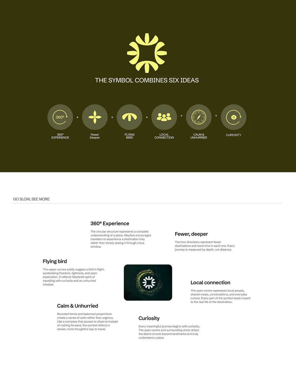
For Wayfare, a slow-travel agency, the circle carried the idea. The sun symbol is built from circles, open spaces and balanced forms so it feels calm, warm and unhurried, and its circular structure stands for a complete understanding of a place, one of six ideas the symbol combines.
2. Choose the type: enclosure, disc, badge or built symbol
Pick from the four types above based on where the logo will live. If it lives mostly on screens and at small sizes, a solid disc or a circle-built symbol is safest. If it lives on packaging, labels and merch, a badge works well as a secondary mark.
3. Build it on a grid of circles
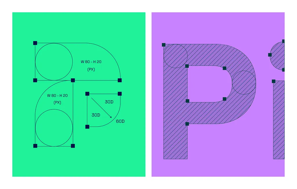
Draw the mark from real circles and arcs, then adjust by eye. Building from a grid keeps curves consistent, makes the logo easy to redraw at any size, and gives the identity shapes you can reuse in icons and patterns.
Pinvet, a fintech brand, uses a P built from three rounded shapes drawn on a grid of circles and set angles. The same rounded shapes then carry across the payment card, the app screens and the notifications.
4. Correct the optics: overshoot and optical center
A circle and a square of the same height don’t look the same size: the circle looks smaller, because only its very top and bottom touch the guides. Type designers fix this with overshoot, letting round letters like O rise slightly above and below the flat ones, by roughly 1% to 3% of the letter height. Do the same when a circle sits next to square elements, text or other icons: make it slightly larger than the measured size.
The same applies inside the circle. A mark placed at the exact geometric center often looks low, so designers nudge it slightly upward to the optical center. Judge by eye at the real size, not by the alignment tool.
5. Get the text on the curve right
If your circle logo has text around the ring, these rules keep it readable:
- Top text runs clockwise along the outside of the curve, so it reads left to right.
- Bottom text shouldn’t run upside down. Set it on its own arc so the letters stand upright and still read left to right.
- Open the letter spacing. Letters on a curve crowd at their base and spread at their tops; extra tracking evens it out.
- Use a sturdy typeface. Thin, condensed or script fonts break down on curves. Medium-weight sans-serifs and slab serifs usually hold up best; how to choose brand fonts covers legibility in more detail.
- Keep it short. A tagline, a place or a founding year, not a sentence.
- Separate the top and bottom with small dots, stars or a symbol, so the ring has a clear start and end.
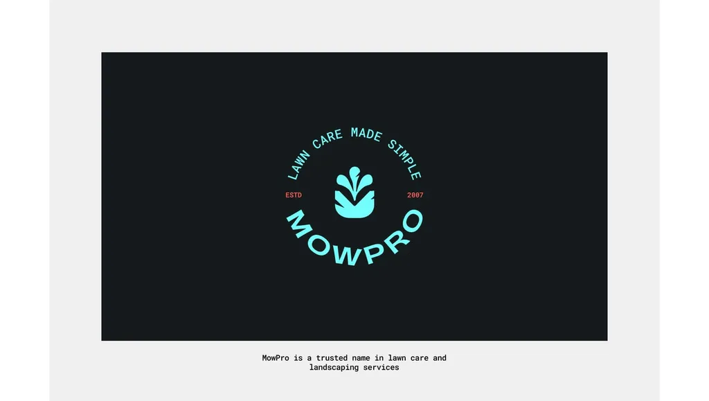
MowPro, a lawn care company, shows this well. The badge sets “Lawn care made simple” clockwise across the top and the MOWPRO name on its own arc at the bottom, upright and readable, with the leaf mark in the middle.
6. Make a version without the ring text
A seal or badge needs a simpler partner for small sizes: the mark alone, or the mark in a plain disc. Decide the minimum size for each version and write it in your guidelines.
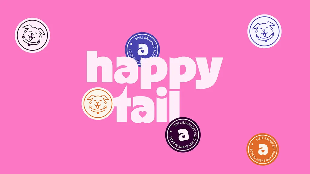
Happy Tail, a dog food brand, uses a heavy lowercase wordmark as the main logo and a round “a” seal, with a line about well-balanced food around the ring, as a secondary mark for stickers and packaging. The seal adds character without having to carry the name on its own.
7. Test it at real sizes and in real crops
Before you approve a circle logo, run these checks. Most problems with round marks only show up small, cropped or recolored.
| Test | How to run it | It passes when… |
|---|---|---|
| Avatar crop | Put it in a round profile picture on two or three platforms | Nothing important touches the edge or gets cut off |
| App icon mask | Place it in a square icon; for Android, keep key art inside the 66 dp safe zone of the 108 dp icon | It survives circle, squircle and rounded-square masks |
| Dark and tinted icons | Switch an iPhone to dark, clear and tinted icons, and turn on themed icons on Android | The mark still reads as one flat tint, with no color doing the work |
| Favicon | View it at 16 and 32 pixels in a browser tab | The shape is still recognizable, even if text isn’t |
| One color | Print it in black only, then white on black | It still reads without color or gradients |
| Ring text | Look at the badge at its smallest planned size | Every word is readable, or you switch to the simpler version |
| Wide space | Put it in a website header next to a wide competitor logo | It doesn’t look tiny; if it does, add a horizontal lockup |
| Category | Line it up with five competitors’ logos | You can still pick yours out in a second |
The Android figures come from the adaptive icons guide: layers are 108 × 108 dp, the inner 66 × 66 dp is never clipped by the mask, and the logo itself should be between 48 and 66 dp.
How do you make a circle monogram that doesn’t look generic?
Initials in a circle are the most requested round logo and the easiest one to get wrong. Thousands of businesses have two letters typed in a font and centered in a ring. These five moves are what separate a monogram from a template:
- Draw the letters for the ring. Shorten, widen or curve the strokes so the letters fill the circle’s shape instead of sitting in a rectangle inside it.
- Let the letters touch or break the ring. When a crossbar, serif or leg runs into the ring, letters and circle lock into one mark. Volkswagen’s V and W both meet the ring; that’s why it reads as one shape.
- Match the stroke weights. A ring much thinner than the letters looks like an afterthought; a ring much heavier swallows them. Start with the same weight and adjust by eye.
- Use shared strokes and negative space. Two letters can share a stem, or one can be cut from the other. This is where monograms become ownable.
- Check it at 16 pixels. Interlocking letters often merge into a blob when small. If it does, open the gaps or simplify one letter.
If your initials don’t suggest anything interesting together, that’s a sign to try a single letter, a symbol or a wordmark instead. A plain monogram is also the hardest kind of circle logo to protect, which matters later.
What colors work for a circle logo?
A circle has no corners to help it stand out, so color and contrast do more of the work than they do in other shapes. Four rules cover most decisions:
- Contrast comes first. In a solid disc, the knocked-out mark must stand out clearly from the disc color. A pale yellow disc with a white mark disappears; the same mark on deep green or black holds.
- Own one color in your category. One saturated color you can own, on a calm base of black, white or a dark neutral, does more for recognition than a five-color palette. This is one of the trends I’d keep from logo design trends 2027.
- Pick against competitors, not color charts. Color meanings are loose and vary by culture and category. What matters more is that you don’t look like the three nearest competitors.
- Always make a flat version. Gradients, highlights and shadows can be fine for the main app icon, but the logo also needs one color for stamps, embroidery and themed icons.
If you want a starting point, these are the associations people most often reach for. Use them as a shortlist, not a rule:
| Color | Common associations | Often seen in |
|---|---|---|
| Blue | Trust, calm, competence | Finance, tech, healthcare, B2B |
| Green | Growth, health, nature, money | Wellness, outdoor, fintech, sustainability |
| Red | Energy, appetite, urgency | Food, drink, retail, media |
| Yellow and orange | Warmth, optimism, attention | Travel, kids’ brands, consumer apps |
| Black and white | Premium, timeless, serious | Fashion, studios, luxury |
| Gold and metallics | Heritage, value, award | Hospitality, spirits, seals (needs a flat yellow or brown version for screens) |
How do you make a circle logo in Illustrator, Inkscape or Canva?
Once the idea is sketched, building the circle itself is quick. These are the basic steps in three common tools.
Adobe Illustrator
- Select the Ellipse tool (L) and hold Shift while you drag to draw a perfect circle.
- For text around the ring, pick the Type on a Path tool and click the circle’s edge. Drag the bracket to set where the text starts.
- For upright bottom text, draw a second circle the same size, add text with Type on a Path, then open Type > Type on a Path > Type on a Path Options, tick Flip, and adjust the baseline shift so the letters sit on the ring.
- When the design is final, convert text to shapes with Type > Create Outlines and strokes with Object > Path > Outline Stroke, then join shapes with the Pathfinder panel.
- Export SVG for screens and save a PDF for print.
Inkscape (free)
- Use the Circles and Ellipses tool and hold Ctrl to keep it round.
- Type your text, select both the text and the circle, and use Text > Put on Path.
- For bottom text, duplicate the circle, reverse its direction with Path > Reverse, and put the second line on it so it reads upright.
- Convert with Path > Object to Path and Path > Stroke to Path, then save as Plain SVG.
Canva
- Add a circle from Elements and set its fill or border.
- Add a text box and apply Effects > Curve, adjusting the curve until the text follows the ring.
- Use it to test ideas and layouts, not for the final mark. Canva’s license doesn’t let you trademark a design built from its stock elements, and its templates are used by many other businesses.
Whatever the tool, the work that makes the logo good is the steps above: the idea, the construction grid, the overshoot and the tests at real sizes.
What’s changing for circle logos in 2027?
The round mark isn’t going out of style; the places it lives are changing. Four shifts matter for 2027:
- Phones now recolor your icon. Apple’s iOS 26 lets people show app icons as dark, clear (glass-like) or tinted, and Apple’s Icon Composer builds one layered icon for all of them. On Android, themed icons tint every app in the user’s wallpaper colors, and from Android 16 QPR 2 the system themes apps automatically even if they don’t supply a monochrome icon. Assume your circle will be seen in one tint you didn’t choose. A disc with a clear knocked-out mark survives this well; a mark that relies on color to separate its parts doesn’t.
- Logos are designed as families. One full badge for packaging, the mark in a disc for the app, and a simplified symbol for the favicon. A circle makes this easy, because each step down simply drops a ring or a line of text.
- More logos move. A ring can draw itself, rotate, open like a lens or close like a seal. For Secuara, a cybersecurity brand, the S is built from two leaf-like quarter circles that lock together like a shield when the mark moves. If your circle animates, plan the still frame first, because that’s what most people will see.
- Human craft matters more. With so many generated logos about, a mark built on a real grid of circles, with construction drawings and dated working files, is easier to show as your own work. Logo design trends 2027 covers these shifts in more depth.
What circle logo ideas can you start from?
Start from the meaning, then find the form, then pick a style from the table above. These are starting points, not templates.
| Idea | What it can say | Often fits | Styles that suit it |
|---|---|---|---|
| Sun or planet | Energy, warmth, a whole world | Travel, solar, wellness, education | Line art, solid disc |
| Lens or eye | Clarity, focus, insight | Analytics, optics, media, research | Minimal ring, geometric |
| Target or bullseye | Precision, aim, results | Marketing, sports, consulting | Geometric, solid disc |
| Coin or token | Value, trust, exchange | Finance, fintech, rewards | Solid disc, vintage seal |
| Seal or stamp | Approval, craft, tradition | Food, drink, crafts, certifications | Vintage seal |
| Cup, bowl or plate from above | Food and drink, sharing | Cafés, restaurants, kitchenware | Line art, minimal ring |
| Loop or cycle | Renewal, continuity | Sustainability, subscriptions, logistics | Geometric, minimal ring |
| Two overlapping circles | Partnership, connection, exchange | Marketplaces, payments, matchmaking | Geometric, solid disc |
| A circle cut into segments | Parts of a whole, structure | Data, software, energy | Geometric |
| The O or another round letter in your name | Ownership of a shape you already have | Any brand with a round letter to work with | Monogram, solid disc |
24 original circle logo examples, by industry
These logos were drawn for this guide for fictional brands, to show the types, styles and ideas above as finished marks. Each one starts from an idea, not from the circle. Use them for inspiration, not as your own logo; any match with a real business name is unintended.
Food and hospitality
| Logo | The idea | Type and style |
|---|---|---|
| 01 Crema Loop, coffee roasters | A cup seen from above, with a highlight of crema; the side tab is the handle | Solid disc, minimal |
| 02 Oat & Ember, bakery | A wheat ear in a seal, “Fresh daily” on top and “Est 2027” upright at the bottom | Badge or seal, vintage |
| 03 Fizzwell, brewing co. | Bubbles rising inside a dark disc with a thin yellow inner ring | Solid disc, geometric |
| 04 Platewise, kitchen | A plate from above with a fork set into it | Enclosure, line art |
| 05 Keystay, boutique hotel | A keyhole knocked out of a dark disc: privacy and arrival | Solid disc, minimal |
| 06 Citrine, juice bar | A citrus slice, so the circle is the fruit itself | Circle-built symbol, geometric |
Health, care and learning
| Logo | The idea | Type and style |
|---|---|---|
| 07 Brightbite, dental studio | A smile and a sparkle, without the usual tooth | Enclosure, minimal |
| 08 Sunnyway, children’s clinic | A soft sun with rounded rays: warm and safe | Enclosure, line art |
| 09 Pawlo, vet care | A paw print built from five rounded shapes | Solid disc, circle-built symbol |
| 10 Stillring, yoga studio | An open ring like a brush circle, with a dot for breath | Enclosure, minimal |
| 11 Quadra, pharmacy | A cross made of four rounded capsules, one in yellow | Enclosure, geometric |
| 12 Owlbright, learning centre | An owl face drawn from two circles for eyes | Solid disc, line art |
Finance, tech and AI
| Logo | The idea | Type and style |
|---|---|---|
| 13 Upcoin, savings app | A coin with an upward arrow: money that grows | Solid disc, coin |
| 14 Halfpay, payments | Two half circles meeting, one for each side of a payment | Circle-built symbol, geometric |
| 15 Slicewise, analytics | One slice of the whole highlighted: the insight | Enclosure, geometric |
| 16 Orbitly, AI assistant | A core with an orbit and a moving point | Solid disc, minimal |
| 17 Shieldora, cybersecurity | A shield in a ring, half lit and half dark | Enclosure, geometric |
| 18 Loopsync, team software | Two arcs chasing each other around a center: syncing | Enclosure, minimal |
Outdoor, travel, makers and retail
| Logo | The idea | Type and style |
|---|---|---|
| 19 Duskway, travel | A sun setting on the horizon, cut off by the ring | Enclosure, line art |
| 20 Greenvein, landscaping | A leaf with veins on a deep green disc | Solid disc, minimal |
| 21 Gridsun, solar energy | A sun drawn as a solar panel grid | Enclosure, geometric |
| 22 Rootcycle, refill store | A sprout inside an open loop: growth and reuse | Solid disc, line art |
| 23 Lune Noir, fashion label | An L and an N joined at the base, with the N rising to touch the ring | Enclosure, monogram |
| 24 Foldleaf, bookshop | An open book whose two pages make a split disc | Solid disc, geometric |
Notice what they have in common: each uses black and white with one or two accent colors, each is simple enough to work in one flat color, and in each one the circle carries the idea (a cup, a coin, a sun, a plate) instead of just framing it.
Which files do you need for a circle logo?
A circle logo needs the same core files as any logo: SVG for screens, PDF for print, and PNG with a transparent background for documents and slides. Logo file formats explains which file to use where. For a round mark, also ask for:
- A square version with padding for profile pictures, so the circle sits inside the round crop with breathing room.
- App icon artwork sized for iOS and Android, with key details inside the safe zones, plus a monochrome layer for Android themed icons and dark and tinted versions for iOS.
- The seal and the simple mark as separate files, with a minimum size for each.
- One-color and reversed versions: black, white, and white on your brand color.
- A horizontal lockup, the circle beside the name, for headers and signs.
- A motion file, if the mark animates: a Lottie file or a short MP4, plus the still final frame.
What are the most common circle logo mistakes?
- Typing initials into a circle and calling it a logo. Draw the letters to fit the ring.
- Starting from a template badge. If the layout came from a logo maker, other businesses have the same one.
- Too much text around the ring. If it doesn’t fit at 2 cm, it doesn’t fit.
- Upside-down text at the bottom. Set the bottom line on its own arc.
- Thin rings. A hairline ring disappears at small sizes and in embroidery.
- Ignoring overshoot. Circles next to squares or text look too small at their measured size.
- Letting color do all the work. If the mark falls apart in one tint, it will fall apart as a themed icon.
- No version for wide spaces. Add a horizontal lockup for headers, signs and vehicles.
- Choosing round for a brand that needs to feel tough. Match the shape to the feeling.
Can you trademark a circle logo?
You can trademark a logo that includes a circle, but not the circle itself. A plain circle is a basic geometric shape, and trademark offices generally treat basic shapes on their own as not distinctive. What gets protected is the distinctive part: the symbol, the drawn letters, the specific combination.
That has two practical consequences:
- The more generic the mark, the weaker the protection. Initials in a ring or a stock badge give you little to defend. A circle that carries a drawn idea gives you much more.
- Search before you commit. The USPTO’s search doesn’t do reverse image search; it finds similar logos by design codes, and circles have their own codes. Search the register in each country where you trade (the USPTO, the UK IPO, EUIPO or the UAE Ministry of Economy & Tourism) for similar round marks in your class, and ask a trademark lawyer for a clearance search before launch. This isn’t legal advice.
Should you use a logo maker or a designer for a circle logo?
A logo maker is fine for testing a name or a direction for a weekend market stall. It’s weak for a brand you plan to grow, for three reasons: the circle templates are shared by many other businesses, the files often lack the icon, monochrome and lockup versions above, and template elements can limit what you can trademark. If you already have a generated or template logo, how to fix an AI-generated logo shows what can be saved and when to start over.
A designer is worth it when the logo will carry the business for years: the work is in finding the idea, drawing it on a grid, testing it at real sizes and delivering every version you’ll need.
How much does a circle logo cost, and how long does it take?
A circle logo costs the same as any custom logo: the shape doesn’t change the work much, though the construction and the extra versions take care. With me, the logo design package is $999 and takes 1–2 weeks, with three concepts, three revision rounds, SVG, PDF and PNG files and a color and type sheet. If you need the full identity around the logo (color, type, guidelines), the brand identity package is $3,499 and takes 2–3 weeks. Both prices are fixed on the pricing page.
Not sure if round is right for you? Bring your name and two or three logos you like to a free 30-minute call in your time zone, and I’ll tell you honestly whether a circle will help or hurt.
FAQ
What does a circle logo mean?
A circle is often read as complete, unified and safe, because it has no start or end and no sharp corners. Research by Jiang and colleagues (2016) found that round logos call up softness associations, such as comfort, while angular logos call up hardness, such as durability. The exact meaning still depends on what the circle shows and the words around it.
Are circle logos still in style in 2027?
Yes. The circle isn’t a trend shape; it has been used for seals, coins and badges for centuries, and it suits the round avatars and app icons people see every day. What’s changing in 2027 is how it’s shown: phones tint and recolor icons, and more logos move, so a circle logo now needs to work in one color and as a simple mark, not just in full color.
Are circle logos good for small businesses?
They can be, especially for businesses that rely on social media, packaging or stickers, where a round mark fits naturally. They’re less suitable when the business name is long or when competitors already use round badges. Many small businesses do well with a wordmark as the main logo and a circle badge as a secondary mark.
Is a round logo better for social media?
Usually, yes. Most platforms crop profile pictures to a circle, and a round logo fills that space without losing anything. If your main logo is wide, create a round or square version for social profiles rather than squeezing the full logo in.
What colors work best for a circle logo?
Strong contrast matters more than any single color: the mark must stand out clearly from the disc. Choose one color you can own in your category, check it against your nearest competitors, and always make a black and a white version for one-color uses and themed app icons.
What font works best in a circle logo?
Medium-weight sans-serifs and slab serifs usually work best, especially for text around a ring, because they stay readable on a curve. Avoid thin, very condensed and script typefaces for curved text. Always check the font’s license covers logo use.
How do I make text go around a circle in a logo?
Set the top line clockwise on the outer edge of the circle, and set the bottom line on a separate arc so its letters stand upright and read left to right. Open the letter spacing slightly and separate the two lines with small dots or a symbol. In Illustrator use the Type on a Path tool, in Inkscape use Text > Put on Path, and in Canva use Effects > Curve.
Can I trademark a circle logo?
You can trademark a logo that contains a circle, but not a plain circle on its own, because basic shapes aren’t distinctive by themselves. Protection comes from the distinctive symbol or drawn letters. Search the trademark register for similar round marks in your class and ask a trademark lawyer before you launch.
Should my main logo be a circle, or a badge used as a secondary logo?
If your name is short and the circle carries a real idea, a circle can be your main logo. If your name is long or your logo will often appear in wide spaces, use a wordmark or horizontal logo as the main version and a round badge as a secondary mark for social, packaging and merch.
Sources
- Jiang, Gorn, Galli and Chattopadhyay: Does Your Company Have the Right Logo? Journal of Consumer Research 42(5), 2016
- Association for Psychological Science: The shape of a logo has a powerful impact on consumers (2016)
- Android Developers: Adaptive icons
- Mastercard: Mastercard evolves its brand mark by dropping its name (January 7, 2019)
- Reuters: Starbucks cuts name and “coffee” from logo (January 2011)
- PepsiCo: PEPSI unveils a new logo and visual identity (March 28, 2023)
- NASA: The Meatball turns 65
- Apple Developer: Create icons with Icon Composer (WWDC25)
- Android Developers: Adaptive icons and themed icons
- Canva Help Center: Copyright ownership of designs made in Canva