How Many Fonts Should a Brand Have, and How to Choose Them
How to choose brand fonts in six steps: legibility first, how many fonts you need, pairing, Arabic and other scripts, licenses, and testing at real sizes, with pairings from real projects.

Summarize with AI
Key takeaways
- Choose the font people will read most first, and choose it for legibility, not personality. Personality can come from a second font, from weight and size, or from the logo.
- Most brands need one or two fonts. One family with several weights is often enough; three is the usual limit.
- If you sell in the Gulf, choose an Arabic typeface designed to sit with your Latin one from the start.
- A font license isn’t one license. Desktop, web, app and ebook uses are often licensed separately. Buy them in your company’s name.
- Fonts under the SIL Open Font License, which covers most Google Fonts, can be used in logos and other commercial work; you just can’t sell the font itself.
To choose brand fonts, start with where the type will be read most (an app, a website, packaging, signs) and pick one main font that stays clear at small sizes there, with the weights you need. Add a second font for headlines only if it does a job the first can’t. Then check that the fonts cover every alphabet you sell in, that the license covers desktop, web and app use in your company’s name, and that the type works at real sizes on real touchpoints.
| Step | What you do | What you end up with |
|---|---|---|
| 1 | List where the type will be read | A short list: app, website, signs, packaging, documents |
| 2 | Choose the main font for reading | One family with the weights you need, legible at small sizes |
| 3 | Add a second font only if it earns its place | A display or accent font for headlines, or none |
| 4 | Check the scripts and languages | Fonts that cover every alphabet you sell in, such as Arabic |
| 5 | Check the license | Desktop, web and app rights, bought in your company’s name |
| 6 | Test at real sizes | The fonts at 8 pt, on a phone, a sign and a slide |
I’m Masuder Rahaman, a brand designer and the CEO and founder of Wolfpixel. I choose type for brand identity projects, including Arabic and English identities, and the pairings below are from that work. Licensing and technical facts link to their sources.
Step 1: Where will your brand’s type be read?
Fonts fail in specific places, so start with those places. Write down where your brand’s type will appear, roughly in order of how often people read it:
- Product screens: an app or web app, where labels and numbers are small.
- Website: headings, body text, buttons.
- Packaging and labels: small print, ingredients, regulatory text.
- Signs and vehicles: large, read from a distance or in motion.
- Documents and slides: written by your team, often in PowerPoint or Google Slides.
The place at the top of the list decides your main font. A data product needs clear numbers at 12 pixels. A café needs a name that reads from across the street. A law firm’s main reading is long documents.
Step 2: How do you choose the main font for reading?
Your main font carries most of the words, so choose it for legibility first.
- A generous x-height. The x-height is the height of lowercase letters such as x. The EU’s data visualisation guide notes that fonts with large x-heights are more legible at small sizes, and Google Design adds that sans serifs tend to have a taller x-height, which makes them more legible small.
- Clear letter shapes. Check that capital I, lowercase l and the number 1 look different, and that 0 and O do too, especially for codes, prices and data.
- Enough weights. At least regular, medium and bold, ideally with italics. Hierarchy comes from weight and size; without them, people reach for a second font.
- Good numbers. If you show prices, tables or data, check the figures line up in columns (tabular figures).
- A variable version, if you have a product. A variable font holds many variations of a typeface in a single file, rather than a file per weight, which gives designers fine control and can simplify web and app use.
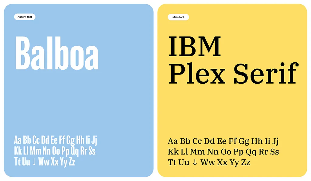
Serif or sans serif? Either can work. Sans serifs are the safer default for screens and small UI text; serifs can work well for long reading and for brands that want a more editorial voice. Leurniq, an e-learning platform I designed, uses IBM Plex Serif as its main font.
Step 3: How many fonts should a brand have?
Most brands need one or two fonts. A second font should do a job the main font can’t: add character to headlines, posters and campaigns. If it doesn’t, leave it out. Here’s how five of my projects handle it:
| Project | Fonts | Why it works |
|---|---|---|
| SpareCharge (EV charging) | Plus Jakarta Sans only | One family; hierarchy from weight and scale keeps data-dense charging screens calm |
| Secuara (cybersecurity) | Inter only | Clear, technical reading across app, web and print |
| Pivosis (data) | Montserrat, with Oleo Script as an accent | The script adds a human, handwritten line to a technical brand |
| ZAYAN (solar) | Helvetica for text, Lavoka for headlines | A distinctive headline face on a neutral text face |
| Leurniq (e-learning) | IBM Plex Serif, with Balboa as a tall condensed accent | The condensed accent gives energy; the serif keeps reading easy |
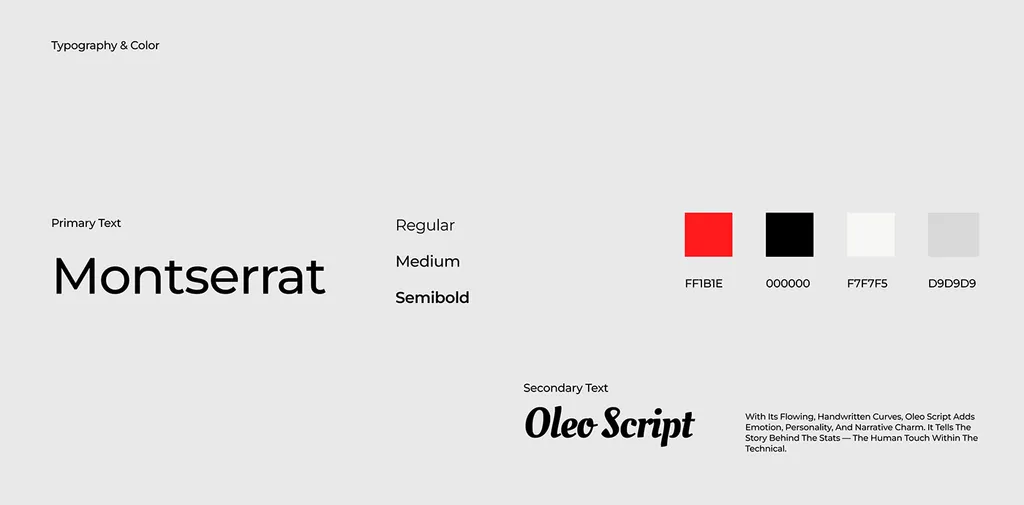
The pattern: one font does the reading, the other has the personality, and they’re clearly different. Two similar sans serifs look like a mistake, not a pairing.
How many fonts does a brand need? One or two, and three at most. Every extra font is another license, another file to load on your website, and another choice your team can get wrong. A third font usually only makes sense for a separate script, such as Arabic, or for a product UI that needs a system font.
Step 4: Which scripts and languages do your fonts need?
If your brand appears in more than one alphabet, check that early. A Latin font with no Arabic, Cyrillic or Greek version means a second font chosen later, and it rarely matches.
For Arabic and English brands, choose a pair designed to work together. Google Design notes that there are now more than fourteen Arabic type families in Google Fonts, Docs and Slides with matching Latin characters. Mohamed Gaber, a type designer in Cairo, describes the goal as matching the Latin “without bending the Arabic letters or ‘Latinizing’ them.” That’s the test: the two scripts should feel like one brand at the same size and weight, while each stays true to its own letterforms.
Check:
- Weights in both scripts. If the Latin has five weights and the Arabic two, your hierarchy breaks in Arabic.
- Size and line height. Arabic often needs more line height than Latin at the same size.
- Numbers. Decide whether you’ll use Western or Arabic-Indic numerals, and check the font has both.
- Right-to-left layouts. Test a real Arabic screen, not a mirrored English one.
How to design a bilingual Arabic–English brand shows three ways to pair the scripts, and bilingual logo design includes a type pairing for both. Arabic and English cost the same as the package in my projects.
Step 5: What does a font license need to cover?
A font is software, and you license it rather than own it. Check the license before the font goes into your logo or your website.
| License type | What it covers | Notes |
|---|---|---|
| Desktop | Installing the font on computers to make designs, documents and logos | MyFonts says a desktop license is the minimum for using a font in a logo |
| Web | Embedding the font on a website with @font-face | Licensed separately from desktop |
| App | Embedding the font in an iOS or Android app | Separate from web and desktop |
| Electronic document | Embedding in ebooks and other electronic publications | Separate again |
| Open license (SIL OFL) | Desktop, web, app and print use, including commercial work | Most Google Fonts use it |
Two things catch businesses out:
- Who owns the license. Licenses belong to whoever buys them. If your designer buys a font in their own name, you may not have the right to use it once they hand over the files. Buy the licenses in your company’s name, as my clients do.
- Free doesn’t always mean free for everything. Google Fonts says most fonts in its collection use the SIL Open Font License, some use Apache 2 and the Ubuntu fonts have their own license, and that you should always read the license for each font. The OFL FAQ says you can use OFL fonts in logos, posters, business cards, signage and other work; what you can’t do is sell the fonts on their own. Fonts from subscription services and free-font websites have their own terms, so read them.
Step 6: How do you test brand fonts at real sizes?
Before you approve the fonts, set real content at real sizes:
- 8 pt and 12 px. Footnotes, labels, small print on packaging, form fields.
- A phone screen. Your app or website, with real text, not lorem ipsum.
- A sign or banner from a distance. Condensed and thin fonts disappear first.
- A slide and a document. Your team will use the brand fonts in PowerPoint or Google Slides; check the fonts are available there, or choose a fallback.
- Every script. The Arabic at the same sizes as the Latin.
- Numbers and prices. A table of figures, a price list, a phone number.
Write down the results in the brand guidelines: sizes, weights, line heights, and which font to use where, including a fallback system font for email and documents.
What are the common brand font mistakes?
- Choosing the headline font first. It’s the fun choice, but the reading font does most of the work.
- Two fonts that are too similar. Pair contrast, not near-matches.
- A beautiful font with two weights. You’ll run out of hierarchy within a week.
- No plan for Arabic or other scripts. The second script ends up in a default system font.
- Licenses in the designer’s name, or no web license for the website.
- No fallback. Emails and shared documents show Times New Roman because nobody chose a backup.
If you’d like your type chosen and tested this way, a brand identity project includes the full color and type system, with Arabic and English at the same package price. You can book a free 30-minute call to talk it through.
FAQ
How many fonts should a brand have?
One or two, and three at most. One family with several weights is often enough; a second font is worth adding only if it gives headlines a character the main font can’t. A separate script, such as Arabic, may need its own matched font.
Can I use Google Fonts for my brand and logo?
Usually yes. Most Google Fonts use the SIL Open Font License, which allows use in logos and other work as long as you don’t sell the font itself. Some use the Apache 2 license. Read the license for the specific font, and remember that a common free font is also available to your competitors.
Should my logo font match my website font?
It doesn’t have to. Logos are often custom-drawn lettering or a display font, while the website needs a font that reads well at small sizes. The two should look like they belong to the same brand.
Do I need a separate font license for my website?
Often, yes. Commercial fonts usually license desktop, web, app and ebook use separately; MyFonts, for example, sells web licenses for embedding on a website and app licenses for iOS and Android apps. Open-licensed fonts such as most Google Fonts cover these uses.
Who should own the font licenses?
Your company. Licenses belong to whoever buys them, so if the designer buys them in their own name, you may not be covered once the project ends. Buy them in your company’s name and keep the receipts with your brand files.
Should a brand use a serif or a sans serif font?
Either can work. Sans serifs are the usual choice for apps and small screen text because they tend to have a taller x-height. Serifs suit long reading and more editorial brands. Choose by where people read your brand most, then test at real sizes.
Sources