Typography Trends 2027: The Type Choices Shaping Brands
Nine typography trends for 2027 backed by published data: variable fonts, owned type, small-screen type, several scripts, accessible motion and font governance, each with a test.

Summarize with AI
Key takeaways
- The typography trends that matter for 2027 change how type works, not only how it looks: variable fonts, owned type, small-screen tuning, several scripts, accessibility and tighter font rules.
- Variable fonts are already mainstream: the HTTP Archive found them on 39.4% of desktop and 41.3% of mobile websites in 2025.
- Good free type is now a real option. Google Sans Flex is open source, free for commercial use and has five variable axes.
- The cheapest fixes are often the most useful: tabular numbers for prices, a license list, and type rules written as exact values.
- Run the seven-point type check at the end before you change anything. If your type fails two or more checks, fix the system before chasing a new look.
The typography trends that matter for brands in 2027 are less about a new look and more about how type works: variable fonts becoming the default, brands owning or customizing their type, free fonts good enough to build on, type tuned for small screens, one family across several scripts, a clear split between expressive and quiet faces, accessible type with calmer motion, tighter control of fonts and licenses, and type rules written so AI tools can follow them. Several of these already show up in the data. The HTTP Archive’s 2025 Web Almanac found at least one variable font on 39.4% of desktop and 41.3% of mobile websites.
| Trend | Evidence | Who should act on it |
|---|---|---|
| 1. Variable fonts by default | About 4 in 10 websites use one (2025) | Any brand with a website or app |
| 2. Owned and customized type | Custom faces in new identities, such as Alpha Bank’s | Brands with scale or a crowded category |
| 3. Free fonts that are genuinely good | Google Sans Flex, open source | Startups and small teams |
| 4. Type tuned for small screens | Optical-size and grade axes | App, SaaS and e-commerce brands |
| 5. One family, several scripts | Greek and Latin, Arabic and Latin faces | Brands selling across languages |
| 6. Expressive display, quiet text | Two-role type systems | Most brands |
| 7. Accessible type, calmer motion | WCAG resize and reduced-motion settings | Every brand online |
| 8. Font governance and licensing | Tools that check fonts against an approved list | Teams of more than a few people |
| 9. Type rules written for AI tools | Type written as tokens | Brands making content with AI |
I’m Masuder Rahaman, a brand designer and the CEO and founder of Wolfpixel, where I lead a design team for founders in the US and the Middle East. Type is part of every brand identity I design, and for the UAE and Saudi Arabia that usually means Arabic and English type that work as one system. This article sits next to two others: logo design trends for 2027 covers the mark itself, and how to choose brand fonts is the step-by-step selection guide. This one covers how brand typography is changing and what to do about it.
What does the evidence actually say about 2027 type?
Every 2027 forecast is written before 2027 starts, including this one. The trends below are drawn from published data (mostly the Web Almanac, which measures millions of web pages, not brands), from type and identity launches in 2025 and 2026, and from the standards browsers already follow. They’re not rules. A trend is only worth following if it solves a problem your brand actually has, so each one ends with a test you can run on your own brand in a few minutes.
1. Why are variable fonts becoming the default?
A variable font holds a whole range of styles (weights, widths and sometimes more) in a single file. Instead of choosing between Regular and Bold, you can set any value in between.
The evidence. The Web Almanac 2025 counted at least one variable font on 39.4% of desktop and 41.3% of mobile websites, up from about 33% and 34% in 2024. Established typefaces are being rebuilt this way too: on May 12, 2026, Monotype launched Gotham Variable, with continuous control across weight and width in a single file.
Why it matters for a brand. One file can cover headlines, body text, buttons and labels. You can fine-tune weight for dark mode or small sizes, and move between weights in an animation without swapping fonts.
Test it on your brand. Does your main typeface come in a variable version? If not, count how many separate font files your website loads. If it’s more than four or five, a variable version may simplify things. Check that your license covers the variable file before you switch.
2. Why are more brands owning or customizing their type?
When every competitor uses the same few popular sans serifs, type stops helping people recognize you. More brands are commissioning a custom typeface, or modifying a licensed one with a few custom letters.
The evidence. Pentagram’s identity for Alpha Bank is built on a custom typeface, Alpha Sans, developed with type designer Tom Baber: five weights in Greek and Latin, with the wordmark taking its form from the typeface, and a second face, Alpha Text, for copy at smaller sizes.
| Option | When it makes sense | Trade-off |
|---|---|---|
| A licensed retail typeface | Most small and mid-size brands | Others may use the same font |
| A retail typeface with a few custom letters | You want a distinctive wordmark or headline style | Check that the license allows changes |
| A fully custom typeface | Large brands, several scripts, heavy license costs | High upfront cost and a long timeline |
Test it on your brand. Cover your logo on your website and social posts. Could the page belong to a competitor? If yes, type is a cheap place to add recognition, starting with headlines.
3. Are free fonts now good enough to build a brand on?
At the other end, the quality of free, open-source type keeps rising, which makes a strong type system affordable for small brands.
The evidence. In November 2025, Google added Google Sans Flex to Google Fonts under the SIL Open Font License. The version on Google Fonts has five variable axes: weight, width, optical size, slant and roundness. The OFL FAQ says you can use fonts under this license commercially with no extra license or permission; the one thing you can’t do is sell the font on its own.
Why it matters. A startup can build a flexible, professional type system without license fees, then spend the budget elsewhere, or on a custom display face later.
Test it on your brand. List every font you use and its license. If you pay for a font that only sets body text, compare it with a well-made open-source family at real sizes before you renew.
4. How is type being tuned for small screens and dark mode?
Most brand typography is now read on phones, watches, app screens and dashboards, often at small sizes and in dark mode. Newer families are designed with that in mind.
- Optical size. An optical-size axis (Google Sans Flex has one) can adjust letter shapes for small or large text, opening up spacing and details at small sizes. Browsers and apps that support automatic optical sizing do this for you.
- Grade. A grade axis changes how heavy text looks without changing its width, so lines don’t rewrap when you adjust text for a dark background. Google’s axis registry describes it as changing weight without any change to overall width, line breaks or page layout.
- Tabular numbers. Figures that line up in columns matter for prices, dashboards and finance apps. The Web Almanac 2025 found the CSS setting for them (font-variant-numeric: tabular-nums) on only about 3% of pages, so many brands don’t use a feature many fonts include.
Test it on your brand. Put your brand type on a phone at 12 to 14 pixels, in light and dark mode, next to a price table. Do the numbers line up, and do letters like il1 and O0 stay distinct?
5. Why do brands want one type family across several scripts?
Brands that sell across languages want their type to feel like one voice in every script, not a Latin font with a mismatched fallback for Arabic, Greek or Cyrillic.
The evidence. Alpha Bank’s custom type was designed in Greek and Latin from the start. Google’s Noto project shows the size of the problem: in 2016 Google described Noto as covering every symbol in the Unicode standard and more than 800 languages.
Why it matters. If your Arabic text is set in a default system font while your English uses a carefully chosen typeface, half your audience sees a weaker brand. For the UAE and Saudi Arabia I design Arabic and English versions of the name, logo and type so they work as one brand, matched in weight, height and personality, including right-to-left layouts. Bilingual logo design covers the mark; how to build a bilingual Arabic and English brand covers the rest.
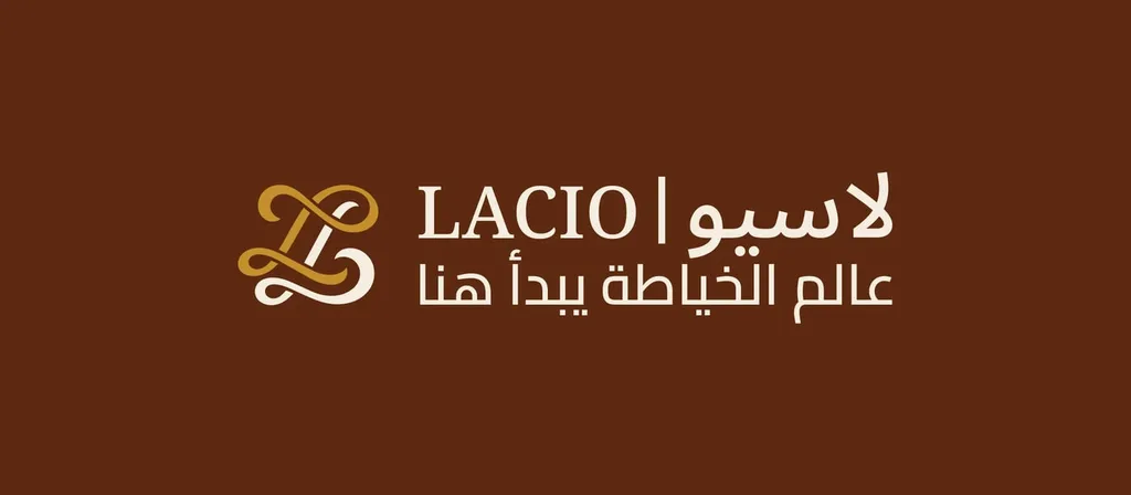
Test it on your brand. Put your English and second-language headlines side by side at the same size. Do they look like the same brand, or like two companies?
6. Why are display faces getting louder and text faces quieter?
Brand type systems are settling on two clear roles: a distinctive display face for headlines and short moments, and a calm, highly readable face for everything else. Alpha Bank’s pair is one example: Alpha Sans, which the wordmark is drawn from, and Alpha Text for copy at smaller sizes.
| Role | What it does | What to look for |
|---|---|---|
| Display | Recognition in headlines, campaigns and packaging | Character and distinctive shapes that work large |
| Text | Long reading, interfaces and small sizes | Legibility, open shapes and good numbers |
| Accent (optional) | Data, code and captions | A monospace or narrow width for tables |
Display faces are getting bolder (serifs with sharp details, wide grotesques, condensed styles) while text faces are getting quieter. A brand can be expressive without making body text hard to read. A single family can also cover both roles if its range is wide enough.
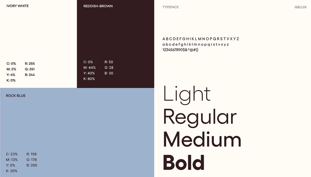
Test it on your brand. If you use one font for everything, check whether your headlines feel like you. If you use three or more, check whether each one has a clear job.
7. How do accessible type and calmer motion fit together?
Accessibility is moving from a checklist to a design starting point, and type is where it shows first.
- Text must scale. WCAG’s Resize Text criterion asks that text can be resized “up to 200 percent without loss of content or functionality.” Type systems need to hold together when people enlarge text.
- Motion needs an off switch. Kinetic type (letters that move, stretch or animate between weights) is easier with variable fonts, but some people find motion uncomfortable. Phones and computers have a setting to reduce motion, and websites can read it through prefers-reduced-motion and stop non-essential animation.
The trend: type animation kept for a few brand moments, such as a logo reveal or a campaign headline, each with a still version ready, rather than motion everywhere.
Test it on your brand. Zoom your website to 200% on a laptop. Does text overlap or get cut off? Then switch on reduce motion in your phone’s settings and check that animated type stops.
8. Why does font governance matter more as teams grow?
As teams grow and more people make content, brands lose control of their type: the wrong weights, unlicensed fonts on someone’s laptop, a different font in every slide deck. License gaps can turn into real costs.
The evidence. On November 10, 2026, Monotype launched the Monotype Connect panel for Illustrator, Photoshop and InDesign. It brings a team’s approved fonts into those apps and shows how the fonts in a design compare with the approved library, so designers can replace the ones outside it. Tools like this exist because unapproved fonts are a common problem.
| Use | License to check | Example |
|---|---|---|
| Design files and print | Desktop | Logos, brochures, signs |
| Website | Web (often priced by page views) | Your site and landing pages |
| Mobile app | App embedding | Fonts bundled in your app |
| Video and ads | Broadcast or digital ads | YouTube ads, social video |
Test it on your brand. Ask who holds the license for each brand font, for which uses and for how many users. If nobody knows, that’s the first job for 2027. In my projects the client buys the font licenses, so they sit with the company, and the brand guidelines list every font, its role and what its license covers.
9. How do you write type rules that AI tools can follow?
More brand content is now drafted or laid out with AI tools and templates. They follow rules well when the rules are explicit, and badly when the rules are only implied by examples.
What’s changing. Design tokens store typography as named values (font family, size, weight, line height and letter spacing) that design tools, websites and AI workflows can read directly. Instead of “use Bold for headlines,” the rule becomes heading-1: 40/48, weight 700, tracking −1%.
Why it matters. Clear type tokens keep AI-made layouts, slides and social posts on brand. That’s why an AI-ready brand system includes design tokens in JSON.
Test it on your brand. Can someone build a correct headline from your guidelines without opening an example file? If not, the rules aren’t explicit enough for people or for AI.
Which typography trends should you skip in 2027?
Not every trend is worth following. Skip these unless they solve a specific problem:
- Distorted or liquid type for body text. Fine for a poster, hard to read at small sizes.
- Very thin hairline weights on screens. They break down at small sizes and in dark mode.
- Too many fonts. Variable fonts make it tempting to use every axis everywhere. Two roles, used consistently, are easier to recognize.
- Motion with no still version. It fails people who reduce motion, and it breaks in print and email.
- A free imitation of a big brand’s custom font. It reads as a copy, and some imitations raise trademark or license questions.
How do you run a 2027 type check on your brand?
Run this on your current brand before you change anything.
| Check | What good looks like | Trends it covers |
|---|---|---|
| Recognition | Pages still feel like you with the logo covered | 2, 6 |
| Files | One or two variable families, not a pile of static files | 1, 3 |
| Small sizes | Clear at 12 to 14 px in light and dark mode, numbers aligned | 4 |
| Languages | Every script you use looks like the same brand | 5 |
| Accessibility | Works at 200% zoom; motion stops when reduced | 7 |
| Licenses | Every font has an owner and covers every use | 8 |
| Rules | Type styles written as exact values or tokens | 9 |
If you fail two or more checks, update the type system before chasing any new look. Most of these are small fixes: a license list, tabular numbers, a variable version of your current font and clearer rules. A bigger type change makes sense when your type doesn’t help people recognize you, when you’re adding a language, or when you’re rebuilding your website or app anyway.
How I can help
In a brand identity project I choose or adapt the type system with the logo, colors and imagery, test it at real sizes and in every script you need, and write it into your guidelines, handed over as PDF, PowerPoint and Illustrator files plus a Figma library. A brand identity is $3,499 and takes 2–3 weeks; for Arabic and English, both scripts are included at the same package price. See pricing for the packages. If you’d like to talk through your type, book a free 30-minute call.
FAQ
What are the biggest typography trends for 2027?
Variable fonts as the default, brands owning or customizing their type, high-quality open-source families, type tuned for small screens, families that cover several scripts, a clear split between expressive display faces and quiet text faces, accessible type with calmer motion, stricter font governance, and type rules written as tokens for AI tools.
Are serif fonts coming back in 2027?
Serifs are common again as display faces, especially for brands that want to feel established, editorial or premium. For long text on screens, highly readable sans serifs still lead. The more useful question isn’t serif or sans, but which role each font plays in your system.
Should my brand use a variable font?
If your brand lives mostly on the web or in an app, usually yes, as long as your typeface comes in a well-made variable version. It can cut the number of font files and gives you finer control over weight and width. Check that your license covers the variable file before you switch.
Is a custom typeface worth it for a small business?
Usually not at first. A well-chosen licensed or open-source font with a distinctive logo and clear rules does most of the work. Custom type starts to pay off when license costs grow with your audience, when several scripts need to match, or when type is central to how people recognize you.
What are tabular numbers, and does my brand need them?
Tabular numbers are figures that all take the same width, so prices, totals and dates line up in columns. If your brand shows prices, dashboards, invoices or timetables, yes. Many fonts include them; they just need to be switched on in your website styles and design files.
How often should a brand update its typography?
Rarely as a full change, often as small fixes. Review licenses, file formats and type rules every year or so. Change the typefaces themselves only when they stop helping people recognize you, when you add a language, or when you rebuild your website or app.
Sources