Luxury Branding: What Changes in the Identity When You Charge More
Luxury brand identity design: what changes in the logo, type, color, photography and packaging when you charge more, with real examples and honest trade-offs.

Summarize with AI
Key takeaways
- A luxury identity has to hold its standard on a key card, a box and a website as well as on a billboard.
- Settle the strategy before the style, because restraint without an idea just looks empty.
- Luxury logos lean toward logotypes and monograms, light type, generous spacing and a short palette. Copying a famous house won’t make you look expensive.
- Premium signals better quality; luxury signals rarity. Most small businesses that “want luxury” need a premium identity.
- Price alone no longer carries a luxury position. Bain forecast a small drop in personal luxury sales for 2025 and sees the post-Covid run of price increases ending.
Luxury brand identity design is the work of building a complete visual system (logo, type, color, imagery, materials and voice) that makes a higher price feel deserved before anyone reads it. A luxury identity has the same parts as any other. What changes when you charge more is how they are handled: fewer choices, made more carefully and applied without exception at every touchpoint.
| Decision | Mass-market identity | Luxury identity |
|---|---|---|
| Logo | Symbol plus name, often colorful, built for quick recognition | Logotype first, often with a monogram for small spaces and patterns |
| Type | Friendly, bold, high legibility | Light weights, high-contrast serifs or precise sans, generous spacing, often custom |
| Color | Bright, several colors | Deep or monochrome base, one accent used sparingly |
| Layout | Full, busy, many messages | Large white space, one message per surface |
| Photography | Product and price, bright and literal | Directed, atmospheric, with a consistent look |
| Copy | Benefits, offers, urgency | Short, quiet, no discounts or exclamation marks |
| Packaging and print | Functional | Materials and finishes are part of the identity |
| Consistency | Some drift tolerated | Every touchpoint checked, including staff and service |
I’m Masuder Rahaman, a brand designer and the founder of Wolfpixel, where I lead a design team for founders in the US and the Middle East. I design logos and brand identities. None of the published work on my site is for a fashion house or a jewelry brand. The closest projects are a resort identity that carries one quiet look from the website to the soap bar, a furniture brand, an architecture studio and an airline. This article sets out the design decisions that change when a business moves up in price, with examples from those projects and the trade-offs of each choice.
What is luxury brand identity design?
It’s the design of a brand’s full visual and verbal system for a business that sells above its category’s normal price. Schweitzer Designs lists the parts as a logo system, typography, color, layout, graphic devices and spacing rules, photography direction, campaign assets and brand guidelines, with positioning and story underneath. That’s the same list as any brand identity, so the difference lies in how each item is handled.
Two ideas come up again and again in design guides on the subject:
- Luxury is judged on perception. Schweitzer puts it plainly: “Luxury markets are perception-driven.” Small signals, such as spacing, paper weight and the light in a photo, tell the buyer what to expect before any copy does.
- Restraint is the main tool. SUM Design argues that reduction signals luxury more than volume, and that strategy defines the story while identity makes it felt.
Why does luxury branding matter more now?
For years, many brands treated price increases as a luxury strategy in themselves. That’s getting harder. Bain & Company’s 2025 luxury study forecast personal luxury goods sales of €358 billion for 2025, down from €364 billion in 2024 (flat at constant exchange rates). Bain also said the post-Covid era of price elevation appears to be ending as demand from mid-tier aspirational shoppers falters.
My reading, for a smaller business: when buyers question price, the identity has to do more of the justifying. A higher price with a generic look invites the comparison you’re trying to avoid.
8 design choices that make a brand identity feel luxury
1. Strategy before style
Decide what the brand stands for, who it’s for and how it should feel before choosing a single typeface. DesignMantic frames luxury around three traits that work together (high prices, exclusivity and premium materials) and advises starting from the emotional need the brand meets. Write the idea in one sentence. Reva7’s was “The perfect blend of nature and nurture,” and every later decision follows from it: the green, the serif, the calm photography and the short lines of copy.
2. Luxury logo design: logotype first, monogram second
Luxury logo design leans toward the name itself. KOTA builds luxury logos around an elegant wordmark, often with a small supporting icon; Liz Marie Strategy recommends a wordmark, with a monogram for pattern work; SUM describes a dual system of a logotype for clarity and a crafted motif for storytelling.
There is a practical reason as well as a stylistic one. A logotype is understated and readable, and a monogram fills the small, physical places where customers touch a luxury brand, such as a key card, a box lid, a stitched label or a pattern.
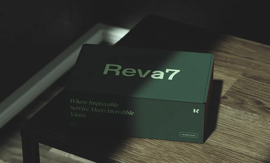
For Reva7, a resort, the identity pairs a confident R monogram with the Reva7 wordmark. The wordmark sits on the box lid and the website; the R goes on the key card, the slippers and the soap, where the full name would be too small.
3. Typography does most of the work
In a luxury identity, type is often the main visual element, so it needs the most care. Fontfabric, a type foundry, describes the usual routes: classic serifs such as Didot, Bodoni or Garamond for heritage and craft; geometric or clean sans serifs for modernity; and pairing a serif logo with a sans for supporting text. KOTA adds smaller type sizes and lighter weights for a calmer, more confident tone.
From my own projects:
- Reva7: an editorial serif with a clean sans.
- NestEdge (architecture): one typeface, Trap Now Display, in Light, Regular, Medium and Bold.
- Vosho (furniture): CS Belia, a looping display face, with Sen for reading text. Vosho’s overview board tagged the brand minimal, modern, luxury and friendly, which is why the display face is expressive but the reading face is plain.
Watch the trade-off: very light, small type looks refined in a mockup and fails on a phone in sunlight, so test it at real sizes. Budget for licenses too. Distinctive typefaces are usually paid, and on my projects the client buys the font licenses.
4. Color: fewer, deeper, used sparingly
Shoreditch Design points to rich, deep colors such as burgundy, navy, gold or charcoal, or a monochrome scheme. KOTA favors black, white or dark shades of the brand color, with an accent used sparingly. Both describe the same principle: a short palette, mostly neutral or deep, and one accent that means something because it’s rare.
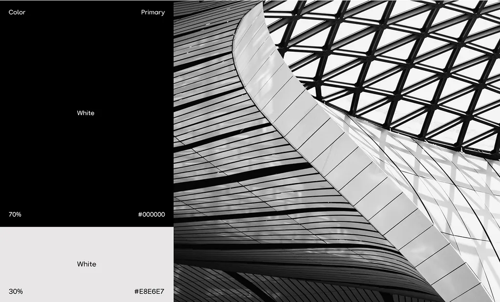
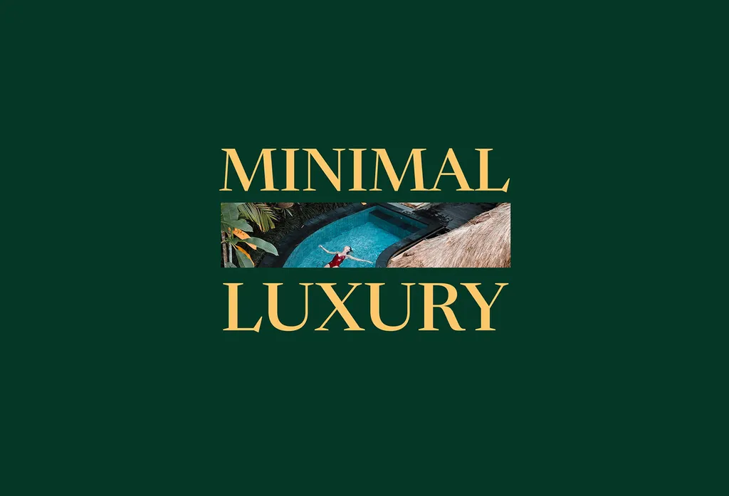
NestEdge takes this to its limit: black at 70% and a soft white at 30%, with the ratio written into the guidelines, and black and white architecture photography doing the rest. Reva7 uses a deep resort green with mint, sky blue and a warm orange; the gold on the “Minimal Luxury” page above is the accent, not the base.
5. Space: the cheapest signal and the hardest to keep
White space costs nothing to design and a great deal to defend, because every stakeholder wants one more message on the page. A luxury identity makes the rule explicit: one message per surface, large margins and a grid that tells the next designer where things go. Write it into the guidelines, with examples of a crowded layout marked as wrong.
6. Photography direction
Schweitzer and Shoreditch both put photography near the top of the list. A generic stock photo can undo careful type and color at a glance. A luxury identity specifies the light, the framing, how people appear, and what’s never shown. NestEdge uses black and white architecture photography throughout; Reva7’s images are calm, natural and warm, matching the nature-and-nurture idea.
7. Materials and touchpoints
At a higher price, physical things such as the box, the paper, the key card and the door hanger carry the brand as much as the logo does. For Reva7, we carried the identity through the welcome folder, menu, key card, door hanger, slippers, soap and dispenser, a brush, a candle, a box and a coffee cup. If you sell a physical product, the packaging is part of the identity, not an add-on; my guide to perfume brand identity shows how that works for bottles, boxes and sample vials.
For hotels and resorts, the touchpoints run through the whole stay. My guide to boutique hotel branding covers them in order, from booking to checkout.
8. Voice: fewer words, no shouting
Luxury copy is short and calm, with no exclamation marks, no “limited time” and no discount language. Reva7’s lines include “Perfect peace, pure paradise” and “From arrival to farewell, excellence awaits.” The airline brand TORIX runs on one line, “Modern flights, timeless values.” The rule for the guidelines: one idea per line, and say less than you could.
Luxury vs premium branding: which do you need?
The two words are often used interchangeably, but they describe different positions.
| Compare | Premium | Luxury |
|---|---|---|
| What the buyer pays for | Better quality than the category norm | Meaning, rarity and how it makes them feel |
| Price logic | Higher, but justified by features | Far above function; the price is part of the signal |
| Availability | Widely available | Limited, sometimes deliberately |
| Identity goal | Look clearly higher quality | Look unmistakable and unhurried |
| Typical businesses | Specialty food, design-led furniture, boutique services, B2B firms moving upmarket | High-end fashion, jewelry, watches, hospitality at the top of its market |
Most small businesses that want “luxury” need premium: a clear signal of quality that justifies a higher price, without the exclusivity that luxury depends on. That works in their favor. A premium identity is easier to keep consistent, and it doesn’t push away buyers they need.
Luxury branding mistakes to avoid
- Gold on everything. Gold works as a rare accent. On every surface, it reads as costume.
- Script fonts that can’t be read small. A flowing script looks expensive on a sign and turns into a smudge on an app icon or a label.
- Copying the famous houses. A serif in spaced capitals on black is now a template. Take the principles, not the look.
- Restraint without an idea. Schweitzer warns that minimalism alone doesn’t signal luxury. An empty page with a thin logo is just empty.
- Cheap touchpoints. A thin business card, a default email signature or a stock photo breaks the promise at the moment the customer is checking it.
- No rules. Without guidelines, every new hire and agency adds “just one more” color or font, and the identity drifts back toward average.
What does a luxury brand identity cost with me?
Luxury and premium identities sit inside my brand identity package: $3,499 for 4 concepts, the brand identity and brand guidelines, with unlimited revisions within the agreed scope, in 2–3 weeks. Guidelines are handed over as PDF, PowerPoint and Illustrator files plus a Figma library with source files, and you own all final files.
The Premium package ($6,999, 4–6 weeks) adds an AI-ready brand system and website design in Figma (design only, no build), which matters when the website is where most buyers first meet you. Packaging design is a separate service and takes 2–4 weeks. Font licenses and printing aren’t included; for a luxury brand, budget for both. If you sell in the UAE or Saudi Arabia, Arabic and English versions of the name, logo and type are designed together at the same price. All prices are on the pricing page.
Plan your luxury brand identity
If you’re moving a business upmarket or launching at a higher price, book a free 30-minute call in your time zone. We’ll work out whether you need a premium or a luxury identity, and what it has to carry. The full scope is on the brand identity service page.
FAQ
What is luxury brand identity design?
It’s the design of a complete visual and verbal system (logo, typography, color, photography, materials, voice and guidelines) for a brand that sells above its category’s normal price. The goal is to make the price feel deserved through restraint, precision and consistency at every touchpoint.
What makes a logo look luxurious?
Usually a logotype or monogram rather than a busy symbol, light or high-contrast type with generous spacing, one or two colors, and a mark that works in one color on any material. Strong typography matters more than decoration.
What colors do luxury brands use?
Most use a deep or monochrome base (black, white, navy, deep green, burgundy or charcoal) with one accent, such as gold, used sparingly. The restraint matters more than the exact colors.
What fonts are used for luxury branding?
Classic high-contrast serifs such as Didot, Bodoni or Garamond suggest heritage; clean geometric sans serifs suggest modernity. Many luxury brands pair a serif logotype with a sans for body text. Check every typeface’s license before using it in a logo.
What is the difference between luxury and premium branding?
Premium branding signals better quality than the category norm and justifies a higher price. Luxury branding signals rarity and meaning, and the price is part of the appeal. Most small businesses need premium.
How much does a luxury brand identity cost?
With me, a brand identity with guidelines is $3,499 and takes 2–3 weeks; the Premium package with an AI-ready brand system and website design is $6,999 and takes 4–6 weeks. Packaging, printing and font licenses are separate.
Sources
- Bain & Company: Luxury Is Ready for a New Era After Stabilizing in 2025 (20 November 2025)
- Schweitzer Designs: Luxury brand identity design guide
- SUM Design: What makes a modern luxury brand identity work
- Fontfabric: The role of fonts in luxury branding
- KOTA: How we approach luxury brand design (September 2021)
- Shoreditch Design: Beyond bling
- DesignMantic: Designing for luxury brands (March 2024)
- Liz Marie Strategy: Luxury branding, how to look expensive