Logo Design Trends 2027, Each Tested on a Real Logo
Nine logo design trends for 2027, each shown on a real logo with a test you can run on yours: responsive families, motion with rules, one story, dark screens and two scripts.

Summarize with AI
Key takeaways
- The logo design trends for 2027 are less about a look and more about behavior: logos that come as a family of sizes, move with a purpose, survive dark mode and themed icons, and are built on one idea instead of a category cliché.
- Style trends (retro, gradients, warmth) date fastest. The trends worth acting on change how a logo works, not only how it looks.
- A trend is only useful if you can test it. Every trend below comes with a check you can run on your own logo in a few minutes.
- The examples are real marks from my studio: Secuara’s logo in motion, SpareCharge’s two-part symbol, SUPA’s slanted mark and Lacio’s bilingual lockup.
- If your logo passes the checks at the end, you probably don’t need a new one in 2027. You may need a better set of versions.
The biggest logo design trends for 2027 are responsive logo families, logos designed to move, symbols built on one story, type-led and slanted wordmarks, visible human craft with a process you can prove, one owned color on a calm base, marks built for dark screens and themed app icons, reinterpreted heritage, and bilingual marks. What ties them together: a 2027 logo is judged at 16 pixels, in motion and in dark mode, not only on a white page.
I’m Masuder Rahaman, a brand designer and the founder of Wolfpixel, where I lead the design team. Trend lists often stop at a look and a famous rebrand. Here, for each trend, you’ll get what it is, a real mark that uses it, who it suits, and a test you can run on your own logo.
What do we actually know about 2027 logos?
Every 2027 forecast is written before 2027 starts, including this one. The closest thing to hard evidence is the LogoLounge 2026 Logo Trend Report, published on June 5, 2026 by Bill Gardner after reviewing more than 30,000 logos and identity systems. Several of its fifteen named trends point the same way as this article: marks that look caught mid-motion even in a still frame (“Roll Over” and “Phasers”), a single leaning letter that breaks a wordmark’s rhythm (“Slant Break”), and designers building toolkits rather than one fixed artwork. LogoLounge itself calls it “a report, not a recommendation.” That’s the right way to read any trend list.
Logo trends also move slower than branding trends. A palette or a campaign style can change every year; a mark is meant to last a decade. So the trends worth acting on are the ones that change how a logo works, not only how it looks. For the longer view, see the future of logo design.
Which logo design trends matter in 2027?
| Trend | Suits | The test |
|---|---|---|
| 1. Responsive logo families | Apps, SaaS, multi-channel brands | Read it at 16 px |
| 2. Logos designed to move | Digital products, video-led brands | Check the first and last frame |
| 3. One story, no category cliché | Crowded categories | The category board |
| 4. Type-led and slanted wordmarks | Brands with a short, clear name | Phone-header size |
| 5. Human craft you can prove | Everyone using AI tools | Keep the sketch trail |
| 6. One owned color, calm base | Brands due a color refresh | One-color version |
| 7. Built for dark screens and themed icons | Anything with an app | Dark and monochrome |
| 8. Heritage, reinterpreted | Brands with real history | Does the story exist? |
| 9. Bilingual and multi-script marks | Gulf and multi-market brands | Both scripts at the same size |
1. Why are responsive logo families replacing the single logo?
What it is. One artwork can’t serve a billboard and a browser tab. A 2027 logo comes as a family: a full lockup, a compact horizontal version, the symbol alone, and a simplified favicon or app icon. Each one is designed, not shrunk.
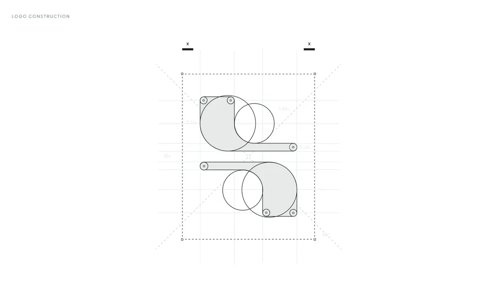
A real example. SpareCharge is a peer-to-peer EV charging app. Its mark had to work on highway billboards, in the app, on a smartwatch and on the charger’s own screen. The symbol, two forms meeting around a central gap, is simple enough to stand alone at app-icon size, so the full name only appears where there’s room for it.
Who it suits. Any brand with an app, a dashboard, social profiles or more than one product. That’s most startups.
The test. Export your logo at 16 × 16 pixels and put it in a browser tab next to five other sites. If you can’t tell it apart, you need a simplified version for small sizes. Google’s favicon guidelines require a square icon and recommend going larger than 48 × 48 pixels, so a long horizontal wordmark won’t do on its own.
2. Why are more logos designed to move?
What it is. More first impressions now happen in an app launch, a product video or a social clip than on paper. A motion-first logo is designed with its movement from the start: how it assembles, what the movement means and where it comes to rest. A static logo with a fade added at the end isn’t the same thing.
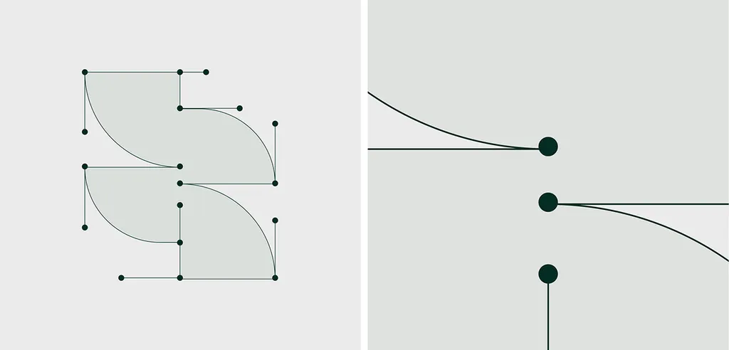
A real example. For Secuara, a cybersecurity brand, the scope covered the identity, its motion and the product UI together. The S is built from two leaf-like quarter circles, joined like nodes in a network. In motion, the two shapes lock together like a shield. The movement carries the brand’s idea, protection, without a padlock or a shield icon anywhere in the logo. You can watch the mark move in the case study. Secuara was also one of six Wolfpixel projects published by the World Brand Design Society.
Who it suits. Digital products, brands that publish video every week, and anyone launching with a demo or an ad.
Who can skip it. Brands that live mostly on shelves, signs and print. A strong static mark is still the foundation.
Motion has rules:
- Design the static frame first. The final frame is the logo. If the animation fails to load, people should see that frame, not a blank space.
- Respect “reduce motion.” Many people turn on a device setting to cut motion because it makes them dizzy or distracted. Websites can detect it with the prefers-reduced-motion media query; when it’s on, show the static logo.
- Keep it short and let it stop. Under WCAG 2.2, moving content that starts on its own, runs longer than five seconds and sits next to other content needs a way to pause, stop or hide it. A logo animation that plays once in a second or two and rests avoids the problem.
- Never flash. WCAG’s three flashes rule limits content to three flashes in any one-second period, unless the flashes stay below its thresholds.
- Hand over the right files. Ask for the motion as a Lottie file (a JSON-based animation format, light enough for websites and apps), as MP4 or WebM video for social and presentations, and as the static SVG for everything else.
3. Why do symbols built on one story beat the category cliché?
What it is. Every category has its default symbol: shields and locks in security, lightning bolts and plugs in EV, sparkles and brains in AI. In 2027 the marks that stand out are built on the company’s own idea. I wrote about the AI version of this problem in why AI startup logos all look the same.
Three real examples:
- SpareCharge skips the bolt. Its two forms are the driver and the charger owner, meeting around a gap that stands for the request linking them.
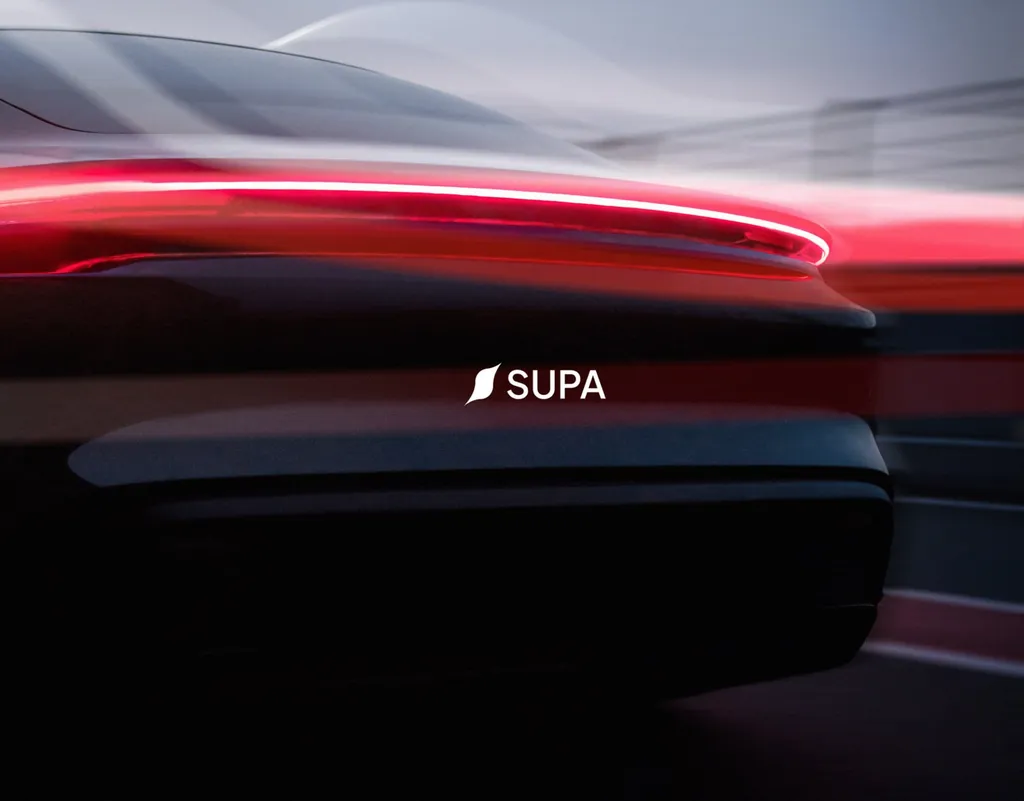
- SUPA, an electric car brand, uses a sharp, slanted symbol instead of a lightning bolt.
- Secuara says “protection” through motion, not through a shield.
Who it suits. Anyone in a crowded category, which is most categories.
The test. Put your logo on one board with the logos of ten competitors, all in black. If yours shares a shape with three or more of them, it’s a category logo, not your logo. My logo design process starts its research with this kind of board.
4. Are type-led and slanted wordmarks a 2027 trend?
What it is. After years of near-identical geometric sans-serifs, more logos lean on type with personality: custom lettering, a distinctive cut of an existing typeface, or a single detail, such as an italic letter or an unusual join, that makes a plain wordmark recognizable. LogoLounge’s “Slant Break” describes one version: one leaning letter that breaks the rhythm of a still wordmark.
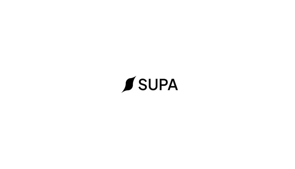
A real example. SUPA pairs its slanted symbol with a clean SUPA wordmark, and sets the brand, the website and the product in one typeface, Geist. The lean in the symbol does the expressive work, so the wordmark can stay calm and readable on an in-car screen.
Who it suits. Brands with a short, distinctive name. If the name is long or generic, a symbol usually does more work.
What to check. Read the wordmark at the size of a phone app header and on a dark background. Check the font license too: licenses often differ for web, app and logo use, and on my projects the client buys the font licenses, so it’s worth knowing before you fall for a typeface. For how brand type itself is changing, see typography trends for 2027.
5. Why does human craft you can prove matter more in 2027?
What it is. AI image tools make polished, generic marks in seconds, so signs of a person’s hand have become valuable: drawn curves, deliberate irregularities, a construction you can explain. A handmade look alone proves little, because a generator can fake texture too. What matters is that someone actually made the mark and can show how.
Why it matters legally. In Part 2 of its AI report, published on January 29, 2025, the US Copyright Office concluded that prompts alone aren’t enough to make a person the author of AI output. A logo typed into a generator may not be protected the way you assume. Trademark is a separate question, and your lawyer should run a clearance search either way. If you already have an AI logo, how to fix an AI-generated logo covers the redraw.
In practice. The SpareCharge and SUPA case studies show their symbols on construction drawings, and Secuara’s S is built from quarter circles. Keep your sketches, construction drawings and dated working files. They’re your record of human authorship.
The test. Can your designer explain why every curve is where it is? If the answer is “the tool suggested it,” keep looking.
6. Why one owned color on a calm base?
What it is. Instead of gradients and five-color palettes, more marks use one saturated, ownable color against black, white or a dark neutral. Color does the recognition work; the shape stays simple. Color forecasts move on their own schedule: WGSN and Coloro named Luminous Blue their Colour of the Year 2027, for example. For a logo, the lesson is simpler: pick one color you can own in your category, then build around it.
Real examples. SUPA uses one electric orange (FF4919) with black and white. SpareCharge uses two greens, Lime Green for highlights and actions and Dark Green for backgrounds and text. Secuara chose deep green and lime in a security category full of blue.
Who it suits. New brands, and brands whose palette has grown too wide to manage.
The test. Your logo must work in one flat color, black on white and white on black, before any color is added. WCAG exempts text that is part of a logo from its text-contrast rules, but that’s a minimum, not a goal. If people can’t read your name on your own website, the exemption won’t help you.
7. How do you build a logo for dark screens and themed app icons?
What it is. Phones now restyle app icons for the user. On Android, apps can provide a monochrome layer so the system can tint the icon to match the user’s wallpaper and theme, and from Android 16 QPR 2 the system themes icons automatically for apps that don’t provide their own. Many people also use dark mode. A logo that only works in full color on white is now a liability.
Real examples. SUPA’s app icon is the symbol glowing orange on black. SpareCharge’s logo is lime green on a dark green background. Both read on dark screens.
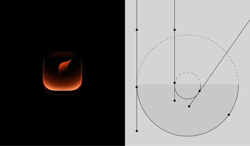
The test. Turn on dark mode, turn on themed icons if your phone has them, and look at your app icon among the others. Then convert your symbol to a single flat color. If it falls apart, it needs a monochrome version.
8. Does reinterpreted heritage suit your brand?
What it is. Some brands revive archival marks or retro type, redrawn for screens. It works when the history is real: an old founder’s signature, a first shop sign, a symbol customers remember.
Honest note. None of the projects in this article use this trend, and I won’t invent one. My view: if a brand has a recognized old mark, refining it usually beats replacing it. That’s what logo refinement is for.
Who can skip it. Startups with no history. A borrowed retro style without a story dates faster than almost anything else on this list.
9. Why are bilingual and multi-script marks growing?
What it is. More startups launch in more than one market from the start. In the UAE and Saudi Arabia customers often expect Arabic alongside English, and a logo translated as an afterthought rarely looks like the same brand. So more marks are being designed in two scripts at once.
A real example. For Lacio (لاسيو), a shop for sewing and tailoring supplies in Iraq, the Arabic and English names were designed together so they read as one brand. The full process is in how to design a bilingual Arabic–English logo, and it’s a service of its own: bilingual logo design.
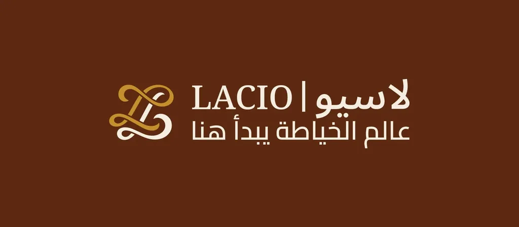
The test. Set both versions at the same height, side by side. They should feel equally weighted and clearly related, with neither one reading as the translation.
Which logo trends should you skip in 2027?
- A fully AI-generated final logo. Fine for exploring ideas, risky as the final mark: it tends to look like others, and it may not be protected by copyright.
- The category default. The sparkle for AI, the bolt for EV, the shield for security. They say what you are, not who you are.
- Gradients and glows that carry the whole idea. They blur at 16 pixels, disappear in one-color print and date quickly. A gradient can sit inside a strong silhouette; it can’t replace one.
- Motion with no static version. Every animated logo needs a still final frame that works on its own.
- Copying a global rebrand. A company with millions of customers can afford to retrain them. A startup copying the look gets the cost without the reach.
How do you test a logo before you approve it?
Run these eight checks on your current logo or on any new concept. Most take a few minutes.
| # | Check | Pass if |
|---|---|---|
| 1 | 16-pixel favicon in a browser tab | You can spot it among five other tabs |
| 2 | One flat color, black on white and white on black | The shape still reads |
| 3 | Dark mode and a themed (monochrome) app icon | It looks designed, not inverted |
| 4 | Category board with ten competitors | It shares no shape with three or more |
| 5 | Motion: first frame, last frame, reduce-motion setting on | The last frame works alone; reduced motion shows the static logo |
| 6 | Phone-header size for the wordmark | The name is readable without zooming |
| 7 | Process trail | Sketches or construction drawings exist |
| 8 | File set | SVG, PNG and PDF, plus Lottie and video files if it moves |
For the twelve rules behind these checks, from the brief to the files, see logo design best practices.
Should you redesign your logo for 2027?
Probably not, if your logo passes most of the checks above. Trends are a reason to improve how a logo works, not to replace one customers already recognize.
| Your situation | What usually fits |
|---|---|
| The logo passes the checks; you just need a favicon, a dark version or motion | New versions within the existing family |
| Customers recognize the logo, but it breaks at small sizes or looks dated | Logo refinement: redraw, simplify, keep the idea (1–2 weeks) |
| You’ve changed name, offer or audience, or the logo was never designed properly | A new logo design (1–2 weeks) or a fuller rebrand |
If you’re starting from scratch, my startup logo design guide covers the brief, and how many logo concepts you should expect covers what a good process looks like.
How I can help
If you’re not sure whether your logo needs new versions, a refinement or a new mark, send it over before a free 30-minute call in your time zone. I’ll run these checks with you and tell you plainly what it needs, including when the answer is “nothing.” If we work together, you get a fixed written proposal: one price, one timeline and a clear list of deliverables. The current packages are on the pricing page.
FAQ
What are the logo design trends for 2027?
The strongest are responsive logo families, logos designed to move, symbols built on one story instead of a category cliché, type-led and slanted wordmarks, human craft with a provable process, one owned color on a calm base, marks built for dark screens and themed icons, reinterpreted heritage, and bilingual marks.
Are minimalist logos still in style for 2027?
Yes, but plain minimalism isn’t enough. Simple shapes win at small sizes and in themed icons, which is why they persist. The 2027 version adds one distinctive detail, such as a lean, a gap or a movement, so the logo is simple without being generic.
Do logos need an animated version in 2027?
Not every logo, but any brand that lives on screens should at least plan how its logo would move. Design the static mark first, make sure the final frame works on its own, keep the animation short, and show the static logo when someone has reduce motion turned on.
Can I use an AI-generated logo for my business?
You can use AI to explore ideas, but a final logo made only by prompting is risky. In the US, the Copyright Office has concluded that prompts alone don’t make you the author of the output, and generated marks often resemble existing ones. Have a designer draw the final mark, and ask your lawyer to run a trademark clearance search.
How often should a company update its logo?
There’s no fixed schedule. Update it when it breaks: when it fails at small sizes, in dark mode or in new formats, or when the business has changed. Most updates are refinements or new versions, not new logos.
What files should a 2027 logo come with?
At minimum: vector files (SVG and PDF or AI), PNGs in color, black and white, a favicon and app icon set, and a dark-background version. If the logo moves, add a Lottie file and MP4 or WebM video, plus the static final frame.
Sources