Future of Logo Design: What to Use, Skip and Keep
Where logo design is heading over the next decade: eleven ideas with a verdict each, from logo systems and AI to symbol-only marks, and how to change a logo without losing recognition.

Summarize with AI
Key takeaways
- The future of logo design is less about a new style and more about a new job. A logo now has to work as a family of versions, on dark screens, at 16 pixels and in motion, and still be recognized years from now.
- Six ideas are worth using: logo systems, motion with a still core, a fixed core with flexible surroundings, AI for exploration, a symbol built on your own story, and marks built for dark screens.
- Four are worth skipping for most businesses: a symbol with no name before you’ve earned it, the plain-sans “blanding” wordmark as a default, glow and 3D as the whole idea, and logos built for AR, NFTs or the metaverse.
- Recognition is the asset. Gap in 2010 and Cracker Barrel in 2025 both went back to their old logos soon after launching new ones. Change how a logo works before you change what it looks like.
- If your name has “Future” in it, the word already says “future.” The logo doesn’t need to repeat it with rockets, circuits or arrows.
The future of logo design belongs to marks that are simple enough to survive a browser tab, built as a family of versions instead of one artwork, designed to move without depending on motion, and based on an idea only one company can own. Styles will keep changing every year. What lasts is a clear shape, a story behind it and the recognition customers have already given it.
I’m Masuder Rahaman, a brand designer and the founder of Wolfpixel, where I lead the design team. Predictions about logos tend to be either this year’s styles or a guess about AR and AI logos by 2030, with little on what to do with the logo you already have. So each idea below gets a verdict, a reason, a real example and what it means for your logo. For the one-year view, with a test for each trend, see logo design trends 2027.
Which logo design ideas will last?
| Idea | Verdict | Main risk |
|---|---|---|
| 1. Logo systems instead of one logo | Use | None, if each version is designed |
| 2. Motion with a still core | Use | Motion that hides a weak shape |
| 3. A fixed core with flexible surroundings | Use with limits | Losing the core |
| 4. AI in the process | Use for exploration | Generic, unprotected final marks |
| 5. Symbols built on your own story | Use | Picking the category cliché |
| 6. Built for dark screens and one color | Use | A logo that only works in full color |
| 7. Heritage brought back | Use only if it’s real | Borrowed nostalgia |
| 8. A symbol with no name | Skip for now | Nobody knows who you are |
| 9. The plain-sans “blanding” wordmark | Skip as a default | Looking like everyone else |
| 10. Gradients, glow and 3D as the idea | Skip as the core | Blurs small, fails in print |
| 11. Logos for AR, NFTs and the metaverse | Skip | Designing for a channel your customers don’t use |
1. Why will logo systems replace the single logo?
Verdict: Use. It’s the safest bet in logo design for the next ten years.
One artwork can’t serve a billboard, a truck, an app icon and a browser tab. A modern logo comes as a family: the full logo, a compact horizontal version, the symbol alone and a simplified favicon. Each one is drawn for its size, not just scaled down. LogoLounge’s 2026 Logo Trend Report, drawn from more than 30,000 logos and identity systems, describes designers building toolkits rather than one fixed artwork.
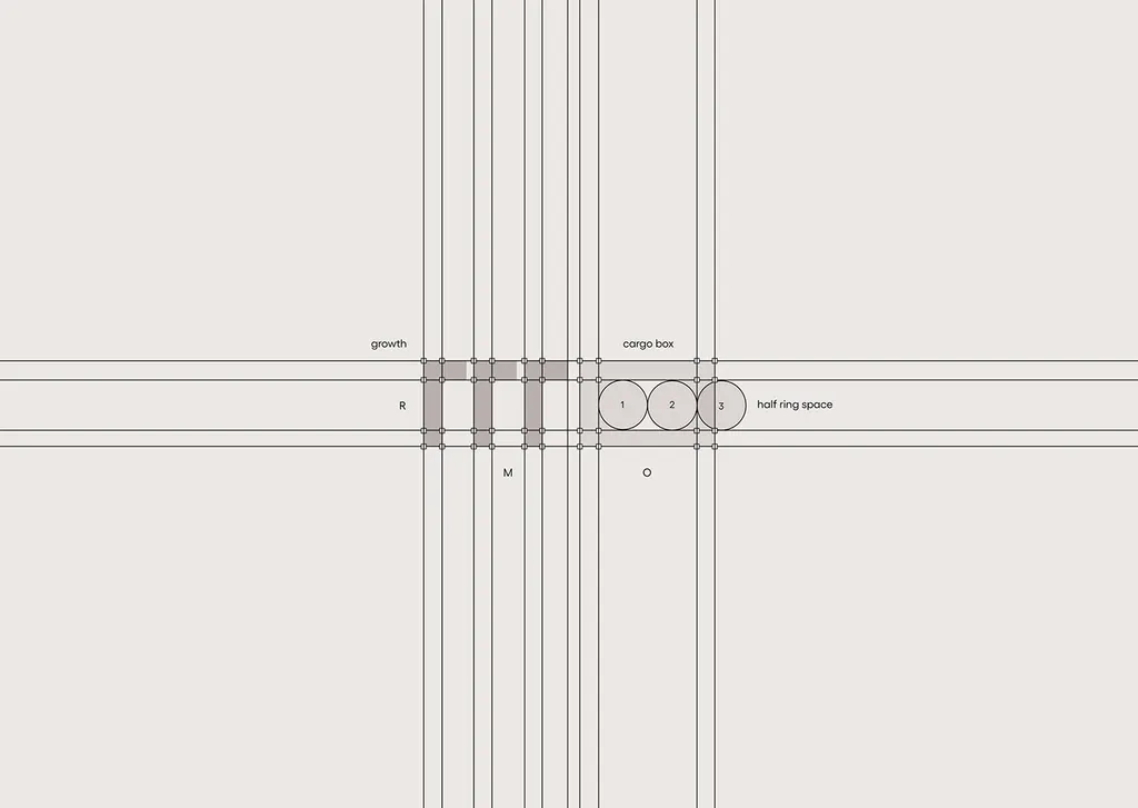
A real example. For ROMO Logistics, a transport company, the monogram was built on a strict grid so it works as an app icon, a sign and a stamp on every parcel. The same mark runs on trucks, warehouses, shipping tubes and the website.
What it means for you. If your logo only exists as one horizontal file, you don’t need a new logo. You need the missing versions.
2. Will logos have to move?
Verdict: Use motion, but design the still logo first.
More first impressions now happen in an app launch, a product video or a social clip than on paper. Logos that move with a purpose, such as assembling, opening or locking together, will become normal for screen-first brands. LogoLounge’s 2026 report already includes trends like “Phasers” and “Roll Over” that show motion inside a still frame.
The part most predictions skip: motion is the extra, not the logo. The last frame of the animation must work on its own, because that’s what people see on a sign, an invoice or a phone set to reduce motion. Logo design trends 2027 covers the practical rules, including reduced motion and the files to ask for.
Who can skip it. Brands that live mostly on shelves, vehicles and print. A strong static mark is still the foundation.
3. What is a dynamic logo, and how far should it flex?
Verdict: Use, as long as one part never changes.
“Dynamic,” “variable” and “generative” logos change color, pattern or shape by product, campaign or context. Some forecasts go further and predict logos that reshape themselves for each viewer.
The idea works when there’s a fixed core people recognize and a flexible layer around it. It fails when everything changes, because recognition needs repetition. If a customer sees five different logos, they’ve seen five brands.
What it means for you. Decide what’s fixed (usually the symbol’s silhouette and the wordmark) and what can flex (color, pattern, illustration, motion). Write that down in your guidelines. A small business usually needs only the fixed part plus one or two approved variations.
4. Will AI design the logos of the future?
Verdict: Use AI for exploration. Skip it as the source of your final logo.
AI tools are making the early stages of logo design faster: mood boards, rough directions, quick tests of a color or layout. That part of the future is already here.
The final mark is different, for three reasons:
- It tends to look familiar. Generators learn from existing images, so their logos lean toward shapes many other businesses already use.
- The files aren’t ready. Generated logos are pixel images with invented lettering and uneven curves, so they have to be rebuilt as vectors anyway. How to fix an AI-generated logo explains how.
- Ownership is uncertain. In Part 2 of its AI report (January 29, 2025), the US Copyright Office concluded that AI output can be protected only where a human author has determined enough of its expressive elements, and that providing prompts alone isn’t enough. Trademark is a separate question, and your lawyer should run a clearance search either way.
What it means for you. Use AI to think faster. Have a person draw the final mark, and keep the sketches and working files as a record of how it was made.
5. Why do symbols built on your own story last longer?
Verdict: Use. It’s the idea that keeps a logo from fading into its category’s background.
Every category has a default symbol: a sun for solar, a shield for security, a brain or sparkle for AI, a lightbulb for ideas. Those symbols say what you are, not who you are, and they date together as a group. The marks that last are built on one idea only that company can claim.
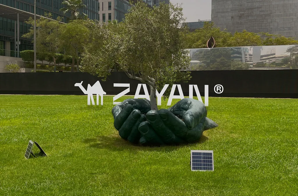
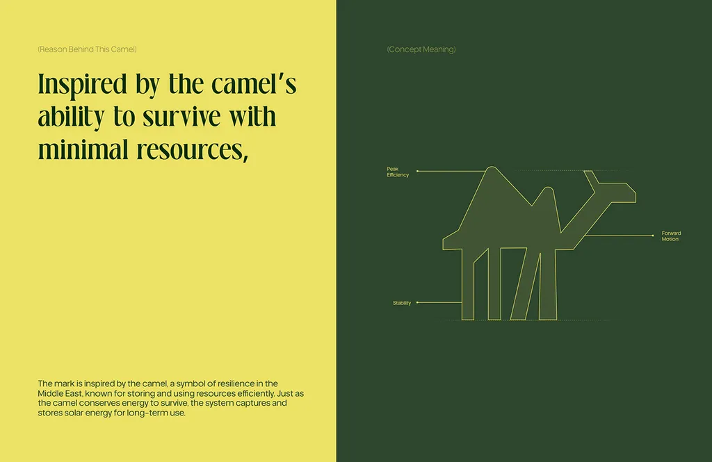
A real example. ZAYAN is a solar energy company (see renewable energy branding for the wider category). Instead of a sun or a panel, its symbol is a simple camel silhouette, inspired by the camel’s ability to survive with minimal resources: like the camel, good solar does more with less. The camel sits beside a confident, spaced-out wordmark and carries straight into lines such as “Like the camel, built to survive more with less.”
The test. Put your logo next to ten competitors’ logos, all in black. If yours shares a shape with three or more, it’s a category logo. My logo design process starts its research with this kind of board.
6. Why must a logo work on dark screens and in one color?
Verdict: Use. It’s no longer optional for any brand with an app or website.
Many people use dark mode, and phones now restyle app icons themselves. Starting with Android 13, users can theme their app icons: apps that provide a monochrome icon layer get tinted to match the user’s wallpaper and theme. A logo that only works in full color on white will look worse each year.
What it means for you. Your logo should work in one flat color, black on white and white on black, before any color is added. If it falls apart, it needs a one-color version designed on purpose, not an inverted export.
7. Should old logos come back?
Verdict: Use heritage only if the history is yours.
After a decade of flattening, some large brands have gone back to their archives. In February 2023, Burberry brought back its Equestrian Knight with a serif wordmark, five years after its 2018 rebrand had replaced the knight with a sans-serif wordmark.
This works when the history is real: a founder’s signature, a first shop sign, a symbol customers remember. A borrowed retro look with no story behind it dates faster than almost anything else.
What it means for you. If your business has an old mark customers still recognize, redrawing it for screens usually beats replacing it. That’s what logo refinement is for. If you’re a startup with no history, skip the vintage badge.
8. Are symbol-only logos the future?
Verdict: Skip, until people already know you.
In 2019 Mastercard dropped its name from its logo, leaving only the two overlapping circles. It’s often cited as a sign of where logos are going, but the details matter. Mastercard’s marketing chief said more than 80% of people recognized the symbol without the word “Mastercard,” and Pentagram’s 2016 update had already moved the name out of the circles to sit beneath them. The symbol-only logo came after decades of exposure; it isn’t a choice a new business can make on day one.
What it means for you. A new business needs its name in the logo. Design a symbol that could stand alone one day, such as for an app icon, and keep the name next to it everywhere else.
9. Why skip the plain-sans “blanding” wordmark?
Verdict: Skip it as a default.
For years many brands replaced their logos with clean, plain sans-serif wordmarks. They’re easy to read and easy to use, and they also look like one another. The reaction has started: Burberry went back to its knight, and Jaguar’s late-2024 rebrand, with a new mixed-case wordmark, was called “already the most divisive of 2024” by Creative Bloq.
A wordmark is still a good choice for a short, distinctive name. What fails is the generic one. Give it one detail people can recognize: a custom letter, an unusual join, a slant, a specific weight. What is a logotype explains when a wordmark is the right choice.
10. Should gradients, glow and 3D carry a logo?
Verdict: Skip them as the core of the logo. Use them in campaigns if you like.
Gradients, glows, chrome and 3D come back every few years, and they date when the fashion turns. They also blur at favicon size and disappear in one-color printing, embroidery and signage. A gradient can sit inside a strong silhouette. It can’t replace one.
11. Do logos need to be built for AR, NFTs and the metaverse?
Verdict: Skip.
Some predictions for logo design by 2030 include logos built for augmented reality, virtual worlds and NFTs. A brand can create AR experiences without redesigning its mark for them. Design for the places your customers actually see you: phones, websites, packaging, vehicles and signs.
How do you adopt a new idea without losing recognition?
Recognition takes years to build and days to lose. Two well-documented cases:
- Gap, 2010. In October 2010, Gap reversed its logo redesign and went back to its old logo after an online backlash.
- Cracker Barrel, 2025. Cracker Barrel launched a simplified logo without its “Old Timer” figure and barrel, then switched back to the old logo after a week of criticism, announcing it on August 26, 2025.
Both companies changed what customers recognized instead of how the logo worked. Before you apply any idea from this article to an existing logo, sort its parts into three lists:
| Keep | Refine | Replace |
|---|---|---|
| The parts customers would describe from memory: the main shape, the name’s spelling, the core color | Parts that work but break somewhere: thin lines at small sizes, a color that fails on dark screens, uneven lettering | Parts nobody would miss, or parts that no longer fit the business |
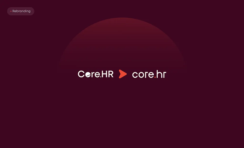
A real example. When Core.hr, an HR software company, was rebranded, the name stayed, and the busy capitalized Core.HR logotype became a calm lowercase core.hr wordmark under a rising red sun. It had to work across a web app, a mobile app and a smartwatch.
Which kind of change you need:
| Your situation | What usually fits |
|---|---|
| Your logo works, but is missing a favicon, a dark version or motion | New versions within the existing family |
| Customers recognize it, but it breaks at small sizes or looks dated | Logo refinement: redraw and simplify, keep the idea (1–2 weeks) |
| Your name, offer or audience has changed, or the logo was never properly designed | A new logo design (1–2 weeks) or a fuller rebrand; rebrand or refresh helps you decide |
How do you design a logo for a “Future” name?
Many searches for future logo design come from businesses with “Future” in their name: Future Tech, Future Star, Future Leaders, Future Doctor and similar. The same rule applies to all of them: the name already says “future,” so the logo doesn’t have to. Rockets, circuit lines, upward arrows and globes are what everyone else in the same search picks. Use the logo to show what’s specific about you instead.
- Future tech logo design. Skip the circuit board, the glowing orb and the robot head. Ask what your technology does for people, and draw that. A tech company also needs a logo that works as an app icon and on dark screens from day one (ideas 1 and 6).
- Future star logo design. A star is fine, but it’s a very common shape in logos. Make it yours: a star drawn from your initials, a specific number of points, a star built into a letter. Run the ten-competitor board test before you commit (idea 5).
- Future leaders logo design. Leadership programs and schools often reach for ladders, peaks and torches. Think about who the logo is for. A logo that a teenager would wear on a hoodie and a parent would trust on a certificate needs warmth as much as ambition.
- Future doctor logo design. For a medical school prep course, a student society, a clinic or a doctor’s personal brand, avoid the caduceus and stethoscope unless you make them distinctive, because so many medical logos already use them. Trust comes from clarity and calm color as much as from the symbol. For a personal brand, a well-drawn monogram often lasts longer than a symbol.
If the name is long, such as “Future Leaders Academy,” plan a short version from the start: an initial, a monogram or a symbol that can carry the brand where the full name won’t fit.
What does a future-proof logo look like?
| Check | Pass if |
|---|---|
| Version family | Full logo, compact, symbol and favicon all exist, and each was designed |
| One flat color, black on white and white on black | The shape still reads |
| Category board with ten competitors | It shares no shape with three or more |
| Story | You can explain the idea in one sentence |
| Process record | Sketches or construction drawings exist |
| File set | SVG, PDF and PNG in color, black and white, plus a dark version |
For the screen tests (a 16-pixel favicon, themed icons, motion with reduced motion on), use the eight checks in logo design trends 2027.
How I can help
If you’re not sure whether your logo needs new versions, a refinement or a new mark, send it over before a free 30-minute call in your time zone. I’ll go through this checklist with you and tell you plainly what it needs, including when the answer is “nothing.”
A new logo with me is a fixed package: $999 for three concepts, three revision rounds and a full file set, delivered in 1–2 weeks. Brand identity and larger packages are on the pricing page, and the logo design service page explains the process.
FAQ
What is the future of logo design?
Logos are moving from one fixed artwork to a family of versions that work at every size, on dark screens and in motion. The marks that last will be simple, built on one idea the company owns, and drawn by a person, with AI used to explore ideas rather than make the final mark.
Will AI replace logo designers?
AI will take over some of the early, fast parts of the work, such as mood boards and rough directions. It’s less suited to the final mark: generated logos tend to resemble existing ones, need to be rebuilt as vectors, and in the US prompts alone don’t make you the author of the output.
What is a dynamic logo, and do I need one?
A dynamic logo changes its color, pattern or shape by product, campaign or context around a core that stays fixed. Most small businesses don’t need one: a fixed logo with one or two approved variations does the job. It makes sense for brands with many products or campaigns.
Should I redesign my logo to look more modern?
Usually not, if customers already recognize it. Refine it so it works on today’s screens and keep what people remember. Replace it only when your name, offer or audience has changed, or when it was never properly designed.
How long should a logo last?
There’s no fixed number, but a well-designed logo is usually meant to last a decade or more, with small refinements along the way. Styles around it, such as colors, photography and campaign graphics, can change much more often.
What should a logo for a “Future Tech” or “Future Star” business look like?
It should show what’s specific about the business, not repeat the word “future” with rockets, circuits or generic stars. Plan a short version from the start, because names with “Future” in them are often long.
Sources
- LogoLounge: 2026 Logo Trend Report (Bill Gardner, June 5, 2026)
- US Copyright Office: Copyright Office Releases Part 2 of Artificial Intelligence Report (NewsNet 1060, January 29, 2025)
- Dezeen: Mastercard drops name from logo in subtle brand refresh by Pentagram (January 10, 2019)
- Dezeen: Burberry unveils "archive-inspired" charging knight logo (February 2023)
- Nation’s Restaurant News: Cracker Barrel switches back to old logo after backlash (August 27, 2025)