What Should Brand Guidelines Include? 10 Sections and a Template
Brand guidelines explained: the 10 sections to include, a free template to copy, real examples from Spotify, Mailchimp and NASA, and the formats to ask for.

Summarize with AI
Key takeaways
- Brand guidelines are the rules for using a brand: how the logo, color, type, imagery and voice are applied, so anyone can make on-brand work without asking a designer.
- Ten sections cover what most growing companies need, from the brand core to ownership. A small team can start on one page and add sections as it grows.
- Public examples show the level of detail that works: Spotify sets minimum logo sizes in pixels and millimeters, Mailchimp names its colors, and NASA’s 1976 manual reached as far as vehicle markings.
- Ask for the guide in formats people can open: a PDF to read, an editable version for non-designers and working files for designers.
- Name one person who owns the guide and approves new uses. A guide nobody owns soon describes a brand that no longer exists.
Brand guidelines are the written rules for using your brand: which logo version goes where, the exact color values, the typefaces, the photo style, the voice, and examples of each one applied. A complete set has about ten sections, from the brand core to file formats and ownership. It can be a single page for a small team or dozens of pages for a larger company. This article explains each section, gives you a free template to copy and shows real examples.
| Section | What goes in it | Who uses it most |
|---|---|---|
| 1. Brand core | Purpose, positioning, audience and personality, on one or two pages | New hires, agencies, partners |
| 2. Logo | Every version, when to use each, clear space, minimum size, misuse | Designers, printers, partners |
| 3. Color | Values for screen (HEX, RGB) and print (CMYK, Pantone), roles, text-safe pairs | Designers, developers, printers |
| 4. Typography | Typefaces, weights, hierarchy, fallbacks for Office and Google tools | Designers, sales, operations |
| 5. Imagery | Photo and illustration style, with examples that fit and examples that don’t | Marketing, photographers |
| 6. Icons and graphic elements | Icon style, patterns, shapes, grids | Designers, product team |
| 7. Voice and tone | Three to five voice traits, words to use and avoid, before-and-after examples | Anyone who writes |
| 8. Applications | The brand on real touchpoints: deck, social post, stationery, signage, web | Everyone |
| 9. Files and formats | Which file to use where, and where the files live | Everyone |
| 10. Ownership | Who approves new uses, who answers questions, when the guide is updated | The brand owner |
I’m Masuder Rahaman, a brand designer and the founder of Wolfpixel, where I lead the design team. I design brand guidelines as a standalone project and as part of every brand identity. Below, each section comes with the minimum that makes it useful, followed by a fill-in template, real guideline pages from projects we designed, and the formats to ask for.
What are brand guidelines?
Brand guidelines (also called a brand style guide, brand guide, brand manual or brand standards) are the rules a business sets for how it presents itself. Shopify describes them as rules that standardize how a business presents itself to the public, covering the visual look, messaging and voice.
They are not the same as your brand identity. The identity is the set of design decisions: the logo, the colors, the type, the imagery. The guidelines are the rules for applying those decisions, so the brand looks the same whoever uses it. How guidelines differ from a brand book, a style guide and a brand kit is set out further down.
Guidelines are written as much for people who aren’t designers as for those who are: the founder making a sales deck, the developer building the website, the printer, the agency running ads and the new hire posting on social.
What to include in brand guidelines: the 10 sections
1. Brand core. One or two pages: what the company does and for whom, the positioning in a sentence, the audience, and three to five personality traits. This isn’t the full strategy. It’s the context people need to make good choices when no rule covers their case.
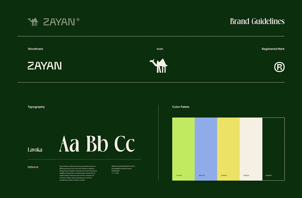
2. Logo. Every version you have (primary, horizontal, stacked, symbol, one-color, reversed), with one line on when to use each. Then the rules: clear space (often measured as a part of the logo itself, such as the height of the symbol), minimum size for screen and print, approved backgrounds, and a set of misuse examples: stretched, recolored, rotated, with effects, on a busy photo.
3. Color. Each brand color with HEX and RGB values for screens and CMYK for print, plus Pantone if you print packaging or signage that has to match. Give each color a role (lead, support, accent) and a rough proportion. Then list the text and background pairs that are safe to use. The WCAG 2.2 contrast standard asks for at least 4.5:1 for normal text and 3:1 for large text (at least 18 point, or 14 point bold), and a guide that shows approved pairs stops people putting pale text on your accent color.
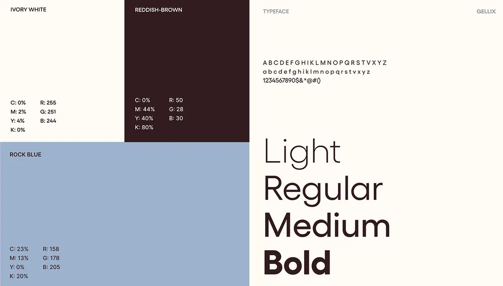
4. Typography. Usually two typefaces: one for headings, one for body text, with the weights you use and a simple hierarchy (heading sizes, body size, line spacing). Add a fallback for each, available in PowerPoint and Google Slides, because most of your company will never install the brand fonts. Note who holds the font licenses.
5. Imagery. The photo or illustration style in words (light, color, framing, subject) and in pictures: six to ten examples that fit and three or four that don’t. This is the section that keeps a brand recognizable when the logo isn’t on screen.
6. Icons and graphic elements. The icon style (line weight, corners, grid), any patterns, shapes or devices that belong to the brand, and the layout grid if the identity defines one.
7. Voice and tone. Three to five traits, each with a short “we say / we don’t say” example. A list of words you use and words you avoid. How the tone shifts between, say, a sales page and a support email.
8. Applications. The brand applied to the things you make most: a slide, a social post, a business card, an email signature, a sign, a web page. People copy examples far more often than they read rules, so this section does a lot of the work.
9. Files and formats. A short table of which file to use where (SVG on screens, vector PDF for print, PNG in documents), and the link to the shared folder where the files live. That folder is your brand kit; what goes in a brand kit lists its contents.
10. Ownership. The name of the person who approves new uses and answers questions, and how changes get made. Frontify lists governance as its own section for the same reason: a guide nobody owns goes out of date.
Two optional sections are worth adding when they apply: co-branding rules (your logo next to a partner’s) and bilingual rules if you work in two scripts, such as Arabic and English.
A free brand guidelines template to copy
Copy this table into a document or a slide deck. Fill in the “What to fill in” column and you have the skeleton of full brand guidelines. The page counts and example rules are suggestions for a growing company; a small team can cover each row in a line or two.
| Section | What to fill in | Example rule |
|---|---|---|
| 1. Brand core (1–2 pages) | Purpose, positioning sentence, audience, 3–5 personality traits | “Scheduling software for dental practices. Calm, exact, helpful.” |
| 2. Logo (3–6 pages) | Versions and when to use each, clear space, minimum size, misuse | “Symbol only below 24 px wide. Clear space = symbol height.” |
| 3. Color (2–3 pages) | HEX, RGB, CMYK (and Pantone), roles, proportions, text-safe pairs | “Black text on yellow: yes. White text on yellow: no.” |
| 4. Typography (2–3 pages) | Heading and body typefaces, weights, sizes, fallbacks, licenses | “Headings: brand font Bold. Fallback: Arial Bold.” |
| 5. Imagery (2–4 pages) | Style in words, 6–10 do examples, 3–4 don’t examples | “Real customers in daylight. No staged handshakes.” |
| 6. Icons and graphics (1–2 pages) | Icon style, patterns, shapes, grid | “2 px line icons, rounded corners, on a 24 px grid.” |
| 7. Voice and tone (2–3 pages) | 3–5 traits with examples, words to use and avoid | “Say what it does before why it matters.” |
| 8. Applications (4–10 pages) | Deck, social post, stationery, signage, web examples | “Every deck uses the title-slide template.” |
| 9. Files and formats (1 page) | Which file goes where, folder link | “SVG for web, vector PDF for print, PNG for slides.” |
| 10. Ownership (1 page) | Brand owner, approval process, review date | “New uses approved by the marketing lead. Reviewed each January.” |
If you only need the short version, my one-page brand guidelines article has a seven-row template built for a team of five with no designer on staff.
How long should brand guidelines be?
Long enough that people can make on-brand work without asking, and no longer. A creative director quoted by Shopify says full brand guides run 15 to 80 pages, and the examples in that article range from 23 to 44 pages.
A practical way to size yours:
| Your situation | Length that usually works |
|---|---|
| Founder plus a few people, no in-house designer | One page plus templates |
| A team of 10–50, a freelancer or agency helping | 15–30 pages |
| Several teams, agencies, products or markets | 30–80 pages, often split into modules |
| Product teams building from the brand | Guidelines plus a design system or design tokens |
More pages don’t make a better guide. A short guide people can search is more useful than a long one nobody opens.
Brand guidelines examples: Spotify, Mailchimp and NASA
Many large companies publish their guidelines. These three each teach one thing worth copying.
| Example | What it does well | What to copy |
|---|---|---|
| Spotify design guidelines | Exact minimums: the logo 70 px on screen or 20 mm in print, the icon 21 px or 6 mm | Give minimum sizes as numbers, for the full logo and the symbol |
| Mailchimp brand assets | Plain rules for outsiders: named colors (Cavendish Yellow, Peppercorn), a reverse logo, please-do and please-don’t lists | Name your colors and give each a role |
| NASA Graphics Standards Manual (1976) | One system for publications, vehicle markings, signboards and the logotype | Include applications, not only the logo page |
Spotify also limits its green logo to black or white backgrounds and asks for a one-color logo everywhere else. A rule that specific leaves nothing to guess.
The guidelines we designed for ROMO Logistics, a transport company, show the applications side: a social section with ready post layouts, a typography section with sizes, line height and letter spacing for each text style, and a photography section with approved images.
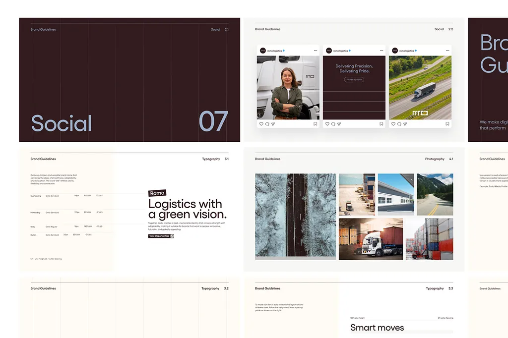
You can see the full project in the ROMO Logistics case study.
Brand guidelines vs style guide, brand book and brand kit
These terms overlap, and sources use them differently. This is how I use them, and how they usually differ when people separate them:
| Document | Answers | Used by |
|---|---|---|
| Brand guidelines | How to apply the brand | Anyone making brand materials |
| Brand book | Why the brand is what it is, and how to apply it | Leadership, new hires, agencies |
| Style guide | How to write (sometimes also visual rules) | Writers and editors |
| Brand kit | Where the files are | Anyone who needs a file today |
The story and strategy pages are covered in what a brand book is, and the folder of files in the brand kit article. If you haven’t decided whether you need guidelines yet or only a logo, see logo, identity or guidelines. The full list of files a designer should hand over is in the brand identity deliverables checklist. Many companies combine all four into one set of guidelines, with a story section at the front and a link to the file folder at the back. For a startup, that’s usually the right call.
What format should brand guidelines be in?
A guide people can’t open is a guide nobody follows, so ask for more than one format. Each serves a different person:
- PDF: for reading and sharing with anyone, including printers and agencies.
- PowerPoint (or Google Slides): an editable version for sales, operations and anyone without design software.
- Illustrator or Figma working files: so a designer can update the guide later instead of rebuilding it.
- A Figma library: the logo, colors, type styles and components, ready for designers to build with.
- An online brand hub: useful when many teams and agencies use the brand; overkill for most startups.
That’s why the brand guidelines I hand over come as PDF, PowerPoint and Illustrator files plus a Figma library with source files.
How to create brand guidelines in six steps
- Collect what exists. Every logo file, color value, font and template already in use, plus five recent pieces that looked off.
- Agree the brand core. Positioning, audience and personality, in plain sentences. Without this, the rules have nothing to point back to.
- Decide the rules. Logo versions and limits, the color system with text-safe pairs, the type hierarchy, imagery and voice.
- Show it applied. Build the applications your team makes every week, so people can copy rather than interpret.
- Package it in the right formats. A PDF, an editable version, working files and one shared folder.
- Test it, then name an owner. Ask someone who wasn’t involved to make a slide and a social post from the guide alone. Every question they ask is a missing rule. Then name one person who approves new uses.
Brand guidelines mistakes to avoid
- Rules with no examples. “Use plenty of white space” means nothing until it’s shown.
- Only the logo on white. Real use is photos, dark screens, partner slides and circle crops.
- No fallback fonts. The team uses Arial and nobody knows it’s wrong.
- No text-safe color pairs. Light text on the accent color in every deck.
- Files somewhere else. The guide says “use the horizontal logo,” but nobody can find it.
- No owner and no review date. The guide describes a brand that no longer exists.
You may see the claim that consistent brands earn 23% more revenue. It comes from Marq’s own research; Marq sells brand-management software, and the article gives no sample size or method. The case for guidelines doesn’t need that number. They save the time spent answering the same questions, and they stop the slow drift that makes one brand look like several companies.
Get brand guidelines designed for your brand
If you already have a logo and colors, brand guidelines on their own take 1–2 weeks, with 3 revision rounds and weekly check-ins in your time zone. You get them as PDF, PowerPoint and Illustrator files plus a Figma library, with full ownership of all final files. The price is set in a fixed written proposal after a free 30-minute call.
If you don’t have an identity yet, the brand identity package ($3,499, 2–3 weeks) includes brand guidelines, and a bilingual Arabic and English version costs the same. Book a free 30-minute call and bring three things your team made recently that looked slightly off. They show which rules are missing.
FAQ
What should brand guidelines include?
Ten sections cover most companies: brand core, logo, color, typography, imagery, icons and graphic elements, voice and tone, applications, files and formats, and ownership. A small team can start with the logo, color, type, voice and a short list of do’s and don’ts on one page.
Is there a free brand guidelines template?
Yes. The template table in this article lists each of the ten sections, what to fill in, a typical page count and an example rule. Copy it into a document or a slide deck and replace the examples with your own.
How many pages should brand guidelines be?
One page can be enough for a founder and a few staff; a company with several teams and agencies may need 30 to 80. A creative director quoted by Shopify puts full guides at 15 to 80 pages.
What is the difference between brand guidelines and a style guide?
Many people use the terms interchangeably. When they’re separated, brand guidelines cover the whole brand (visual and verbal), while a style guide often covers writing only: grammar, terms, tone and formatting.
What are good brand guidelines examples?
Spotify’s design guidelines show exact minimum logo sizes and background rules. Mailchimp’s brand assets page names its colors and gives outsiders plain do’s and don’ts. NASA’s 1976 Graphics Standards Manual applies one system to everything from publications to vehicles.
What format should brand guidelines be in?
A PDF for reading, an editable version (PowerPoint or Google Slides) for non-designers, and working files (Illustrator or Figma) so the guide can be updated. A Figma library helps designers build from it.
How long does it take to create brand guidelines?
When the logo and colors already exist, I deliver standalone brand guidelines in 1–2 weeks. A full brand identity, which includes guidelines, takes 2–3 weeks.
Sources
- W3C: Understanding WCAG 2.2, Contrast (Minimum)
- NASA: NASA Graphics Standards Manual (2015 post about the 1976 manual)
- Spotify for Developers: Design guidelines
- Mailchimp: Brand assets
- Shopify: Brand Guidelines: How to Create a Style Guide (30 September 2026)
- Frontify: Brand Guidelines: What They Are & How to Create Them
- Marq: Branding essentials: Guide to creating a brand book (28 September 2026)