- Industry
- Data management
- Year
- 2025
- Scope
- Logo, type, illustration, app UI
- Applications
- App, social, signage, badges
Industry
Data management
Year
2025
Scope
Logo, type, illustration, app UI
Applications
App, social, signage, badges
The brief
A tech service that helps startups and enterprise clients regain control of their data.
The name joins “Pivot”, for agility and central coordination, with “Thesis”, for a structured, data-driven foundation.
The mark
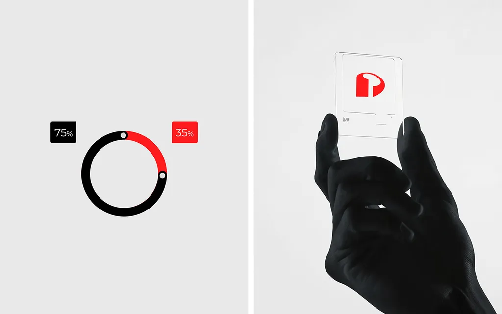
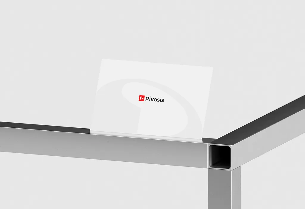
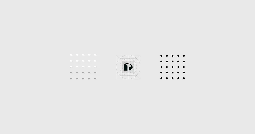
A solid P drawn on a construction grid and set in a red square beside the Pivosis wordmark.
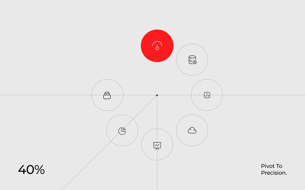
Grids of dashes and dots come from the same system, and a large outline of the P runs across cards and badges.
Color & type
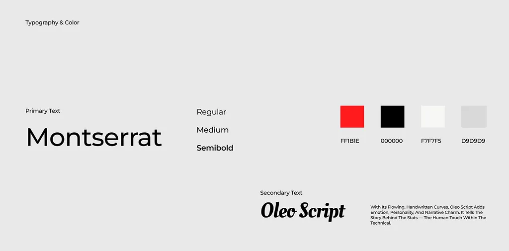
Signal red, black and two soft grays, with Montserrat for clear, technical reading.
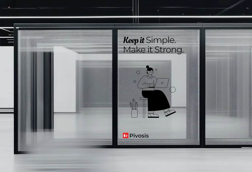
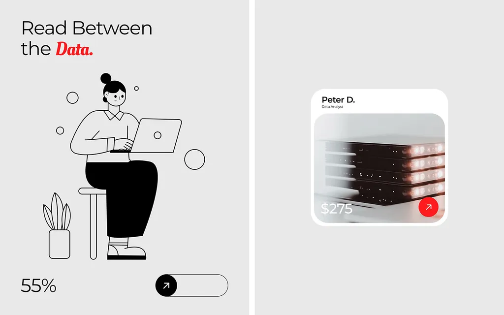
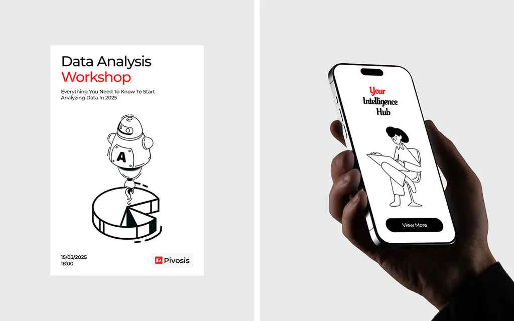
Oleo Script adds a handwritten accent to lines like “We Turn Signals Into Success” and “Read Between the Data.”: the human touch within the technical. Simple line drawings of people at work carry the same idea.

App & product
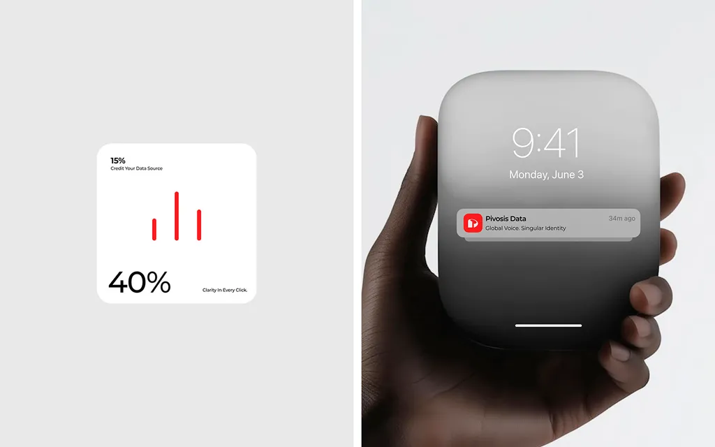
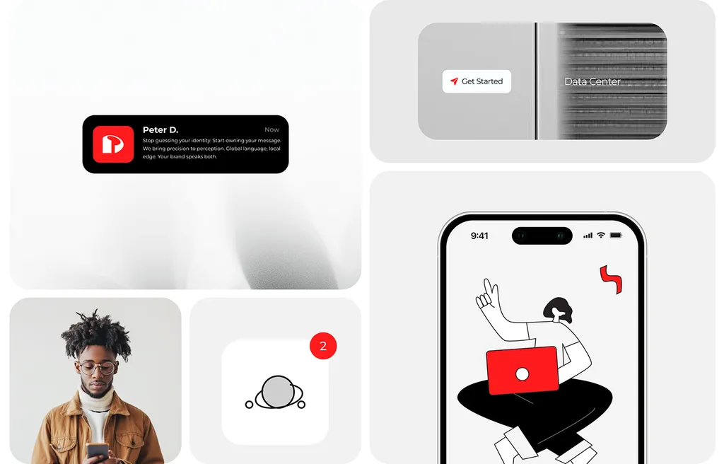
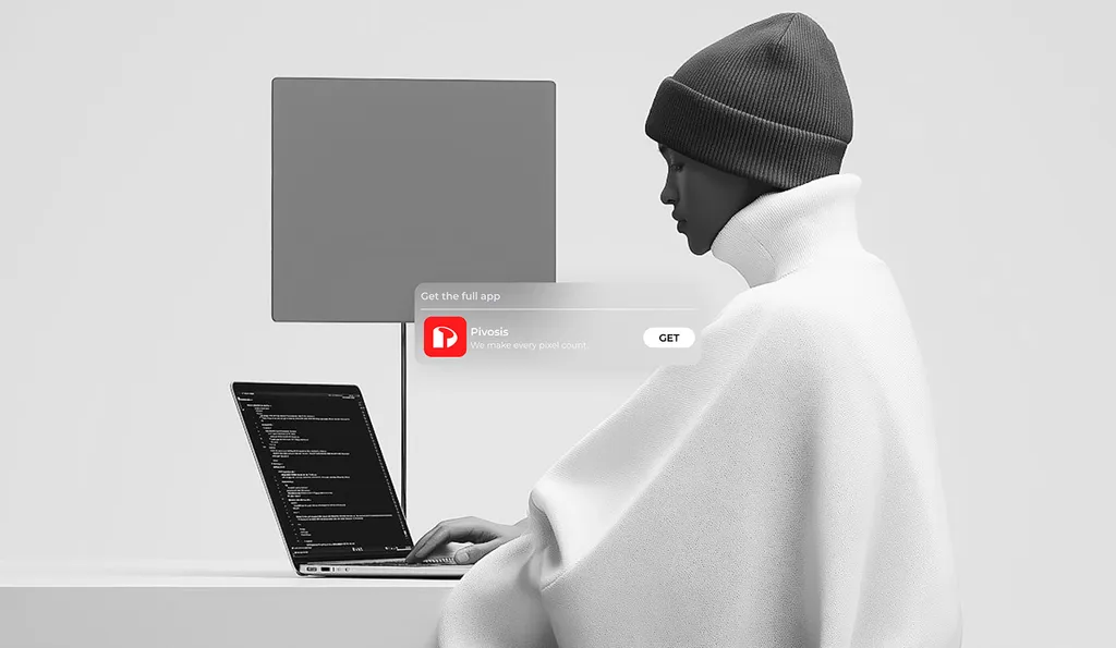
Widgets, notifications and app screens turn data into short, clear cards.
The red app icon and black line drawings carry the brand from the lock screen to events like the “Data Analysis Workshop”.
Brand in use
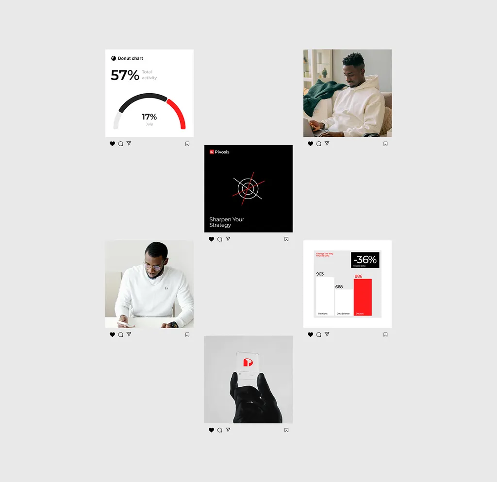
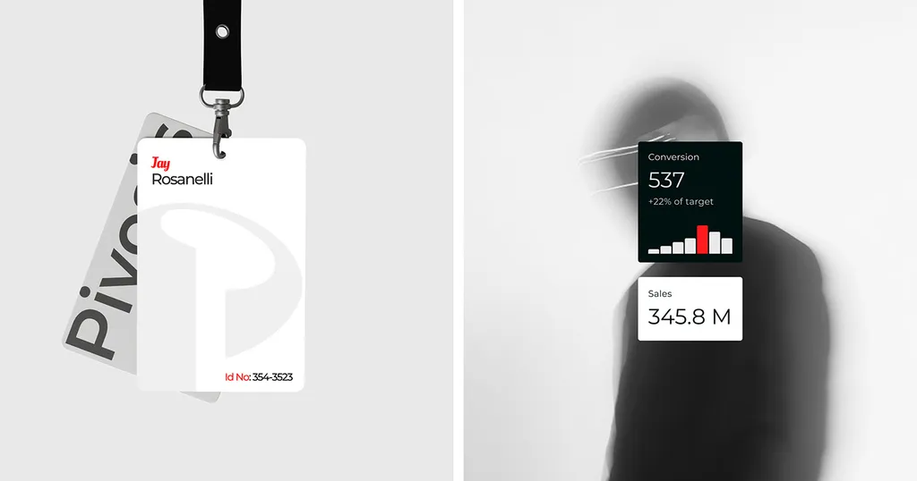
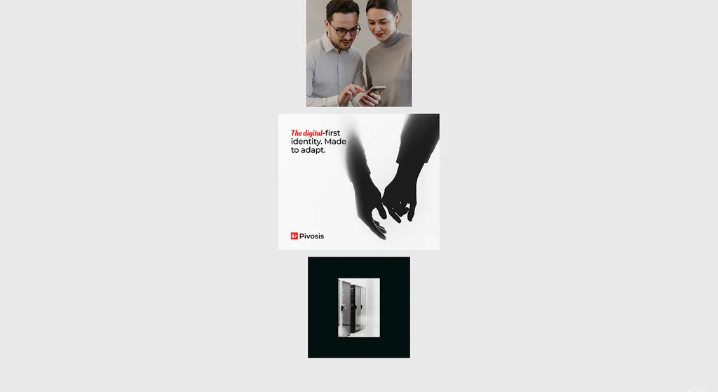
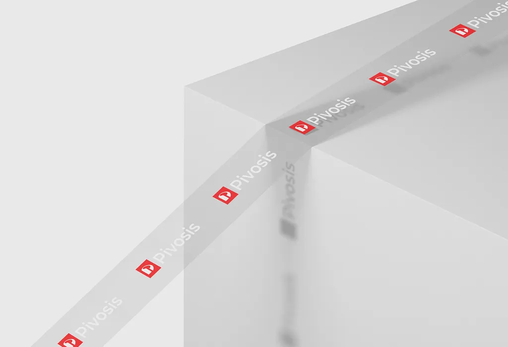
Social posts, staff badges and branded tape in the same red, black and gray.
The posts carry the line “The digital-first identity. Made to adapt.”
What we delivered
- Logo & mark
- Color & typography
- Icons & illustration
- App & widget UI
- Social media posts
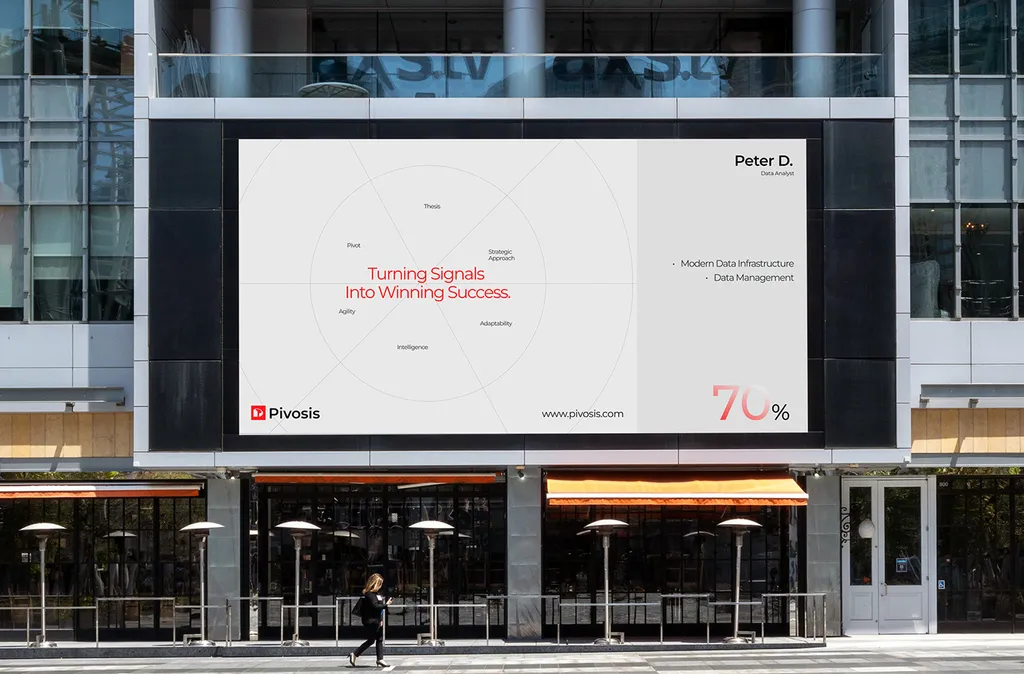
- Billboard & office graphics
Data management branding questions
Straight answers before you book a call.
What makes a good data company logo?
A simple mark with a system around it, so it works from an app icon to a billboard. Pivosis has a solid P drawn on a construction grid and set in a red square. Grids of dashes and dots and a large outline of the P come from the same system, so cards, badges and widgets feel related without repeating the logo everywhere. A logo project takes 2–4 weeks.
What colors work for a tech or data brand?
One strong signal color and quiet neutrals, so charts and text stay readable. Pivosis uses signal red (FF1B1E) with black and two soft grays (F7F7F5 and D9D9D9). Red picks out the key mark, bar or icon, while black and gray carry text, grids and line drawings. A tight palette like this works from a city billboard down to a small app widget.
What does a data company brand identity include?
For Pivosis: the P mark and its grid system, color and type, line illustrations, data icons, app widgets and notifications, social posts, a billboard, staff ID badges and branded tape. Montserrat keeps the data clear, and Oleo Script adds a handwritten, human accent. A brand identity takes 4–10 weeks, and after a free 30-minute call you get a fixed written proposal.
How much does data company brand identity cost?
It depends on scope: strategy, logo, guidelines and the applications you need, such as signage, packaging or a website. After a free 30-minute call you get a written quote for your exact scope. Our guide to brand identity pricing explains what drives the cost.
How long does a brand identity project take?
A focused logo project takes a few weeks. A full identity with guidelines and launch assets takes longer. You get a clear timeline with your quote, before any work starts.
Do you work with data and SaaS founders in the US and the Middle East?
Yes. We work with founders across the US and the Middle East, with calls in your time zone and files your team can use from day one.
What do we get at the end of the project?
A logo and mark, color and typography, brand guidelines and organized master files, plus any website, packaging or launch assets in your scope.
Related topics 25
- Pivosis branding
- Data company brand identity
- Data company branding
- Data management branding
- Data analytics branding
- Data platform branding
- Data infrastructure branding
- Tech company brand identity
- Tech company branding
- Tech company visual identity
- IT company branding
- B2B tech branding
- SaaS brand identity
- Data company logo design
- Data analytics logo design
- Data management logo
- IT company logo design
- SaaS logo design
- Letter P logo design
- Tech brand illustration
- App widget design
- Office branding design
- Data company brand color palette
- Data company brand typography
- Data company branding case study
Building a data or SaaS brand?
Let’s talk about yours.
A free 30-minute call in your time zone, then a written quote for your scope.
More saas & tech
brands
Brand identities and rebrands for software, data, e-learning and cybersecurity companies, carried through to the product UI and website.