Building a Brand Identity From Scratch: 9 Steps for Founders
How to build a brand identity from scratch in nine steps: brief, competitor audit, positioning, name checks and voice, then the logo system, color and type, real-world tests and guidelines.

Summarize with AI
Key takeaways
- Build the identity in the order strategy, name, design, rules. Most weak identities start at step 6 and skip the first five.
- Check the name before anyone draws a logo. A trademark search and a domain check cost little; renaming after launch costs a lot.
- A logo is a system, not one file: a primary version, other layouts, a small symbol, and versions for light and dark backgrounds.
- Test every color pair for contrast (WCAG asks for at least 4.5:1 for normal text) and check that you’re allowed to use your fonts commercially.
- Founders can do steps 1 to 5 themselves. Steps 6 to 9 are where a designer earns the fee.
To build a brand identity from scratch, decide what the brand stands for before you design anything. Write a short brief, look hard at your competitors, put your positioning in one sentence, and check that your name is free to use. Only then design the logo system, color and type, test them on the places your brand will actually appear, and write it all down in guidelines.
| Step | What you end up with | Who usually does it |
|---|---|---|
| 1. Write a one-page brief | Who it’s for, the problem, the competitors, the budget | You |
| 2. Audit your category | A wall of competitor screenshots and the gap nobody owns | You, or a designer |
| 3. Write your positioning | One sentence your design must prove | You, with help if stuck |
| 4. Clear the name | A name with the domain and a trademark search checked | You and your lawyer |
| 5. Set personality and voice | Three words, plus “we say / we don’t say” lines | You |
| 6. Design the logo system | A primary logo, other layouts, a symbol and color versions | A designer |
| 7. Choose color and type | A palette that passes contrast checks, and licensed fonts | A designer |
| 8. Test it on real uses | Mockups on your sign, app icon, deck and social posts | A designer |
| 9. Write the guidelines and hand over | A rule book and a complete file set you own | A designer |
I’m Masuder Rahaman, a brand designer and the CEO and founder of Wolfpixel, where I lead a design team for founders in the US and the Middle East. My own process runs in four stages: Discovery, Strategy, Identity, and System and handover. The nine steps below are that process, broken down so you can follow it with or without a designer. Where a step has its own detailed guide on this site, I link to it rather than repeat it.
What is a brand identity, and what are you actually building?
A brand identity is the set of visible and verbal parts people use to recognize your business: the logo system, color, typography, imagery, voice and the guidelines that hold them together. It isn’t your brand, which is what people think of you, and it isn’t just your logo, which is one part of the identity.
That distinction tells you what “from scratch” means. You’re not just making a logo. You’re making the decisions behind it, the parts around it and the rules that keep it consistent when someone else uses it. What a brand identity includes lists every element, and which ones a startup needs first.
Step 1: What should go in a brand brief?
A one-page brief answers five questions before any design starts. Write it even if you’re the only person reading it.
- Who is it for? One specific customer, not “everyone.” What do they buy now instead of you?
- What problem do you solve? In their words, not yours.
- Who are your three to five closest competitors? Name them.
- Where will the brand appear first? A shop sign, an app, packaging, a sales deck, social. This decides what the logo must survive.
- What’s the budget and the deadline? A launch date, a funding round or a trade show changes how you plan.
If you’ll sell in the Gulf, add a sixth: does the brand need Arabic? It changes the name, the logo and the type from the first sketch. Designing a bilingual brand in Arabic and English explains why it’s cheaper to plan for it at the start.
Step 2: How do you audit your competitors’ branding?
Screenshot your five closest competitors’ websites, logos, social profiles and packaging, and put them side by side on one wall or one board. Then look for patterns:
- Color. If every competitor is blue, blue says “this category,” and another color says “not like the others.”
- Type. Is the category all clean sans-serif, or all serif and traditional?
- Symbols. Are the logos all shields, leaves, waves or initials?
- Voice. Formal and technical, or plain and friendly?
You’re looking for the space nobody owns that still makes sense for you. Write down the two or three conventions you’ll keep, so customers know what you sell, and the one you’ll break, so they remember you.
Step 3: How do you write a positioning statement?
Positioning is one sentence that says who you’re for, what you do and why you’re the better choice. A common format is: For [audience] who [need], [brand] is the [category] that [main benefit], because [proof].
It’s the step most founders skip and the one that makes design decisions easy. When you’re choosing between two logo concepts, the positioning decides, not taste. The full method, with a template, examples and a test, is in how to write a positioning statement. If you want to go further, the brand strategy template covers audience, values, personality and messaging.
Step 4: How do you check a brand name before you design?
Check the name before the logo, because a logo drawn around a name you can’t use is wasted. Three checks, in this order:
- Trademark search. Search the official register in each market you’ll sell in: the USPTO’s trademark search in the US, the UK trade mark search in the UK, the Ministry of Economy and Tourism’s trademark service in the UAE, and SAIP in Saudi Arabia. Look for the same or similar names in your class of goods or services. A search you do yourself is a first filter; ask a trademark lawyer before you file.
- Domain and social handles. Check the domain you want and the handles on the platforms you’ll use.
- Say it out loud. Can a customer spell it after hearing it once? If you’ll sell in the Gulf, agree the Arabic spelling with native speakers now.
If you’re changing an existing name, how to rename a company covers the rest of the checks.
Step 5: How do you define brand personality and voice?
Pick three words that describe how the brand should feel, and make them specific enough to rule things out. “Professional” rules out nothing. “Calm, plain-spoken, confident” rules out jargon, exclamation marks and stock photos of handshakes.
Then write a few lines of “we say / we don’t say”:
| We say | We don’t say |
|---|---|
| “Your books, done by the 5th of every month.” | “Revolutionary financial solutions for a better tomorrow.” |
| “Call us. A person answers.” | “Reach out to our dedicated support team.” |
Those lines guide the website copy, the social captions and the designer’s choices. A calm, plain-spoken brand doesn’t get a jagged display font.
Step 6: What should a logo system include?
A logo system includes at least a primary logo, a horizontal or stacked layout, a small symbol or icon, and versions in full color, one color and reversed (light on dark). One logo file isn’t enough, because no single layout fits a wide website header, a square social avatar and a 16-pixel browser tab.
This is where a designer earns most of the fee. A designer starts from the positioning, sketches many ideas, and presents a small number of strong concepts on real uses rather than dozens on a white background. How many logo concepts to expect explains why three good concepts beat ten weak ones, and the logo design process walks through each stage from brief to final files.
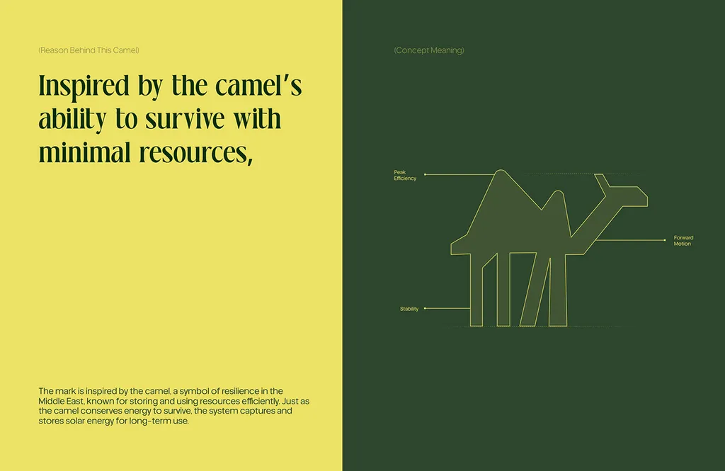
A real example: for ZAYAN, a solar company, the identity started from a brief to help homes and businesses cut high electricity costs. The symbol came from one idea, the camel’s ability to survive with minimal resources, because good solar does more with less. That idea came from the strategy, not from a list of solar logos.
Step 7: How do you choose brand colors and fonts?
Choose a small palette and a type system, then check both against practical rules before you fall in love with them.
Color. Most identities need one or two main colors, a few supporting ones, and neutrals for backgrounds and text. Check every text and background pair for contrast: the W3C’s accessibility standard, WCAG, asks for a contrast ratio of at least 4.5:1 for normal text and 3:1 for large text at level AA. A lovely pale brand color that fails that test can’t be used for text on your website. Define each color in HEX and RGB for screens and CMYK for print, plus Pantone if you’ll print packaging or signs.
Type. Most brands need one or two typefaces: one with personality for headlines, one easy to read for body text. Check the license before you choose. Google Fonts are open source and free, and its FAQ says you can use them commercially, under each font’s license (most often the SIL Open Font License). A paid typeface comes with its own license, so check that it covers your logo, website and app. If you need Arabic, choose a pair that works in both scripts. How to choose brand fonts covers pairing and licensing in detail.
ZAYAN’s palette, for example, is spring lime, deep camouflage green, chalk blue, pearl and mustard, with Lavoka for headlines and Helvetica for text. A sunny lime is unusual for an energy company, and that was the point. (More on this category in renewable energy branding.)
Step 8: How do you test a brand identity before you launch?
Put the identity on the things your customers will actually see, before you approve it. Use the list from your brief (step 1, question 4):
- The smallest size. The app icon, the browser tab, the social avatar. Does the symbol still read?
- The hardest background. Your logo on a photo, on your darkest color, on a busy shop street.
- Your real content. A real social post with your real copy, a real slide from your pitch deck, a real product label.
- One color. A stamp, an embroidered shirt, a photocopied form. Does it survive without color?
Most problems show up here, and they’re cheap to fix now and expensive after you’ve printed. A good designer shows you concepts on these uses from the first presentation.
A second example: Tong, a coffee shop, built its identity around one line, “Coffee isn’t just a drink, it’s an adventure.” It was designed for its real uses from the start: red cups, wrapping paper, bags and boxes that are easy to spot in a hand or on a street, plus the shopfront, the bar and the merch.

Step 9: What goes in brand guidelines and the final handover?
Brand guidelines are the rule book: how to use the logo (clear space, minimum size, what not to do), the color values, the type sizes, the image style and the voice, with examples. Without them, the next person who makes a flyer will guess, and in a year your brand will look like five brands.
For a small team, a short, practical guide beats a beautiful 80-page PDF nobody opens; brand guidelines for a small team shows what to keep. For the full list of sections, see brand guidelines.
The handover is the files: every logo version in vector (SVG, PDF) and raster (PNG) formats, the color values, the fonts or links to license them, and the source files. Make sure you own them in writing once you’ve paid. Logo file formats covers which file goes where, and the brand identity deliverables checklist lists what to verify before you sign off.
Which steps can you do yourself, and when should you hire a designer?
You can do steps 1 to 5 yourself, and you should: nobody knows your customers, your competitors and your ambitions better than you. A good brief and a clear positioning statement also make any designer faster.
Steps 6 to 9 are craft. A logo that works at 16 pixels and on a billboard, a palette that passes contrast checks, a type system that holds up in two scripts, and guidelines your team will actually use take skill and practice. Logo makers and AI tools can give you a starting image, but not a system; if you’ve already got one, fixing an AI-generated logo shows what a redraw involves.
With a designer, a logo usually takes 1–2 weeks and a full brand identity 2–3 weeks in my projects. How long a brand identity takes has a week-by-week plan, and the brand identity cost guide has market prices in the US, the UK and the Gulf.
What are the most common mistakes when building a brand identity?
- Starting with the logo. Without a brief and positioning, you’re choosing on taste, and taste changes.
- Skipping the name checks. A trademark conflict after launch can force a rename.
- Copying the category leader. You’ll look established, and forgettable.
- Too many colors and fonts. Each extra one makes the brand harder to apply consistently.
- Approving on a white background. Test on real uses (step 8) before you sign off.
- Leaving Arabic for later. In the Gulf, a typed Arabic name under a finished English logo usually looks like two brands.
- No guidelines. The identity drifts the first time someone else designs a flyer.
Build your brand identity with me
My brand identity package covers steps 2 to 9 with you: strategy, four concepts shown on real uses, color and type, guidelines as PDF, PowerPoint and Illustrator files, and a Figma library, with unlimited revisions within the agreed scope. It costs $3,499 and takes 2–3 weeks. If you only need the mark for now, the logo design package is $999 and takes 1–2 weeks, and it’s credited if you upgrade to the identity later. Arabic and English versions come at the same package price. You get full ownership of all final files; you buy the font licenses, and your lawyer files the trademark with clean files from me. The pricing page has the full list.
Bring your brief, even a rough one, to a free 30-minute call in your time zone, and I’ll tell you which steps you’ve already covered and what’s left.
FAQ
In what order should you build a brand identity?
Strategy first, then the name, then the design, then the rules: a brief, a competitor audit, positioning, name checks and voice, followed by the logo system, color and type, tests on real uses and guidelines. Doing the strategy steps first makes the design faster and easier to judge.
Can I build a brand identity without a designer?
You can do the strategy yourself: the brief, the competitor audit, positioning, name checks and voice. The logo system, color and type, testing and guidelines are craft work, and that’s where most DIY identities fall short. If budget is tight, do the strategy yourself and hire a designer for the logo first.
What comes first, the logo or the brand strategy?
The strategy. The logo should express your positioning, so it has to come after it. A logo made first ends up being chosen on taste, and is often replaced within a couple of years.
What’s the difference between a brand and a brand identity?
Your brand is what people think and feel about your business. Your brand identity is the set of parts you control to shape that: the logo system, color, type, imagery, voice and guidelines.
How short can brand guidelines be for a small business?
A few pages are enough to start: logo use, colors, fonts and voice. Even that stops the brand drifting when someone else makes a flyer, a post or a slide.
Which brand identity steps are worth paying a designer for?
The logo system, color and type, testing on real uses and the guidelines. Those are craft work. The brief, competitor audit, positioning, name checks and voice are steps you can do yourself, and they make the designer’s work faster.
Sources