Manufacturing Company Logo Design: Built for Hard Hats
Manufacturing company logo design for hard hats, workwear, nameplates and trucks: how each is made, eight industrial logo rules, and a production test.

Summarize with AI
Key takeaways
- An industrial logo is reproduced by processes with hard limits: pad printing, embroidery, engraving, stencils, vinyl and paint. Design for those, not for a screen.
- Start with a one-color version. If it only works in full color or with a gradient, it is not finished.
- Draw for thickness and openness: strokes that stitch and engrave cleanly, counters that do not fill in, no hairlines.
- Have a short mark (a monogram or symbol) for hard hats, nameplates, app icons and embroidery on a chest.
- Check your brand colors against your plant’s safety colors, and leave flags and map outlines out unless your product qualifies.
- Gears, wrenches, globes and swooshes identify the category, not the company. Start from the name, the process or the product instead.
Good manufacturing company logo design starts from where the logo lives. A manufacturer’s logo spends most of its life on things that are printed, stitched, engraved or painted, not on screens: a pad-printed hard hat, an embroidered work shirt, a laser-engraved nameplate on a machine, a stencil on a crate, vinyl on a forklift, a sign above a loading dock. Each of those processes punishes gradients, fine lines and tiny lettering. So design the mark to survive the hardest of them first: one solid color, strokes thick enough to stitch and engrave, open shapes that do not fill in, and a short version for small curved surfaces. Then keep it away from the colors your plant already uses for safety, and avoid flags or map shapes that make an origin claim you cannot back up. A logo that passes those tests will also look fine on Instagram. The reverse is rarely true.
I’m Masuder Rahaman, a brand designer and the founder of Wolfpixel, where I lead the design team. I design logos and brand identities for industrial and B2B companies in the US and the Gulf, remotely. I should be clear up front: I have no published case study for a factory. My closest published work is in logistics, construction and energy, such as ZAYAN, a solar brand shown on a fleet and uniforms, and I use two of those projects below for what they show about physical touchpoints.
Why is a manufacturing logo different?
A manufacturing logo is judged off-screen, on surfaces made by suppliers with hard limits. Most logo advice assumes the logo’s main home is a website and a social profile. For a manufacturer, those are a small share of where buyers, staff and visitors meet it. Engineers and purchasing managers meet you on spec sheets, catalogs, quotes and trade-show stands, which is why the B2B brand strategy guide treats those documents as brand. Your own people wear it on hard hats, vests and shirts. Customers see it on the nameplate of a machine, a stamped part, a crate or a pallet label. The town sees it on the trucks and the sign at the gate.
Two things follow. First, most of those surfaces are made by suppliers using processes with real limits, often by people who never speak to your designer. Second, they last. A sign, a nameplate or a truck livery may stay in place for years, so a logo that dates quickly is expensive to replace.

How are industrial logos printed, stitched and engraved?
Each surface has its own method, and each method sets limits on the logo:
| Surface | Usual method | What the logo needs |
|---|---|---|
| Hard hats | Pad printing, sometimes a decal | A compact one- or two-color mark that reads on a curved shell |
| Hi-vis vests | Screen print or heat transfer on the garment | A small logo placed where it does not reduce the visible background or reflective tape |
| Shirts, jackets, caps | Embroidery | Thick strokes, open shapes, a short mark for the chest |
| Nameplates and parts | Laser engraving, chemical etching, stamping, embossing, molding | A mark that reads as a single outline or a single fill |
| Crates, pallets, drums | Stencil or rubber stamp | A version with bridges, or shapes that are not fully enclosed |
| Trucks, forklifts, vans | Cut vinyl or printed wrap | Bold forms, high contrast, a horizontal lockup |
| Machines and guards | Powder coat or paint, plus decals | A paint or powder-coat reference for each brand color |
| Plant signs | Fabricated letters, panels, illuminated boxes | Simple forms, generous letter spacing, a lit version |
| Spec sheets, catalogs, quotes | Office printing, often black and white | A black-only version that holds |
A few practical notes from suppliers’ own specifications. Pyramex, a safety equipment maker, says it can print up to four colors on hard hats and prefers vector files; when a fade needs more than four pad-print colors, it offers a solid-color logo instead. Custom Ink recommends embroidered text at least 0.25 inches tall and 0.05 inches thick, and says gradients cannot be stitched. Laser engraving comes out in one tone. That is the general pattern across workwear and PPE decoration. Plan for it instead of discovering it on the first proof.
8 rules for industrial logo design
The rules follow from those methods: design for the coarsest process first, and the mark will hold up on everything else.
- One color first. Draw and approve the one-color version before you add color. Engraving, stamping, stencils and many vinyl jobs are one color by nature. If the mark depends on color to be read, it fails on half your surfaces.
- Thickness over finesse. Hairlines vanish in embroidery and engraving and break up on a stencil. Thin serifs in small text fill in. Draw strokes with enough weight that they survive the coarsest method you will use, usually embroidery or a stencil.
- Open counters and generous gaps. The enclosed spaces inside letters and shapes (the hole in an O, the gap in a monogram) fill in with thread and ink. Keep them open and keep the gaps between elements wide enough to survive small sizes.
- A short mark. Most manufacturers need a full lockup (name and symbol) and a short mark (a monogram or the symbol alone). The short mark goes on the hard hat, the nameplate, the shirt chest, the app icon and the favicon.
- A stencil-safe version. If you mark crates, drums or pallets, design a stencil version with bridges, or shapes that do not fully enclose, so no piece falls out of the stencil.
- A horizontal lockup for vehicles and signs. Trucks and fascias are long and short. A stacked logo shrinks to fit and loses distance legibility. The same rule drives HVAC logo design, where the van is the company’s biggest sign.
- Paint and powder-coat references. Screen colors and ink references do not cover paint. Specify each brand color for print, for screen and as a paint or powder-coat reference, and approve them on physical samples. The industrial and B2B page makes the same point: the same blue can look different as paint on a product, vinyl on a truck and ink on a spec sheet.
- Reversed and on-color versions. Your logo will appear white on dark trucks, dark on hi-vis yellow and in one color on a safety-orange panel. Test each.
Which safety and labeling rules affect an industrial logo?
Three sets of rules change the mark itself: safety colors, origin claims and hi-vis garment standards. The industrial and B2B page has the wider list, with sources.
Safety colors already have a job. OSHA’s safety color code makes red the basic color for fire protection equipment, danger and emergency stops, and yellow the basic color for caution and physical hazards. If your brand color is red or yellow, decide how the logo sits next to safety markings on the plant floor, on machine guards and on signs, so nobody mistakes a brand panel for a warning or the other way round. A brand color does not have to avoid red or yellow; it has to be distinct from the safety use in shade and in where it appears.
Flags and maps can be claims. The FTC says that, depending on the context, US flags, map outlines or references to US factories may imply a Made in USA claim. Under its 2021 Made in USA Labeling Rule, an unqualified Made in USA label on a product that is not all or virtually all made in the US, including in catalogs or online, can bring civil penalties. If any parts are imported, keep the flag out of the logo, and ask your lawyer before you add one.
Hi-vis garments have their own rules too. ANSI/ISEA 107 sets minimum areas of visible background and retroreflective material for each class of high-visibility garment, and a logo that covers too much of either can make the garment non-compliant. Keep logos small and placed where the garment supplier confirms they do not affect compliance, and let the supplier handle the decoration.
General information, not compliance advice. Your safety lead, garment supplier and lawyer confirm what applies to your products and site.
Industrial logo ideas better than a gear
Search for “industrial logo ideas” and you will see the same symbols: gears, cogs, wrenches, hammers, bolts, globes, factory roofs with smokestacks, and swooshes. They say “manufacturing” the way a sparkle says “AI”: they identify the category and nothing about you. Most of your competitors already use one. Look in four other places.
- The name. Many of the strongest industrial marks are a well-drawn wordmark or a monogram cut from the name. A monogram built on a strict grid is also the easiest mark to engrave, stitch and stencil.
- The process. What does your plant actually do? Cast, cut, bend, press, weld, extrude, coat, assemble. The shape of a die-cut, a folded sheet, a weld bead or an extrusion profile can be a mark nobody else in your category has.
- The product. A cross-section, a profile, a connector or a fastener drawn as a simple form can be distinctive if it is yours and nobody else’s.
- The heritage. A founder’s name, a founding year or a place can anchor a mark for a long-established firm. If customers already recognize something in your current logo, the industrial page explains when a refresh that keeps it beats a full rebrand.
For the general choice between a wordmark, a monogram and a symbol with a wordmark, see startup logo design; the three routes apply to manufacturers too.
Industrial logo examples from my work
I have no published manufacturing case study. These two projects are the closest: both had to work on vehicles, workwear and sites rather than mainly on screens. More are in the energy and mobility and real estate and construction work.
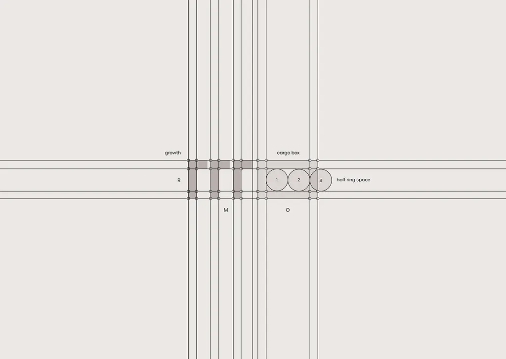
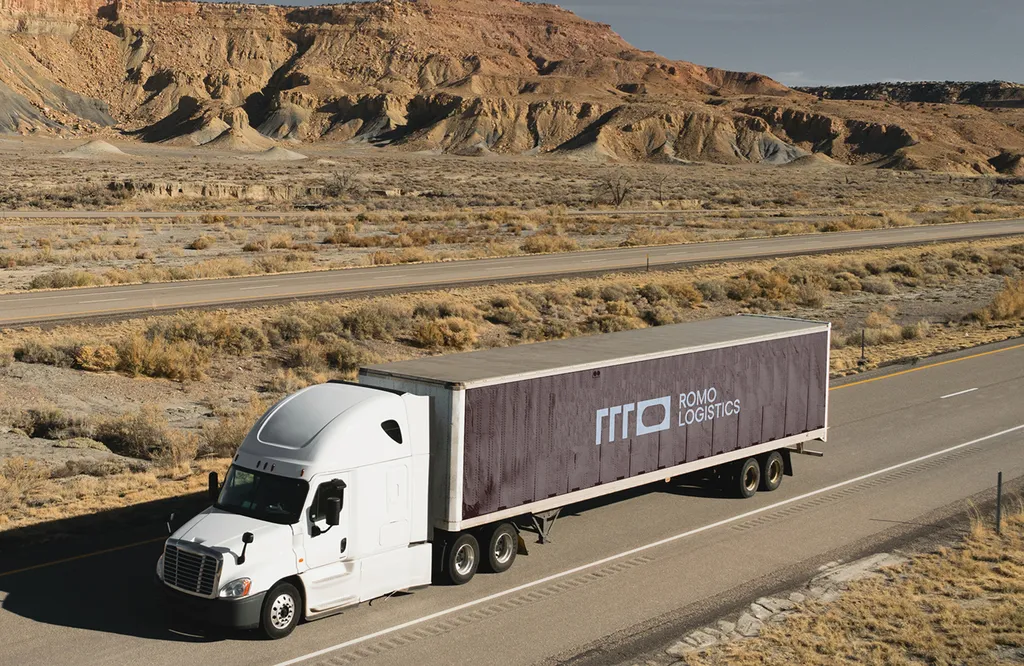
ROMO Logistics is a transport company. Its mark is a geometric monogram that spells the name in simple, solid shapes, built on a strict grid so it works as an app icon, a sign and a stamp on every parcel. The palette is reddish brown, rock blue and ivory white, with one clean sans in four weights. The same system runs on brown trailers, shipping containers, worker vests and brown jackets, warehouse facades, hanging signs and kraft shipping tubes. The relevant lesson for a factory is the grid: a mark drawn from solid geometric shapes engraves, stamps and stitches without losing anything.
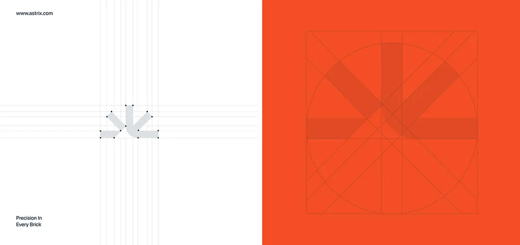
Astrix Builders is a construction company delivering residential, commercial and industrial projects. Its mark is an asterisk built from heavy angular strokes that read like steel beams, drawn on a construction grid and paired with a two-line wordmark so it holds up from a business card to the side of a truck. The palette is safety orange, deep navy and sky blue, with concrete and steel textures, and Geist in three weights. Bold color blocks keep it readable on hoardings, barriers, workwear and orange box trucks from across a busy site. The lesson is weight: strokes heavy enough to survive distance, dust and coarse reproduction.
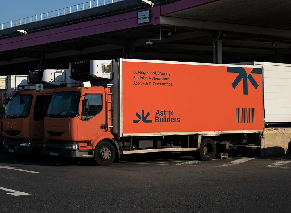
Astrix also shows the safety-color question in practice: its orange is a brand color used in large blocks on hoardings and trucks, which is exactly why the orange, the navy and the placement have to be decided together.
Checklist: the production test for an industrial logo
Run every concept through this before approving it. Each fail is a revision.
- Reads in one color, black on white and white on black
- Reads as an engraving: a single outline or a single fill, no shading
- Survives embroidery at chest size: no hairlines, counters open
- Has a stencil-safe version if you mark crates, drums or pallets
- Fits a hard hat’s small curved print area as a short mark in one or two colors
- Reads on a truck at road distance in its horizontal lockup
- Holds up in grayscale on a photocopied spec sheet
- Is distinct from your plant’s red and yellow safety markings
- Contains no flag or map outline unless your products qualify
- Looks different from your five closest competitors’ marks
- Has paint or powder-coat references for every brand color, approved on samples
- Has an Arabic version drawn with it, if you sell in Saudi Arabia or the UAE
How do you roll out a new logo across a plant?
A manufacturer’s logo is installed, not just published: on signs, trucks, machines, uniforms, nameplates, packaging and molds. Two practical points.
Audit before you redesign. List every place the current logo appears and what it is made of. That list sets the design constraints and shows what replacement will cost. If buyers and distributors already recognize the mark and only the type and colors look dated, a brand refresh that keeps the recognizable part may be enough.
Roll out as things come due. The industrial page suggests rolling out signs, trucks and catalogs as they come due for replacement. Start with what customers see most (website, spec sheets, quotes, trade-show stand) and workwear, then vehicles and signs. Molds, tooling and nameplates on installed equipment often change last, or never; make sure the new mark and the old one can coexist for a while without confusing anyone.
Common manufacturing logo mistakes
- A gear, a globe or a swoosh. The category’s symbol, not yours.
- A gradient or a 3D render. Beautiful on the website, impossible to engrave, stitch or stencil.
- Hairline type under the symbol. Fills in on a shirt and disappears on a hard hat.
- No short mark. The full lockup squeezed onto a nameplate or a chest.
- A logo approved only on screen. The paint, the vinyl and the embroidery thread all come back a different color.
- A flag “because we’re American.” A Made in USA claim you may not be able to support.
- Bright red or yellow with no plan. Confusion with safety markings on the plant floor.
- A generator logo. Often a stock symbol other companies also received, and often not drawn as clean vectors that suppliers can use.
How much does a manufacturing logo cost?
With me, a manufacturing logo is $999 and a full brand identity $3,499 (see pricing). I design remotely, with calls in your time zone. A logo design project takes one to two weeks, with three concepts, each shown on real uses (for a manufacturer, things like a hard hat, a nameplate, a truck and a spec sheet), three revision rounds, and SVG, PDF and PNG files in color and in black and white for web and print. A brand identity takes two to three weeks and adds strategy, a full color and type system and guidelines with a Figma library, so your printer, sign maker and fleet supplier get the same answer. A rebrand of an established firm takes three to four weeks; a refresh that keeps what customers recognize takes two to three. For the Gulf, I draw the Arabic and English versions together. I do not file trademarks or handle production; your lawyer and suppliers do, with clean files from me. The logo design process article walks through each step, and how to hire a brand designer covers what to ask any designer before you sign.
If you are replacing a logo that no longer matches your work, book a free 30-minute call and bring photos of where it appears today: a hard hat, a truck, a nameplate and a spec sheet. We will start from the hardest surface.
FAQ
What makes a good manufacturing or industrial logo?
One that survives physical reproduction: it works in one color, engraves and stitches cleanly, has a short mark for small surfaces, reads on a truck at distance and holds up in grayscale on a spec sheet. Then it should be distinctive among competitors, which usually means avoiding gears, wrenches and globes.
What colors should an industrial logo use?
Any palette you can own and reproduce consistently in ink, thread, vinyl and paint. Check red and yellow against your plant’s OSHA safety markings so the brand is not mistaken for a warning, and specify a paint or powder-coat reference for each brand color.
Should a manufacturing logo include a gear or a factory?
Usually not. Gears, wrenches, globes and factory roofs identify the category rather than the company, and many competitors already use them. Marks drawn from the name, the process or the product are more distinctive.
Can I put my logo on hard hats and hi-vis vests?
Generally yes, through the PPE supplier’s decoration service. Hard hats are usually pad printed in a limited number of colors on a small curved area. On hi-vis garments, keep the logo small and placed so it does not reduce the visible background or reflective areas the standard requires. Your supplier confirms the details.
Can my logo use an American flag?
Ask your lawyer first. The FTC says flags and US map outlines may imply a Made in USA claim, depending on the context, and an unqualified Made in USA label on a product that is not all or virtually all made in the US can bring civil penalties.
How much does a manufacturing logo cost?
With me, a logo is $999 over one to two weeks and a full brand identity $3,499 over two to three weeks. A rebrand or refresh for an established firm is quoted in writing after a free call.
Sources