Marketing Agency Branding: How to Brand Your Own Agency
How to brand your own marketing agency: pick a specialism, settle the name, design an identity that frames client work, brand the touchpoints buyers check, and learn from real agency rebrands.

Summarize with AI
Key takeaways
- A good marketing agency brand says clearly who the agency is for, proves it with case studies, and shows up the same way on every touchpoint a buyer checks: website, credentials deck, proposals and the founders’ LinkedIn.
- Buyers check you out before they call. In a Hinge Research Institute study of 1,028 professional services buyers, over 99% checked firms out, and over 80% visited the firm’s website.
- Specialize first, design second. The identity can’t fix a position that’s “everything for everyone.”
- Your agency’s identity should frame your clients’ work, not compete with it.
- Treat your own brand like a client project: a brief, one person who signs off, and a deadline.
A good marketing agency brand does three things: it says clearly who the agency helps and with what, it proves that with real case studies, and it looks and sounds the same on every touchpoint a buyer checks before they get in touch. The identity itself (name, logo, type, color) should be distinctive enough to recognize in a small LinkedIn avatar, and quiet enough to frame your clients’ work.
| Element | What good looks like | The usual problem |
|---|---|---|
| A clear specialism | One sentence that says who you help and with what | “Full-service, every industry” |
| Proof | Case studies with the problem, the work and the result | A gallery of logos and screenshots |
| A distinctive name and mark | Recognizable in a small LinkedIn avatar and on a pitch cover | A wordmark that looks like every other agency’s |
| A flexible visual system | Type, color and layouts that frame your clients’ work | An identity louder than the work it shows |
| Consistent touchpoints | Website, credentials deck, proposals and LinkedIn look like one firm | A sharp website and a proposal template from years ago |
| Visible people | The team and founders, with real photos and points of view | Stock photos of handshakes |
I’m Masuder Rahaman, a brand designer and the CEO and founder of Wolfpixel, the design team I lead. I design brand identities for businesses that sell expertise, and I also work with agencies on a white-label basis, designing brand work they present to their own clients. This article is about the other side: branding your own agency.
Why do agencies struggle to brand themselves?
Agencies brand other companies for a living and often leave their own brand until last. There’s always a client deadline that comes first, everyone in the building has an opinion, and nobody owns the decision. The result is a familiar one: a dated website, an old proposal template, and a positioning line that could belong to any of a hundred agencies.
That matters more than it used to, for three reasons:
- Buyers check you out first. In the Hinge Research Institute’s study of 1,028 professional services buyers (2014), over 99% checked firms out before hiring, using more than three methods on average, and over 80% visited the firm’s website.
- Referrals alone are getting weaker. RSW/US’s 2026 outlook, as reported by Agility PR, says the share of marketers finding agencies through networking fell from 73% in 2022 to 58%, and through friends or co-workers from 60% to 35%, while more find agencies through AI platforms, search, content and direct outreach.
- Most of your future clients aren’t buying today. The LinkedIn B2B Institute’s 95-5 rule says 95% of potential business buyers aren’t ready to buy today but will be in the market later. Your brand has to be remembered until then. B2B brand strategy explains the research behind this.
Step 1: What should your agency be known for?
Positioning comes before the logo. An agency that says “full-service marketing for growing businesses” has nothing for a designer to express, and nothing for a buyer to remember.
There are three common ways to specialize:
| Specialism | Example | What it gives you |
|---|---|---|
| By industry | “Marketing for dental practices” | Buyers see themselves in your case studies; referrals travel within the industry |
| By service | “Paid social for ecommerce brands” | Depth in one discipline; easier to price and package |
| By method or point of view | “Brand-led growth for B2B software,” a named process | Something to own in content and pitches |
Hinge says its data, year after year, correlates specialization with greater growth and profitability. You don’t have to turn away all other work. But the website, the case studies you lead with and the brand should point one way.
Write the result as one sentence: who you help, with what, and what makes your way different. Everything below hangs off that sentence. If you’re stuck, a brand strategy project starts here.
Step 2: How do you settle the name and the brand architecture?
Two decisions shape the identity more than any color choice.
The name. A founder’s surname ties the brand to a person, which helps early and can complicate a sale or the founder’s exit. An abstract or descriptive name is easier to grow past one person. Names also shorten as agencies mature: in its 2018 rebrand, Ogilvy & Mather dropped “& Mather” to become Ogilvy. If you’re renaming, how to rename a company covers the steps.
The architecture. If you’ve added services or bought other agencies, decide whether they’re one brand or several. The same Ogilvy rebrand unified its collection of sub-brands. One brand is simpler for buyers; separate brands make sense only when the audiences really differ.
Step 3: How do you design an identity that frames your work?
An agency’s identity has an unusual job. Most of the time it sits around other brands’ work: on case study pages, in credentials decks, on award entries. So it has to be recognizable without shouting over the work it frames.
What tends to work:
- A mark that survives small. Your logo appears most often as a LinkedIn avatar, a favicon and a footer. Test it at those sizes.
- A restrained base with one owned element. A distinctive color, a typeface or a graphic device that’s always present, on a calm base that lets client work lead. Ogilvy kept its red and added its own re-cut serif and sans typefaces.
- A system, not a logo. Layouts for case studies, decks and social posts, so every person in the agency produces material that looks like the same firm.
- Something human. Agencies sell people. DAVID’s identity for its tenth anniversary lets each team member use their profile as the logo. Thisaway’s 2026 rebrand uses hand-drawn characters, with subtle animation, across its website and credentials documents.
What doesn’t work: an identity built on whatever’s fashionable in agency land this year. Agency websites that follow the same fashion blur together.
Step 4: Which touchpoints do buyers actually check?
For a product company, the brand lives on packaging and in the app. For an agency, it lives in documents and people. These are the touchpoints to design, roughly in the order a new buyer meets them:
| Touchpoint | What it needs | Common gap |
|---|---|---|
| Website home page | Your one-sentence position, three proof points, a clear next step | A showreel and a slogan, no specialism |
| Case study pages | A repeatable layout: client, problem, constraints, work, result | Image galleries with no story |
| Founder and team LinkedIn | Consistent banners, real photos, the same positioning line | Every person describes the agency differently |
| Credentials deck | A short, designed deck: who you are, who for, three case studies, team, process | 40 slides of logos and awards |
| Proposals and statements of work | A branded template with your process, scope, price and terms | A plain document from the founding year |
| Email signature | Name, role, the mark, one link | Five social icons and a banner from an old campaign |
| Pitch and video calls | Branded backgrounds, a consistent opening slide | Each person improvises |
Cedar, a content agency that refreshed its brand on the eve of its 50th anniversary, makes the same point in its story of the rebrand: a toolkit and presentation templates are what let a team actually use the new brand. That’s the part most agencies skip, and it’s the part clients see most often.
Step 5: How do you make case studies your strongest brand asset?
For an agency, case studies are the proof, and they’re where the brand does most of its work. Give every case study the same structure:
- The client and the problem, in one or two sentences.
- The constraint: budget, deadline, market, regulation. This is what makes the work credible.
- What you did, with the key decision explained, not just the output.
- The result, stated only as far as the client allows you to publish it. If you can’t share numbers, describe the outcome in words, and never invent figures.
- A quote from the client, word for word, with their name and role if they agree.
Design one layout for this and use it every time, so the case studies look like a series. Lead with work in your chosen specialism, even if it’s not your most famous.
Step 6: How do you run your own rebrand like a client project?
The cobbler’s-children problem has a practical fix: run your rebrand the way you’d run a client’s.
- Write a brief. Position, audience, touchpoints, budget, deadline.
- Name one owner. One person who signs off, not a committee of every creative in the building.
- Research before you design. Before leading its own rebrand after four decades, Meyocks audited its direct peers and best-in-class agencies, interviewed its team and surveyed its clients. It found peers emphasizing awards and accolades, and chose to describe itself by what works best for its clients and the care its people show each other.
- Decide who designs it. Your own team knows the agency best but has the least time and the most opinions. An outside designer brings distance and a deadline, and can work with your team. Either works if someone owns it.
- Keep what people recognize. Meyocks kept its purple and evolved the shade. Ogilvy kept its red. A rebrand doesn’t have to throw away what clients already know.
When should an agency rebrand?
Common triggers:
- You’ve specialized, and the old brand still says “full-service.”
- You’ve added services or merged with another agency.
- You’re moving upmarket, and the brand looks smaller than the clients you now pitch.
- A founder is leaving, or the agency is preparing for a sale.
- An anniversary gives you a reason to tell the story again, as it did for DAVID at ten and Cedar at fifty.
If the positioning still fits and only the look has dated, a refresh may be enough. Rebrand or refresh helps you decide, and how to rebrand a business covers the rollout.
What can you learn from real agency rebrands?
| Agency | What changed | Lesson |
|---|---|---|
| Ogilvy (2018) | Dropped “& Mather,” re-cut the wordmark, added its own serif and sans, kept its red, unified the sub-brands | Simplify the name and the architecture; keep the color people know |
| DAVID (2022) | Kept its black and white for its tenth anniversary; team members can use their profile as the logo | Put the people in the brand |
| Meyocks (2026) | Led its own rebrand after a peer audit, team interviews and a client survey; evolved its purple | Research first; say what peers don’t |
| Thisaway (2026) | “Branding You Can Believe In”; hand-drawn, animated characters on the website and credentials | Carry the identity into credentials, not just the website |
| Cedar (before its 50th) | “Made different” proposition, a recut C, new typography, voice and website | Give staff the templates, or the rebrand stays on the website |
What’s the closest work in my portfolio?
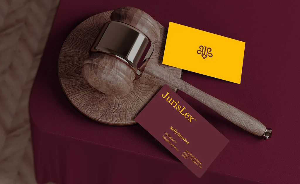
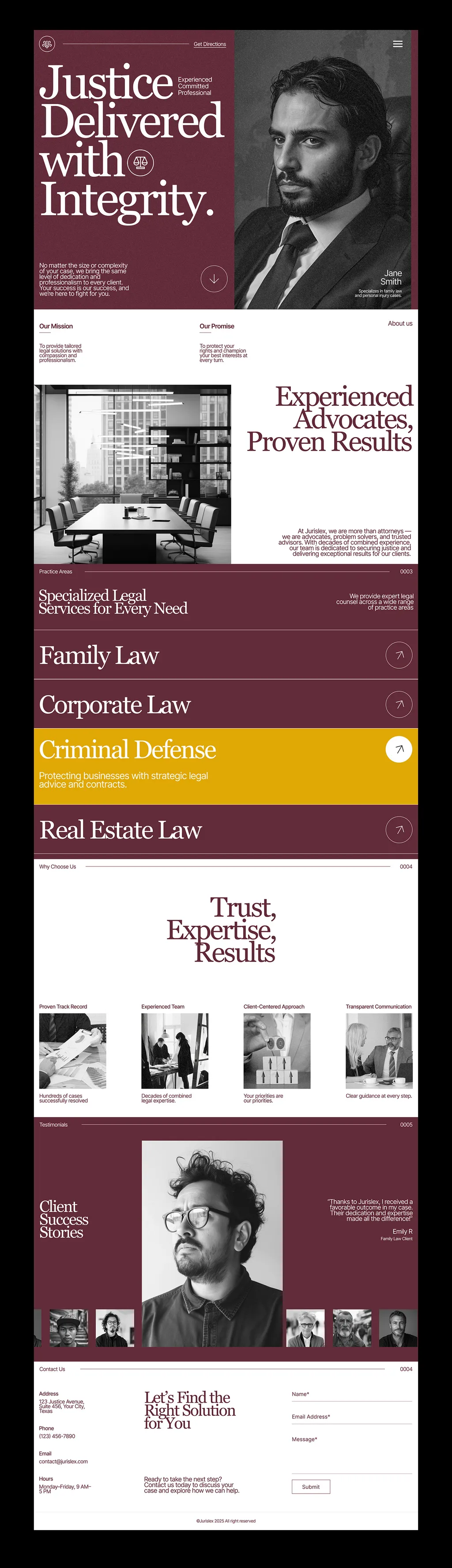
I haven’t designed a brand for a marketing agency that I can show, so here is the closest: a firm that also sells expertise rather than a product. JurisLex is a real estate law firm in Sydney that wanted a distinctive brand in a competitive legal market. The identity uses deep burgundy, warm cream and bright yellow, Georgia for headlines, and a symmetrical mark, carried onto billboards, business cards, ID badges and a website that opens with “Justice Delivered with Integrity.”
The parallels with an agency are direct: a crowded category where firms look alike, a buyer who checks the website before calling, and a brand that has to appear the same on a pitch document, a badge and a billboard.
What are the common agency branding mistakes?
- “Full-service” as a position. It tells buyers nothing.
- An identity that competes with client work. Your case studies should be the loudest thing on the page.
- Rebranding the website only. The deck, proposals and LinkedIn still say the old thing.
- Awards as the main proof. Clients buy results in their own situation. Lead with relevant case studies.
- Stock photos of people. Agencies sell their team. Show the real one.
- Inventing results. Unverifiable growth percentages hurt trust when a buyer asks for the reference.
- No owner. A rebrand by committee drags on and pleases nobody.
What does agency branding cost?
It depends on scope, and on whether your own team or an outside designer does it. My packages are fixed, in US dollars:
- Logo design, $999: a new mark and lockups, if your positioning and system are fine.
- Brand identity, $3,499: strategy and positioning, the full identity system and guidelines, with a Figma library your team can build decks and case studies from.
- Premium, $6,999: everything in Brand identity plus an AI-ready brand system and website design in Figma (the build isn’t included), which suits an agency whose website is its main sales tool.
Anything else, such as naming or a rebrand with several sub-brands, gets a fixed written proposal after a free call. The pricing page has the details. For market ranges by provider type, see branding package price, and for how agencies charge, see branding agency pricing.
If you’d like an outside view on your agency’s brand, book a free 30-minute call. And if what you need is brand design for your clients, under your agency’s name, see white-label brand design for agencies.
FAQ
How do I create a brand identity for my agency?
Start with positioning: one sentence on who you help, with what, and why your way is different. Then settle the name and whether services are one brand or several, design a mark that works small and a restrained system that frames client work, and roll it out to the website, case studies, credentials deck, proposals and the team’s LinkedIn profiles.
Should a marketing agency specialize?
Usually, yes. A specialism gives the brand something to say and makes case studies more convincing to buyers in that field. Hinge reports data correlating specialization with greater growth and profitability. You can still take other work; lead with the specialism.
When should an agency rebrand?
When the brand no longer matches what you do: after you specialize, add services, merge, move upmarket, or prepare for a founder’s exit or a sale. If the positioning still fits and only the look has dated, a refresh may be enough.
Should my agency be named after the founder?
It can be, but think about the long term. A founder’s name builds trust early and ties the brand to one person, which can complicate a sale or the founder’s exit. Abstract or descriptive names are easier to grow past one person. Some agencies shorten their names as they grow, as Ogilvy & Mather did when it became Ogilvy.
Who should design an agency’s own brand?
Either your own team or an outside designer, as long as one person owns the decision and there’s a brief and a deadline. In-house teams know the agency best but are busy and close to it; an outside designer brings distance and a fixed timeline.
Which touchpoints matter most for an agency brand?
The ones a buyer checks before calling: the website home page, case study pages, the founders’ and team’s LinkedIn profiles, the credentials deck and the proposal template. Over 80% of professional services buyers in Hinge’s study visited the firm’s website.
Sources
- Hinge: How professional services buyers check you out (February 17, 2014)
- Hinge: To specialize or not to specialize (January 28, 2025)
- Agility PR: RSW/US 2026 Outlook report (January 16, 2026)
- It’s Nice That: Ogilvy rebrand (June 6, 2018)
- Meyocks: Four lessons from rebranding a 41-year-old agency (May 12, 2026)