Food Truck Branding: Everything a Truck Needs Before Launch
Food truck branding, piece by piece: a logo that works on a sticker, a wrap designed on your truck’s template, a name sized for distance and a menu board read from the queue.

Summarize with AI
Key takeaways
- A food truck is a moving billboard and a storefront at once. Design the wrap for a two-second glance from traffic and for a slow read from the queue.
- Design the wrap on the template for your exact truck or trailer, side by side: serving side, street side, back and front, with the window open and closed.
- Size the name for distance. The road-sign rule an FHWA report uses is about 30 feet of legibility per inch of letter height, so a name read across a parking lot needs letters measured in inches, not points.
- Test the logo small before you test it big: a round sticker, an app avatar, a cup and a one-color napkin.
- Some cities and states set display rules for trucks, such as California’s 3-inch business name on the consumer side. Check yours before the wrap goes to print.
Food truck branding is the name, logo, colors and voice of a food and beverage business on wheels, built to be read from a moving car and then from a queue three feet from the window. A full package has five parts: a logo system that works from a round sticker to a 12-foot side panel, a wrap designed on your truck’s own template, a menu board people can read while they wait, the small things customers carry away (cups, napkins, bags, stickers), and social templates for posting where you are today. Get the logo right small, design the wrap for the real vehicle, and leave room on the serving side for the permit decal and any lettering your city requires.
I’m Masuder Rahaman, a brand designer and the founder of Wolfpixel, where I lead the design team. I design brand identities and packaging for restaurants, cafés and other food and beverage brands, remotely, with calls in your time zone. There is no food truck case study on my site yet. The examples below are my closest work: Tong, a coffee shop, and Bright Fizz, a soda brand that lives on the street as much as in the fridge.
The truck is the billboard, the sign and the shop
A café has a fixed sign, a menu on the wall and a cup. I covered those in café branding, and pastry boxes, bags and display labels in bakery branding. A truck has to do all three jobs on one painted box that moves every day.
That changes the order of design decisions:
- Recognition first, appetite second, details last. From the road, people should know your name and what you sell. From the curb, they should want it. Only at the window do they need prices.
- No fixed address. Customers find you by recognizing the truck and by checking your posts, so the truck and your social avatar must look like the same brand.
So the real brief is not “design a logo.” It is “design a name and mark that hold up at 2 inches and at 2 feet, then build a vehicle around them.”
Custom food truck branding: what a package includes
| Part | What it includes | Why a truck needs it |
|---|---|---|
| Name and strategy | What you sell, who you sell to, the feeling, and the one thing people should recognize | Decides what goes big on the wrap and what stays off it |
| Logo system | A primary logo, a compact or round mark, a one-color version, a horizontal lockup | The round mark becomes the sticker, avatar and cup print; the lockup fits the side panel |
| Color and type | A palette with print values for vinyl, a bold display face, a readable menu face | Vinyl and screens show color differently; menu type has to read from the queue |
| Wrap design | Artwork for the serving side, street side, back and front on your vehicle template | The biggest, most-seen brand surface you will ever own |
| Menu board | A board layout for the window, plus a printed or digital version for specials | Where people decide, often in sun glare and in a hurry |
| Carry-away items | Stickers, cups, napkins, bags, food boats or clamshell labels | The brand leaves the truck with every order |
| Social and location templates | A weekly schedule post, a “today we’re at” post, story frames, a profile avatar | How regulars find a business with no fixed address |
| Guidelines and files | Brand guidelines and source files for your wrap shop, printer and team | So the next sticker run or replacement panel matches the first |
With me, the strategy, logo system, color, type, voice and guidelines are the brand identity package. The rest depends on your truck and what you serve, so it is scoped on a call. Prices and timelines are in the last section.
Design the wrap on your truck’s template
A wrap is artwork laid over doors, hinges, vents, a fuel cap, a generator hatch, a service window and an awning. A logo placed without the template can land across a door seam or vanish behind the open awning.
Get the real template first. Ask your wrap installer for the template for your exact make, model, wheelbase and body, or, for a trailer, the builder’s drawings. Then photograph and measure every side, because builders add vents, propane boxes and outlets that no template shows.
Design each side for its reader.
- Serving side. The busiest side. The name sits high enough to stay visible over the heads in the queue. The menu board, the order point and the permit decal sit at eye level. Keep the area around the window calm, because people read here; they don’t glance.
- Street side. Seen by traffic and from across a lot. One big name, one big image or color field, what you sell in two or three words. No menu, no long tagline.
- Back. Read by the car behind you at a light, for several seconds. This is the place for the name, the food in a word, and your social handle or website.
- Front. A clean logo on the hood is enough; it is seen head-on for a moment.
- Roof. Often skipped. It matters only if people look down on you from a garage or an office.
Design the window open and closed. When the awning goes up, it covers part of the panel above the window and throws it into shade. When the truck is closed and driving, the shutter or window is part of the side. Check both states in your mockups, and keep the name out of the strip the awning hides.
Watch the windows. Ask your installer what can be applied to the cab and service windows, and what local vehicle rules allow there. Many shops offer perforated window film, which lets people inside see out, but it shows the artwork less crisply than solid vinyl. Keep small type and faces off it.
Plan for grease and heat. Panels near the exhaust, the generator and the service ledge get dirty and scrubbed often. Ask your installer about laminate there, and keep key artwork away from the exhaust.
Readability at distance and speed
Most wrap mistakes are type that is too small and too many messages.
An FHWA research report on road signs uses the US sign manual’s criterion of about 30 feet of legibility per inch of letter height, which assumes 20/40 vision. It was made for road signs, not trucks, and a busy wrap reads worse than a clean sign. Treat it as a minimum, not a target:
| Letter height | Readable at roughly | Good for |
|---|---|---|
| 1 inch | 30 ft | Fine print at the window: hours, an allergen note, the decal |
| 3 inches | 90 ft | Menu headings, the social handle on the back |
| 6 inches | 180 ft | Your food in a word: “Tacos,” “Smash burgers” |
| 12 inches and up | 360 ft and more | The name on the street side |
Speed makes it stricter. A car at 30 mph covers 44 feet every second, so a driver passing a parked truck gets a glance of two or three seconds. In that time, people read a name, maybe one word about the food, and a color. That’s why the street side should carry three things at most.
Practical rules that follow:
- High contrast. Dark on light or light on dark. Test the colors in sunlight and under your night lighting.
- Bold, open letterforms. Thin scripts and condensed type break down at distance.
- One hero image, not a collage. A single big taco or character reads. Twelve small food photos read as noise.
Wrap, paint or lettering
The same choice comes up for any business whose vehicle is its biggest sign; HVAC branding covers it for service vans.
| Option | What it is | Choose it when |
|---|---|---|
| Full wrap | Printed vinyl over the whole body | You want photo-quality artwork, full color and the option to change it later |
| Partial wrap | Printed vinyl on key panels over a solid body color | The budget is tight and the body color can be part of the brand |
| Paint plus cut lettering | A painted body with a cut vinyl name and logo | Your brand is one bold color and a simple mark |
| Paint only | Hand-painted or sprayed artwork and lettering | You want a sign-painted look and don’t plan to change it for years |
The biggest difference is permanence. Cast wrap films are made to come off: Avery Dennison, for example, launched its MPI 1105 wrap film with “long-term removability.” That suits a new truck still testing its menu, or a leased vehicle. Ask your installer for the film’s rated life and warranty in writing, for the sides and for the roof and hood. Prices vary by truck size, film and region, so get quotes from local wrap shops with the same artwork.
Display rules: leave room on the serving side
Some cities and states tell you what must be shown on a food truck, and where. Two examples:
- California. Health and Safety Code section 114299 requires the business name, city, state, ZIP code and, if different, the permitholder’s name to be permanently affixed on the consumer side. The business name must be at least 3 inches high, the other details at least 1 inch, in colors that contrast with the background, and motorized units carry it on two sides.
- New York City. The Health Department’s guide for mobile food vendors says the unit needs a current valid decal attached to the outside where customers can see it, and vendors wear their license so the public can see it at all times.
These are examples, not a list for your city. Rules differ by city, county and state, and they change, so check with your local health department and licensing office before the wrap is printed. This is general information, not legal advice. For the design, it means: plan a clean zone for the decal and required lettering on the serving side, and design that lettering in your brand type rather than letting the installer add it later in a default font.
Menu calories. In the US, the FDA’s menu labeling rule covers restaurants and similar retail food establishments that are part of a chain with 20 or more locations doing business under the same name, and the regulation defines a location as “a fixed position or site.” A single truck is unlikely to be covered. If you plan to grow into fixed locations, build the menu template with space for calories from the start.
The menu board: readable from the queue
The menu board is where the queue turns into orders. People read it standing 6 to 15 feet away, sometimes squinting into the sun, while deciding fast.
- Few items, grouped. Five to eight main items read faster than twenty. Put add-ons and drinks in their own small block.
- Names first, prices aligned. Item names in the largest menu type, prices in a column, so people can scan both.
- The bestseller marked. One badge or color for the item you want most people to order.
- Matte, not gloss. Glossy boards turn into mirrors in direct sun.
- A swappable specials panel. Magnetic, slide-in or chalk, so price changes don’t mean reprinting the board.
- The same layout online. A matching menu image for social posts and ordering apps.
If you serve two languages, design both on the board from the start, with matched type.
The logo test: sticker, avatar, cup, napkin
The wrap gets the attention, but most people meet your logo small. Before approving a logo, put it on four things:
- A round sticker. About 2 inches across, on a kraft bag or a foil wrapper. Does the name still read? A compact round mark often works better than a long wordmark here.
- An app avatar. Social profiles and many ordering apps crop your logo into a circle at thumbnail size. If the round mark works on the sticker, it usually works here too.
- A cup. Small, curved and often printed in one or two colors. A wide logo wraps around the back.
- A napkin. Plan for one color, and assume the printing on soft paper will be rougher than on a sticker.
A logo that passes these tests scales up to the side panel. One designed only for the side panel rarely scales down.
Carry-away packaging on a truck budget
A truck’s packaging is usually stock: clamshells, food boats, paper bags, cups, foil. That’s fine. Brand it with round stickers to seal bags and clamshells, a rubber stamp of the one-color mark for kraft, branded napkins, and a printed liner if your food is handheld. Add printed cups or sleeves once volumes justify them. Custom printed packaging is designed on your supplier’s dielines; that work is packaging design, quoted by scope.
Social and location templates
With no fixed address, your posts are part of the storefront. Plan a small template set with the identity:
- Weekly schedule. Days, places and hours in one image, in the same layout every week.
- “Today we’re at.” A story or post with the location, hours and a photo of the truck, posted the same way every day.
- Sold out and closed early. Short, on-brand, ready to post in seconds.
- Menu and specials. The board layout, sized for a phone.
- Profile avatar. The round mark, the same on every platform.
Closest work: a coffee shop and a drink brand
Tong: one color and a sticker-sized mark
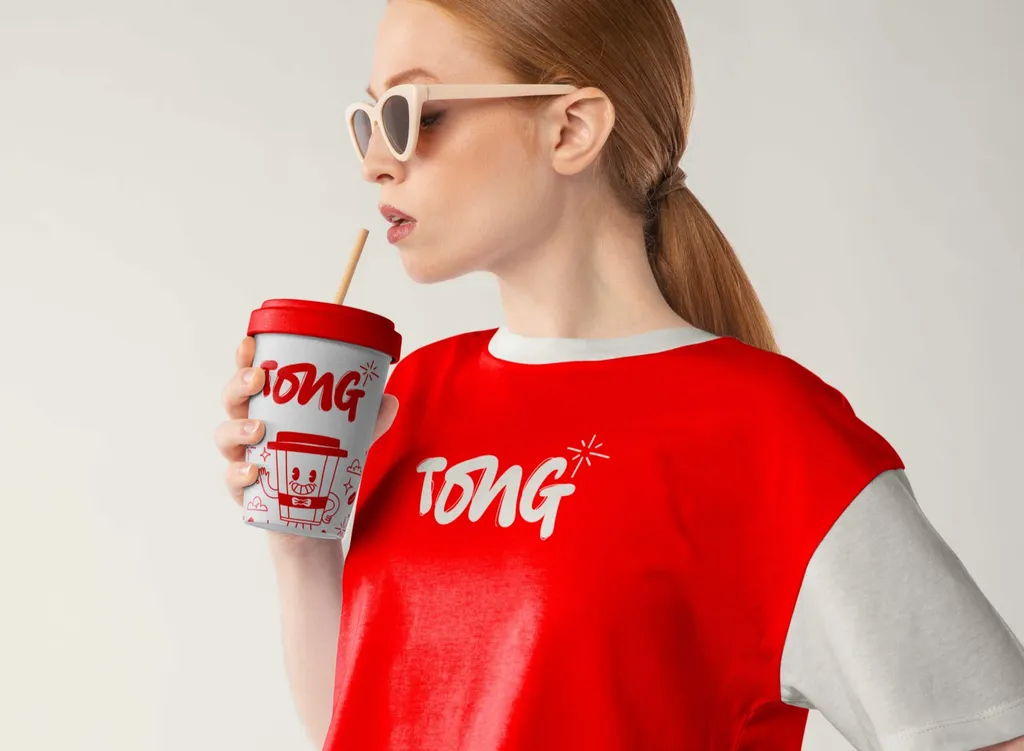
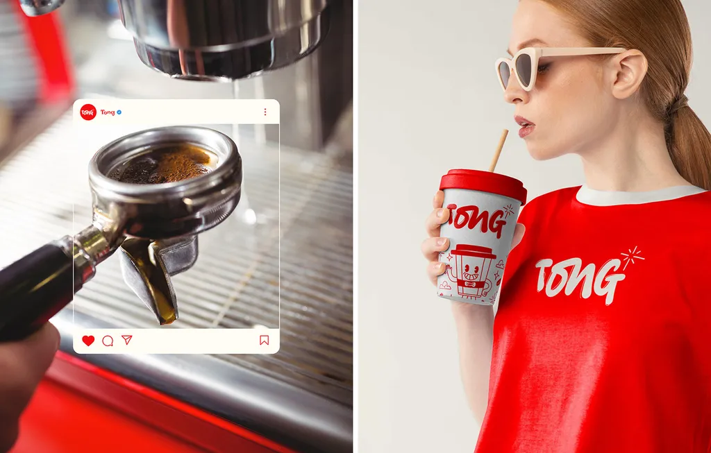
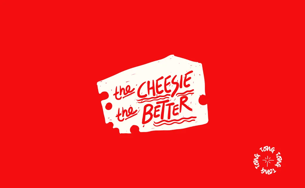
Tong is a coffee shop built around the idea that coffee isn’t just a drink, it’s an adventure. Its logo is a bold, funky handwritten wordmark, joined by doodles led by the Coffee Rebel. Red runs across the shopfront, cups, paper bags, pattern wrapping paper, merch, posters, social posts and a billboard across a train station. Stickers like “the cheesie the better” carry the voice in white on red.
For a truck, the lesson is one color and a mark that works small. Tong reads on a sticker and on a billboard, the same range a truck needs, from the bag seal to the side panel.
Bright Fizz: one color per flavor, and a sign on the street
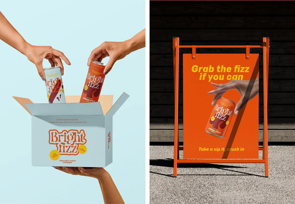
Bright Fizz is a premium cola in two flavors: classic ginger cola in orange and cinnamon cola in pale blue, each with its own flavor illustration and the same wordmark. Along with the cans, we designed a pale blue box, the campaign, street signs and a website. One orange A-frame sign reads “Grab the fizz if you can.”
For a truck, the lessons are color as recognition and short lines on the street. Each flavor reads from across a fridge because it owns one color; a truck works the same way across a lot.
Common mistakes in food truck branding
- A collage wrap. Twelve food photos, a slogan, a phone number, a website and three social icons on the street side. Nothing reads at speed.
- Designing on a generic truck picture. The logo lands on a door seam, a vent or under the open awning.
- A thin script name. Beautiful on screen, unreadable at 100 feet.
- A logo that only works big. The sticker, avatar and napkin each get an improvised version.
- No zone for the decal and required lettering. The installer adds the permit details in a default font wherever they fit.
- The whole menu printed on the wrap. Prices change; the wrap doesn’t. Keep the menu on a swappable board.
- A different name or avatar online. Customers look for the truck they saw.
- Glossy menu boards. Unreadable in the afternoon sun.
Checklist: a food truck brand ready to roll
- A name and the one thing people should recognize, checked against the trucks you park next to
- A logo, a round mark, a horizontal lockup and a one-color version
- The logo tested on a 2-inch sticker, a circular avatar, a cup and a napkin
- The vehicle or trailer template from your installer, with every vent, hatch and outlet marked
- Wrap artwork for the serving side, street side, back and front, checked with the window open and closed
- The name sized for distance, with three messages at most on the street side
- A clean zone for the permit decal and any lettering your city or state requires
- A menu board with few items, aligned prices, a matte finish and a swappable specials panel
- Stickers, a stamp, cups, napkins and liners in the same system
- Weekly schedule, “today we’re at” and sold-out templates, plus one avatar everywhere
- Guidelines and source files for your wrap shop, printer and team
How I work with food trucks
A logo on its own is $999 and takes one to two weeks, with three concepts and three revision rounds. For most trucks I recommend a brand identity: $3,499 over two to three weeks, with strategy, the logo system, color, type, imagery, voice, brand guidelines and a Figma library, and unlimited revisions within the agreed scope. If you buy the logo first and the identity later, the $999 is credited. Custom printed cups, bags and liners are packaging design: two to four weeks, quoted by scope after a free call, with print-ready files on your supplier’s dielines. Wrap artwork, the menu board and social templates depend on your truck and are quoted after a free 30-minute call, as a fixed written proposal. Your wrap shop prints and installs, with clean files from me. All the packages are on the pricing page. I work remotely, with weekly check-ins in your time zone, and you own all the final files.
If you are launching or rebranding a food truck or trailer, book a free 30-minute call and bring photos of all four sides of your truck, the make and model or the trailer builder’s drawings, and your menu. We will start with what has to read from across the lot.
FAQ
What does a food truck branding package include?
A name and strategy, a logo system (a primary logo, a round mark, a horizontal lockup, a one-color version), color and type, wrap artwork for every side of your vehicle, a menu board, carry-away items such as stickers, cups and napkins, social and location templates, and brand guidelines with source files for your wrap shop and printer.
How much does food truck branding cost?
It depends on the scope. With me, a logo is $999 over one to two weeks, and a full brand identity is $3,499 over two to three weeks. Wrap artwork, menu boards and packaging are quoted after a free 30-minute call, as a fixed written proposal. The wrap itself is printed and installed by a wrap shop, which quotes separately.
Should I wrap or paint my food truck?
A wrap suits full-color artwork and a brand you may change, because wrap films are made to be removed later. Paint suits a simple, bold color and a look you plan to keep for years. A partial wrap or cut lettering over a painted body is a middle option. Ask your installer for quotes and the film’s rated life in writing.
What size should the lettering on a food truck be?
Big. The road-sign rule an FHWA report uses is about 30 feet of legibility per inch of letter height, so a name meant to be read across a 150-foot lot needs letters at least 5 inches tall, and more in practice. Some places also set minimums: California requires the business name on the consumer side in letters at least 3 inches high.
What should go on a food truck menu board?
Five to eight main items with names in large type, prices in an aligned column, one marked bestseller, a small block for drinks and add-ons, and a swappable panel for specials. Use a matte finish so it reads in sunlight, and match the layout on your social posts.
What does a food truck logo need to work on?
Everything from a 2-inch round sticker and a circular app avatar to a cup, a napkin and a 12-foot side panel. Test it small first. A mark that reads as a sticker will scale up to the truck; a logo designed only for the truck rarely scales down.
Sources
- FHWA: Information As A Source of Distraction, Chapter 3, Legibility Testing (FHWA-HRT-15-027)
- California Health and Safety Code section 114299 (Mobile food facilities: business name), via California Public Law
- NYC Health Department: What Mobile Food Vendors Should Know (PDF)
- 21 CFR 101.11: Nutrition labeling of standard menu items in covered establishments (Cornell LII)
- Avery Dennison: Avery Dennison Launches Next Generation of Cast Films (June 2016)