How to Brand a Dental Practice Without Another Tooth Logo
Dental practice branding for nervous patients and crowded streets: how to look calm and clean without looking clinical, and what to use instead of a tooth.

Summarize with AI
Key takeaways
- Decide who the practice is for before designing anything. A family practice, a cosmetic studio and a pediatric office need different brands.
- Calm comes from restraint: space, warmth, real photography and plain words, not soft colors alone.
- Clean doesn’t have to mean clinical. One warm accent and type with some character keep a practice from looking like a lab.
- A tooth logo isn’t wrong, but it is the default, so it rarely sets you apart. A distinctive wordmark, monogram or symbol often works better.
- Test the logo where patients actually meet it: a Google listing thumbnail, a sign, embroidered scrubs and an appointment card.
Dental practice branding is the name, logo, color, type, photography and voice that make a practice recognizable, applied the same way on the sign, the Google listing, the website, the reception desk, the forms and the reminder messages. Done well, it does two jobs:
- It helps a patient pick your practice out from the others on the same street or the same map.
- It doesn’t add to the nerves many patients already bring with them.
That second job is easy to overlook. A 2021 meta-analysis of 31 studies estimated that about 15% of adults have dental fear or anxiety, and about 3% have it at a severe level (Silveira and colleagues, Journal of Dentistry). Most of those studies were at high risk of bias, and the questionnaire used changed the result, so treat the figures as estimates. A brand can’t treat that fear. But it can avoid making the practice feel colder or more clinical than it is.
I’m Masuder Rahaman, a brand designer and the founder of Wolfpixel, where I lead the design team. This guide covers how to make a dental brand feel calm, how to keep it clean without looking clinical, and why the tooth logo is the default, along with what to use instead.
What dental practice branding covers
| Layer | What it means for a practice |
|---|---|
| Positioning | Who the practice is for, what it is known for, and why a patient should choose it over the practice down the road |
| Brand identity | Name, logo system, color, type, photography, graphic elements and voice |
| Patient experience | How the brand shows up at each touchpoint: listing, website, phone, reception, treatment room, forms, reminders, follow-up |
Branding isn’t the same as marketing. Marketing finds patients; branding decides what they recognize and remember. The two work best when the brand comes first, so every ad, post and leaflet has something consistent to build on.
Decide who the practice is for
The most common reason dental brands look alike is that they are designed for “everyone.” Choose the patients you want more of, then let that choice shape the name, colors, photography and words.
| Practice type | Design direction | Watch out for |
|---|---|---|
| Family / general | Warm palette, approachable type, real photos of the team | Becoming generic: “friendly” is everyone’s claim |
| Cosmetic | Restrained palette, editorial type, close-up photography | Over-promising; specialty wording has rules (below) |
| Pediatric | Brighter colors, a character or illustration system, rounded type | Designing only for children; parents choose and pay |
| Implants / complex care | Quiet palette, clear information design | Clinical coldness, photos of equipment |
| Group / multi-dentist | A practice name not tied to one person, strong guidelines | Inconsistent locations and listings |
Two sets of rules shape what a dental brand may say:
- The ADA Code of Ethics calls a practice name that is false or misleading unethical, and it limits how specialties can be announced.
- Some states add requirements for signs and names.
These rules affect wording such as “cosmetic specialist”: cosmetic dentistry isn’t one of the specialties the ADA Code lists. They also affect whether to name the practice after yourself. The healthcare branding page summarizes the rules for the US and Saudi Arabia; your lawyer confirms what applies to you.
Naming a dental practice
The name goes on the sign, the Google listing, the license paperwork and every form, so it is the most expensive part of the brand to change later.
| Route | Pattern | Think about |
|---|---|---|
| Your own name | “Dr. [Surname] Dental” | Builds on your reputation, but ties the practice to one person |
| Place or neighborhood | “[Street or area] Dental” | Easy to remember locally; harder to stretch to a second location elsewhere |
| A coined or evocative name | A short word that suggests how the practice feels | The most distinctive and the easiest to protect; takes more work to explain at first |
Before you decide:
- Your plans to grow or sell. The ADA Code lets a departed dentist’s name stay on a practice for up to a year, or longer with their permission and a public notice that they retired. More dentists now work with dental support organizations (16.1% in 2024, according to the ADA Health Policy Institute), so if you may add partners, join a group or sell, a name not tied to one person is easier to keep.
- State rules. In California, an owner practicing under a fictitious name needs a permit from the Dental Board; a county filing isn’t enough. Other states have their own rules.
- Google. If you are the only public-facing dentist at a branded practice, Google allows one profile named “[practice]: [your name]”.
- The phone test. Say the name aloud. A patient who hears it once should be able to spell it, search for it and find you, not a practice with a similar name nearby.
The sources for these rules are on the healthcare branding page. Brand naming is a separate service if you want help; your lawyer checks the trademark.
Calm: designing for patients who would rather not be there
A calm brand isn’t a pale blue logo. It comes from many small decisions that each lower the tension a little.
Visual choices that help
- Generous space. Crowded layouts, stacked offers and busy pages feel urgent. White space feels unhurried.
- Warmth in the palette. A warm neutral or one soft accent next to the cool colors keeps the brand from feeling sterile.
- Rounded but not childish. Softer letterforms and corners help. Toy-like shapes belong only in pediatric brands.
- Real photography. Your team, your rooms, natural light, people at ease. Avoid stock photos of perfect smiles, and avoid close-ups of instruments, needles and drills.
- Accessible contrast. “Calm” pale gray text on white is hard to read, and frustration isn’t calming. WCAG 2.2 asks for a contrast ratio of at least 4.5:1 for normal-size text.
Words that help
- Say what will happen. “Your first visit takes about an hour. We’ll talk before we start” is calmer than “state-of-the-art care.”
- Use plain words. Replace jargon with everyday language on the website, the forms and the aftercare sheets.
- Avoid fear-based marketing. Warnings about what happens if patients delay treatment can push anxious people further away.

Places to apply it
The calm has to carry through the patient’s visit, not stop at the website. The reception desk, the waiting area signs, the forms, the reminder messages and the aftercare leaflet should all feel the same. A mismatch, a calm website and a harsh, cluttered intake form, is noticeable.
Clean, not clinical
Dentistry is right to want to look clean. Hygiene matters, and patients look for signs of it. The problem is that most practices express “clean” the same way: white, teal or blue, a sans serif, and a tooth with a sparkle. The result looks hygienic and forgettable at the same time.
What actually reads as clean:
- Consistency. The same logo, colors and type everywhere looks organized, and organized looks clean.
- Restraint. Fewer colors and fewer type styles, used with care.
- Legibility. Clear hierarchy on the sign, the website and the forms.
How to stay clean without looking clinical:
- Keep white and one cool color if you like them, and add one warm accent: sand, terracotta, soft green or a warm gray.
- Choose a typeface with some character for headlines, paired with a plain one for everything else.
- Bring in texture or illustration from your location or your practice idea, used sparingly.
Not another tooth logo
Why the tooth is everywhere
A tooth tells people instantly what you do, which is why so many dental logos use one. But if every practice on the map shows a tooth, a tooth no longer helps a patient tell you apart. Combined with blue or teal and a sparkle or swoosh, it looks like stock clip art, even when it was drawn from scratch.
When a tooth can still work
A tooth isn’t forbidden. It can work when:
- It carries a second idea, for example a tooth shape built into a letter of your name, or combined with something specific to your practice or location.
- It is drawn with a clear point of view, simplified or abstracted, not a glossy molar.
- The practice is pediatric and the tooth becomes a character.
Alternatives that often work better
| Route | What it is | Works well for |
|---|---|---|
| Wordmark | The practice name in distinctive lettering | Practices with a short, ownable name |
| Monogram | One or two letters from the name, drawn as a mark | Longer names; small sizes like the app icon or Google thumbnail |
| Symbol from the practice idea | A shape drawn from the location, the name’s meaning or the way you treat patients | Practices with a clear positioning |
| Character or illustration system | A friendly figure or illustration style | Pediatric and family practices |
The name, the colors and the setting already tell people it is a dental practice. That frees the logo itself to be distinctive.
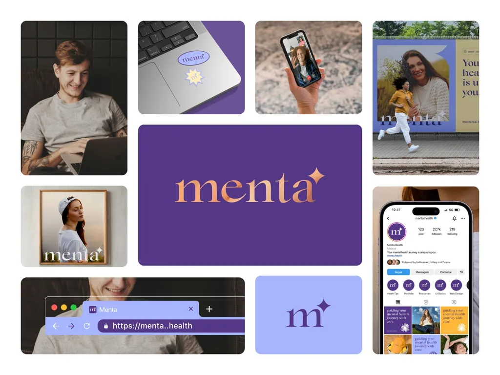
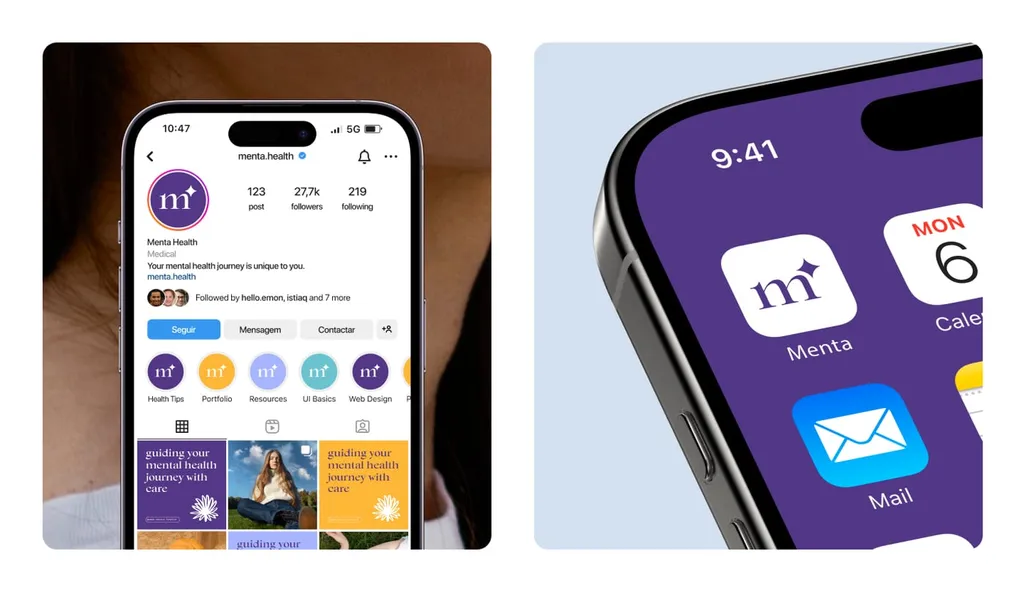
A parallel from a neighboring category: for Menta, a mental health platform, the brief was a calm, human brand, and the case study describes the result as not another brain or heart icon. The answer was a soft serif wordmark with a small spark, and a lowercase m with the same spark for the app icon. The logic carries over to dentistry: skip the category’s default icon and let a well-made wordmark and one small idea do the work. See the Menta case study.
Dental logo design: the test checklist
Before approving a dental logo, check it where patients will actually see it:
- Google Business Profile and map thumbnails: readable as a small square or circle on a phone.
- Browser tab and app icon: a monogram or symbol that works at very small sizes.
- Exterior sign: readable from the street, in one color, lit or as cut letters.
- Embroidered scrubs and polo shirts: no hairlines or tiny details that thread can’t hold.
- Appointment card and letterhead: clear in black and white as well as in color.
- Next to your nearest competitors: put their logos side by side with yours. Do you stand apart?
- Free of claims: no stars, “best” or specialty words you aren’t entitled to use.
- Bilingual where needed: for Saudi clinics, Arabic and English designed together, for the entrance sign and right-to-left screens.
- Still right in ten years: signs, scrubs and printed forms are costly to replace.
Where patients meet the brand
In roughly the order a new patient meets them:
- Google listing and maps. Google asks that the listing name reflect the name used on your storefront, website and stationery. Decide the exact name before the sign is made. It is the same first step for any local service business; HVAC company branding shows it for trucks and technicians.
- Website and online booking. The first screen should say who you are for and make booking easy. Brand the booking tool as far as it allows.
- Phone and messages. Confirmation and reminder texts carry no logo, so the voice does the branding.
- Exterior sign and entrance.
- Reception and waiting area. Signs, the check-in screen, printed material.
- Forms and consent documents. Often the most neglected and the most read.
- Treatment room. Patient bibs, aftercare sheets, screens facing the chair.
- Staff. Scrubs, badges.
- After the visit. Follow-up emails and review requests. Ask honestly: in the US, the FTC’s rule bans fake reviews and paying for reviews on the condition that they are positive or negative (the healthcare page has the details).
How the brand supports your dental marketing
Marketing brings new patients to the practice; the brand is what they recognize when they arrive. With the brand in place, each channel reuses the same parts instead of being designed from scratch:
- Google Business Profile. The monogram or logo as the profile photo, real photos of the team and rooms, and replies to reviews in the practice’s voice.
- Website. The first screen says who the practice is for, in the same words as the sign and the listing.
- Reviews. A simple request card at the front desk or a follow-up message, in the brand’s type and colors. Never buy or fake them.
- Social media. A few templates and a photo style, so posts look like one practice even when different staff make them.
- Ads and mailers. The same logo, color and voice, and no claims or specialty words you aren’t entitled to use.
What a dentist brand identity should include
| Element | What the practice needs from it |
|---|---|
| Logo system | Primary logo, wordmark, monogram or symbol, horizontal and stacked lockups, one-color and reversed versions |
| Color | Screen and print values, with rules for which colors go where, including accessible text combinations |
| Typography | Headline and text typefaces for print, web and signs (and Arabic pairings where needed) |
| Photography direction | What to show (team, rooms, patients at ease) and what not to show (instruments, stock smiles) |
| Voice | How the practice writes: website, reminders, forms, review replies |
| Templates | Appointment cards, letterhead, forms, social posts, aftercare sheets |
| Guidelines | Rules your staff, sign maker, uniform supplier and marketing agency can all follow |
Common dental branding mistakes
- Starting with the logo. Without a decision on who the practice is for, the logo has nothing specific to express.
- The tooth-plus-sparkle-plus-teal default. Hygienic, forgettable, and the same as the competitor next door.
- Naming the practice after one dentist when you plan to grow, add partners or sell. It can be harder to change later; see the rules summary on the healthcare page.
- Calm on the website, chaos at the front desk. The brand ends where the printed forms begin.
- Low-contrast “soft” text. It looks calm and reads badly.
- Inconsistent names across Google, the sign and the website.
What dental practice branding costs
There is no standard price. These are the things that move it:
| Factor | Why it changes the price |
|---|---|
| Scope | A logo alone costs less than a full identity with color, type, photography direction, templates and guidelines |
| Naming | A new name is separate work, with checks before the design starts |
| Languages | An Arabic and English brand has to be designed as one system |
| Locations | Several practices need stronger guidelines and templates |
| Rollout | Signs, printing and uniforms are paid to your suppliers, on top of the design fee |
The brand identity cost guide explains typical market ranges. My own fixed prices are under How I can help below.
Where to start
| Your situation | Start with |
|---|---|
| Opening a new practice | Positioning and the name, then a full brand identity before the sign, website and forms are ordered |
| Bought an existing practice | Decide what patients already recognize before changing it: a refresh may keep goodwill a full rebrand would lose |
| The brand feels dated or generic | A rebrand or brand refresh, depending on how much recognition is worth keeping |
| Several locations look different | Brand guidelines and templates, so every location applies the brand the same way |
| Tight budget | A strong logo system plus a basic color and type sheet, applied first to the Google listing, sign and website |
How I can help
I design names, logos, brand identities and rebrands for healthcare businesses, including dental practices, working remotely with calls in your time zone. To be clear: my portfolio doesn’t yet include a published dental case study. The closest work is the Menta mental health brand and the Sovia wellbeing brand, both about trust and calm in health.
- Logo design: $999, one to two weeks. Three concepts and three revision rounds, with files for web and print.
- Brand identity: $3,499, two to three weeks. Strategy, a logo system, color, type, imagery and voice, with unlimited revisions within the agreed scope, brand guidelines and a Figma library.
- For Saudi clinics: Arabic and English versions of the name, logo and type designed as one brand, at the same package price.
- Not included: building the website and filing trademarks. Your lawyer files the trademark using the clean files I hand over.
The rules on names, titles and signs for dental practices and clinics are on the healthcare branding page.
Opening or rebranding a practice? Book a free 30-minute call in your time zone. You’ll get a clear recommendation on scope and a fixed written quote.
FAQ
What is dental practice branding?
It is the name, logo, color, type, photography and voice that make a practice recognizable, used the same way on the sign, Google listing, website, forms, reminders and uniforms. It starts with a decision on who the practice is for.
Should a dental logo have a tooth in it?
It doesn’t have to. A tooth tells people what you do, but because so many practices use one, it rarely sets you apart. A distinctive wordmark, a monogram or a symbol drawn from your practice idea often works better. If you do use a tooth, give it a second idea.
What colors work for a dental practice?
There is no single right palette. Many practices use white with blue or teal, which reads as clean but looks like everyone else. Keep one cool color if you like, add a warm accent, and check that text combinations meet accessible contrast.
How can branding help nervous dental patients?
Branding can’t treat dental anxiety. What it can do is avoid adding to it: calm layouts, warm colors, real photography of the team and rooms, plain words that explain what will happen, and the same calm on forms and messages as on the website.
What does a dentist brand identity include?
A logo system, color and type for screen and print, photography direction, voice, templates (cards, forms, letterhead, social posts) and guidelines your staff and suppliers can follow.
Should I name my dental practice after myself?
Only if you expect it to stay your practice. Your name builds on your reputation, but the ADA Code lets a departed dentist’s name stay for only up to a year, or longer with their permission and a public notice. If you may add partners, join a group or sell, a place-based or coined name is easier to keep.
How much does dental practice branding cost?
It depends on scope (a logo or a full identity), whether you need a new name, how many languages and locations the brand covers, and the cost of signs and printing, which you pay to your suppliers. With me, a logo is $999 and a brand identity $3,499.
How long does dental practice branding take?
With me, a logo takes one to two weeks and a full brand identity two to three weeks. Naming, sign production and printing take extra time and depend on your suppliers.
Sources
- Silveira et al.: Estimated prevalence of dental fear in adults, a systematic review and meta-analysis (Journal of Dentistry, 2021)
- American Dental Association: Principles of Ethics and Code of Professional Conduct
- Google Business Profile Help: Guidelines for representing your business on Google
- W3C: Understanding WCAG 2.2, Contrast (Minimum)
- FTC: Final rule banning fake reviews and testimonials (August 2024)