Packaging Design Trends 2027: What to Use, Skip and Keep
Fourteen packaging design trends for 2027 with a verdict each: design for recycling, provable claims, QR-ready panels and range systems to use, and the eco look and AI shots to skip.

Summarize with AI
Key takeaways
- The packaging design trends that matter in 2027 come more from rules and retail systems than from taste: the EU packaging regulation, California’s recycling-claim law, 2D barcodes at checkout and US food-label changes.
- Eight trends are worth using: design for recycling, honest recycling claims, right-sized packs, QR-ready panels, range systems, ownable illustration and pattern, a front of pack that reads as a phone thumbnail, and clear labels with room for new rules.
- Use tactile finishes sparingly and heritage only if it’s real. Skip the kraft-and-leaf “eco look,” a core range built on the color of the year, AI-generated people and product shots, and AR “portal” gimmicks.
- Recognition on the shelf is the asset. When Tropicana replaced its familiar carton in 2009, unit sales fell 20% and the old pack came back in less than two months.
- Change the structure and the small print before you change the face shoppers know.
The biggest packaging design trends for 2027 are packs designed to be recycled under the new EU rules, recycling claims you can prove, less empty space in shipping boxes, room for a QR code that checkout scanners can read, and ranges built as systems so each new flavor looks like part of the family. On the visual side, illustration, pattern and saturated color are taking back shelf space from flat minimalism. The rule for all of them: change how the pack works before you change what shoppers recognize.
I’m Masuder Rahaman, a brand designer and the founder of Wolfpixel, where I lead the design team. Packaging trend lists are often mood words with few real packs, and they rarely mention the regulations that will change what goes on your label. So each trend below gets a verdict, a reason, a real pack from my studio where I have one, and what it means for your next print run.
Which packaging design trends matter in 2027?
| Trend | Verdict | Main risk |
|---|---|---|
| 1. Design for recycling | Use | Finishes and mixed materials that block recycling |
| 2. Recycling claims you can prove | Use | Printing a symbol you can’t back up |
| 3. Right-sized and e-commerce packs | Use | Shipping air |
| 4. QR-ready panels for 2D barcodes | Use | No space left on the dieline |
| 5. Range systems | Use | Every variant looking like a different brand |
| 6. Ownable illustration, characters and pattern | Use, if it’s yours | Stock-style art anyone could use |
| 7. A front of pack that works as a thumbnail | Use | A pack that only works in your hand |
| 8. Clear labels and room for new rules | Use | Redesigning twice |
| 9. Tactile finishes | Use sparingly | Cost and recyclability |
| 10. Heritage and nostalgia | Use only if it’s real | Borrowed nostalgia |
| 11. The kraft-and-leaf “eco look” | Skip | Looking green without being green |
| 12. Chasing the color of the year | Skip | A whole range that dates in a year |
| 13. AI-generated people and product shots | Skip | Trust and accuracy |
| 14. AR “portal” packaging | Skip for most | A feature nobody scans |
1. Why is design for recycling the trend to act on first?
Verdict: Use. It’s the trend most likely to still matter in ten years, because it’s becoming law.
The EU’s Packaging and Packaging Waste Regulation has been in force since February 11, 2025 and has applied since August 12, 2026. According to the EU’s official summary, all packaging must be recyclable, with recyclability performance grades from 2030 and stricter recyclability obligations from 2038.
For a designer, that changes the brief more than the look:
- One material where you can. A label, sleeve or window in a second material can make a pack harder to sort.
- Fewer finishes that block recycling. Heavy laminates, metallic films and full-coverage foils deserve a question to your printer before they go on the dieline.
- Ink and color as a choice, not a default. Large flood-coated areas aren’t always necessary. A colored material, or a strong color on part of the pack, can carry the brand.
What it means for you. Even if you don’t sell in Europe yet, ask your printer which material and finish combinations are recyclable where you sell, before the design starts. Designing around that costs much less than redesigning later.
2. Can you still print the recycling symbol on your pack?
Verdict: Use claims you can prove. Printing the chasing arrows on everything is ending.
California’s SB 343 limits the chasing arrows symbol, or any other sign of recyclability, on products and packaging manufactured after October 4, 2026: an item may be labeled recyclable only if it’s regularly collected and processed for recycling in the state. On July 14, 2026 a federal court issued a preliminary injunction in California League of Food Producers v. Bonta that, as CalRecycle puts it, only blocks enforcement while the case continues. The law itself still stands.
What it means for you. Treat every environmental symbol and claim on your pack as a statement you may have to prove. Ask your supplier where the material is actually recycled, ask your adviser to check the claim, and design the back panel so the recycling information can be updated without redrawing the whole pack.
3. Why are right-sized packs taking over e-commerce?
Verdict: Use. Shipping air is becoming expensive and, in Europe, regulated.
The EU summary says that by 2030, grouped, transport and e-commerce packaging must not exceed 50% empty space, and packs designed to look bigger than their contents, such as double walls and false bottoms, are banned unless protected by design rights or trademarks. Outside the EU the reason is simpler: a box that fits the product costs less to ship and feels more considered when it’s opened.
A real example. For Happy Tail, a dog food brand, a pink mailer box holds the pouches. The box is part of the brand, not just a carton around it, so the shipping pack does the work of a shelf pack when it arrives at the door.
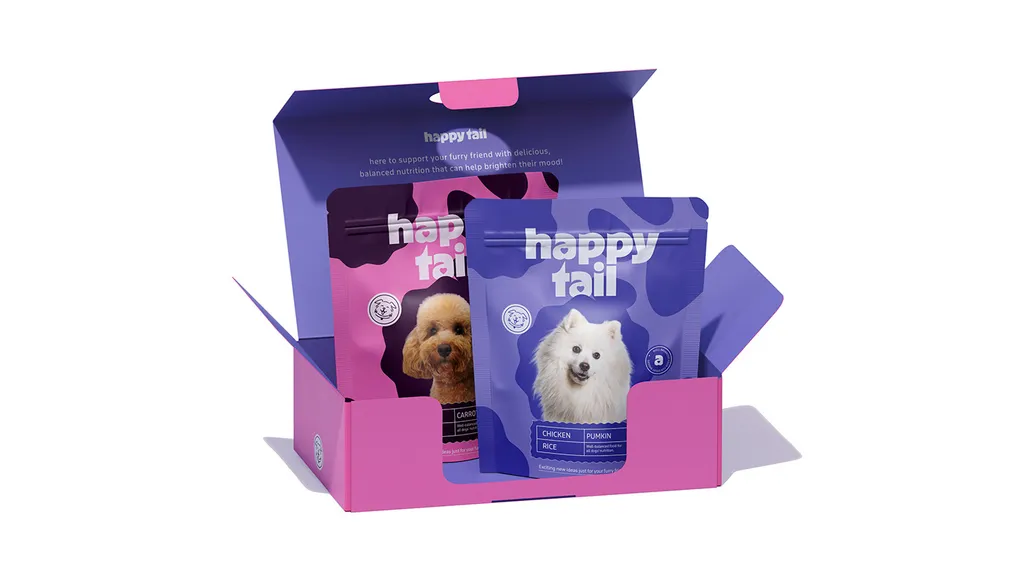
What it means for you. If you sell online, design the mailer and the product pack together, sized to each other, instead of choosing a stock box at the end.
4. Why leave room for a 2D barcode now?
Verdict: Use. Leave the space now, even if you don’t use it yet.
GS1, the organization behind retail barcodes, runs Sunrise 2027: a move from the familiar 1D UPC barcode to 2D barcodes such as QR codes, with retailers making sure their point-of-sale systems can read them. GS1 asks brands to add 2D barcodes to their packaging and to use GS1 Digital Link with the product’s GTIN, so one code can serve checkout and link to ingredients, usage, recycling instructions or a reorder page. Not every 2D capability has to be in place by 2027.
What it means for you. Plan a clear, flat area on the dieline for a 2D code next to or in place of the traditional barcode, with enough quiet space around it to scan. Ask your barcode provider which format your retailers accept before you print. Don’t let a QR code float on a busy pattern or wrap around a curved edge.
5. Why do range systems beat one-off packs?
Verdict: Use. It’s the trend that saves the most money over time.
Most brands launch with one or two products and end up with ten. If each new flavor is designed from scratch, the shelf turns into a collection of different brands. A range system sets the rules once: what stays fixed (logo position, type, layout) and what changes (color, illustration, flavor name).
Real examples:
- ChocoBloom, a new bar from a chocolate shop in France, uses one wrapper layout with a different color pair per flavor: lavender in mint and plum, elderflower in lime and plum.
- Bright Fizz gives ginger cola and cinnamon cola the same can layout in two colors, orange and pale blue, each with its own flavor illustration, so the range reads as one brand in a fridge door.
- Happy Tail’s pouches come in pink, lilac and yellow, each with a different dog in a wavy window, under the same wordmark and recipe-label system.
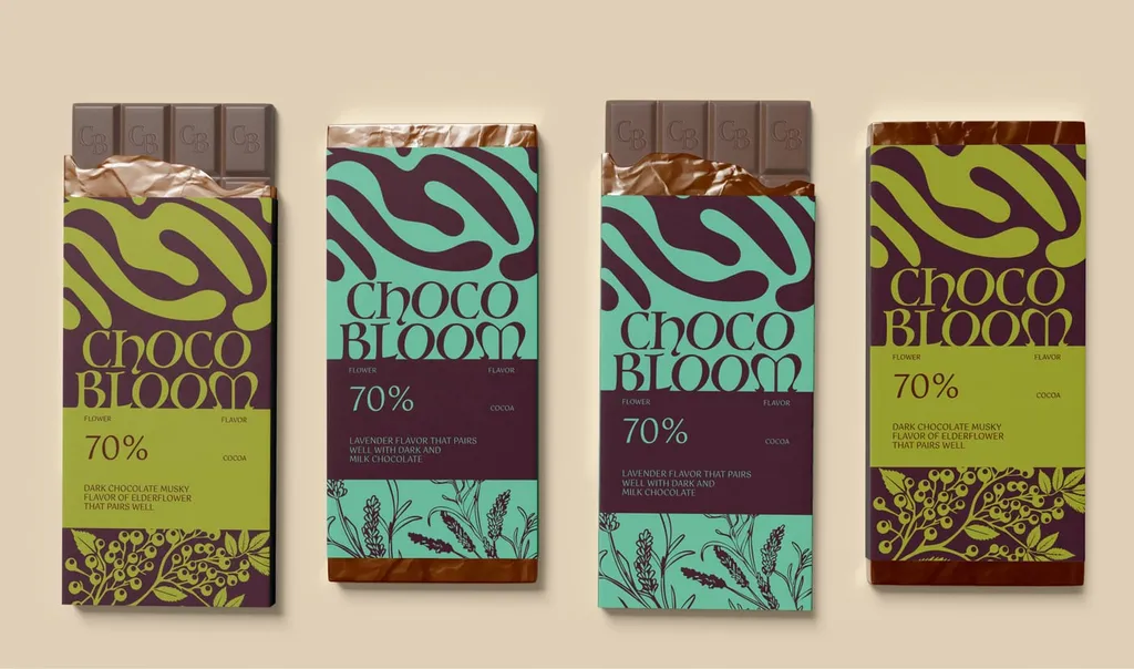
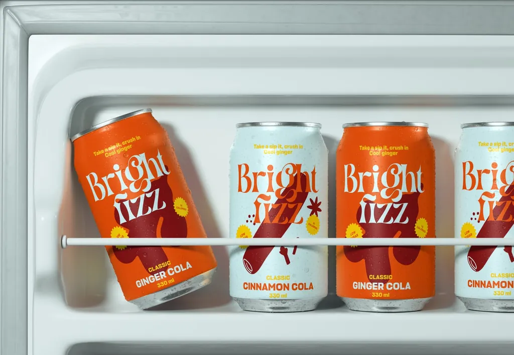
What it means for you. Before designing the first pack, write down the rules for the fifth one. A range system is one of the deliverables on my packaging design projects for exactly this reason.
6. Is illustration coming back on packaging?
Verdict: Use, if the art belongs to your brand.
After years of flat color blocks and plain sans-serif type, especially in direct-to-consumer brands, several 2027 forecasts expect illustration and pattern to return. Pattern Weaver says illustrated all-over pattern is “taking back shelf space,” and Sonoco’s Lifestyle Trends 2027 names “Playtime,” a desire for joy, color and interaction, as one of its three themes. Both are industry forecasts, not sales data.
Real examples. ChocoBloom’s two chocolate-bar characters wave next to the logo on its kraft paper bag. Tong, a coffee shop, wraps sandwiches and boxes in its own red pattern, drawn from the brand’s doodles of cups and a moka pot.
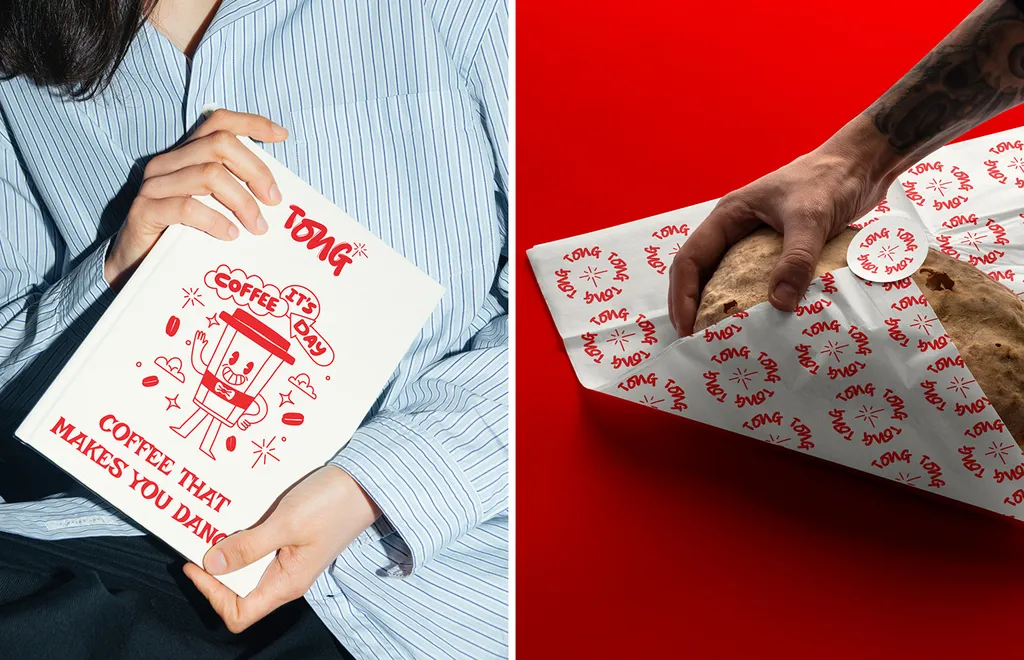
What it means for you. Illustration lasts when it’s drawn for you and used everywhere: pack, bag, social, signage. Stock illustration or a style copied from a popular brand dates as fast as the trend. Pattern also has a practical upside: a small, non-directional repeat survives die-cutting and folding better than one big image.
7. Does your pack work as a phone thumbnail?
Verdict: Use. For many products, the first time a shopper sees your pack is a small image on a screen.
On a marketplace or delivery app, your pack competes as a thumbnail next to dozens of others. Fine type, low-contrast color and detail around the edges disappear. One agency, BigEye, says a design that reads cleanly at 500 × 500 pixels has an edge in e-commerce.
What it means for you. Before approving a design, shrink the front of pack to the size of a product tile on your phone. The brand, the product name and the variant should still be clear. If they aren’t, simplify the front and move detail to the back.
8. How much room should a food label leave for new rules?
Verdict: Use. Especially for food and supplements in the US.
Two US rule changes affect how much room the front of a food pack needs:
- The FDA announced a final rule updating the “healthy” claim on December 19, 2024. If you plan to say “healthy” on the pack, check that the product qualifies under the new definition.
- The FDA has proposed a front-of-package nutrition label, called the Nutrition Info box, for most packaged foods. It’s a proposal, not a final rule, but a front panel with no spare space would need a redesign if it goes ahead.
What it means for you. Keep the front of pack uncluttered, with a defined zone that could take a small nutrition box later, and keep legally defined words such as “healthy,” “organic” or “gluten-free” off the artwork until your adviser has cleared them.
9. Are tactile finishes worth the cost?
Verdict: Use for one detail, not the whole pack.
Embossing, debossing, uncoated textured paper and soft-touch coatings make a pack feel premium, and Sonoco’s “Heritage” theme describes a return to tactility and craftsmanship. They also add cost, and some coatings and laminates make recycling harder (trend 1).
What it means for you. Pick one tactile moment, such as an embossed logo or a textured paper label, and keep the rest of the pack simple. Ask your printer for a physical proof on the real material before you commit.
10. When does heritage packaging work?
Verdict: Use only if the history is yours.
Sonoco’s 2027 report names “Heritage” as a theme, and Vistaprint’s 2026 list includes engraving-style “Vintage Etch” linework. It works when the history exists: an old label, a founder’s recipe, a first shop. A new brand dressed in a vintage label usually looks like what it is.
What it means for you. If you have an old pack customers remember, redraw it for today’s printing and screens instead of replacing it. If you’re new, borrow the warmth of illustration and pattern (trend 6) instead of a fake history.
11. Why skip the kraft-and-leaf “eco look”?
Verdict: Skip it as a shortcut.
Brown kraft, green leaves and the word “natural” became the shorthand for sustainable packaging. It now says very little, because anyone can print it, and it can mislead if the pack isn’t actually more recyclable. With claims under more scrutiny (trend 2), the look without the substance is a risk.
What it means for you. Kraft is fine when it’s the right material and fits the brand. ChocoBloom’s logo sits on a kraft paper bag because it suits a small chocolate shop. Just don’t use it in place of the real work in trends 1 and 2.
12. Should your packaging follow the color of the year?
Verdict: Skip for your core range. Use it for a limited edition if you like.
Color forecasts get a lot of attention: WGSN and Coloro have named Luminous Blue their Colour of the Year 2027, for example. A pack is printed in thousands and sits on shelves for years, so a range built around this year’s color looks dated by the next print run.
What it means for you. Choose colors your brand can own in its category. Saturated, brand-forward color is one of the stronger 2027 directions. Save the color of the year for a seasonal sleeve or a limited run.
13. Should you use AI-generated images on packaging?
Verdict: Skip on the pack. Use AI for exploring ideas.
AI tools are useful for mood boards and early layout ideas. On a final pack, generated photos of people, food or the product itself can misrepresent what’s inside, which is the last thing a label should do.
What it means for you. Use real product photography or illustration drawn for the brand on anything that goes to print.
14. Is AR “portal” packaging worth it?
Verdict: Skip for most brands.
Some 2026 lists, such as Vistaprint’s, include “portal” packaging that opens into augmented or virtual reality. It can work for a large launch with a budget for the content behind it. For most brands, a 2D code that links to something useful, such as recipes, refills or reordering (trend 4), does more.
Which packaging trends from 2024 to 2026 stuck?
If you’re comparing this with packaging design trends 2024, 2025 or 2026 lists, here’s my read of how their main ideas look heading into 2027:
| Earlier trend | Where it stands in 2027 |
|---|---|
| Sustainable and minimal packaging | Stuck, and moved from look to rules: recyclability and provable claims (trends 1 and 2) |
| Flat, minimal DTC packs | Fading: illustration, pattern and saturated color are coming back (trend 6) |
| QR codes on packs | Stuck, and now tied to checkout scanning (trend 4) |
| Nostalgia and retro | Still around; works only with real history (trend 10) |
| Tactile and sensory finishes | Still growing in premium categories, limited by recyclability (trend 9) |
| AR and “metaverse” packs | Mostly faded outside big launches (trend 14) |
| AI-designed packaging | Changed role: a tool for ideas, not the source of final artwork (trend 13) |
What are the food packaging design trends for 2027?
Food packs are where most of these trends meet:
- Labels first. Plan the front panel around the details your market requires, and leave room for a possible nutrition box (trend 8).
- Portions and freshness. Lacerta’s food packaging trends link the rise of GLP-1 medicines to packaging that supports portion control and freshness. Smaller portions mean more pack sizes, which is another reason to build a range system (trend 5).
- Recyclable materials. Food packs often mix plastic films, foil and paper. Check recyclability with your supplier before designing the graphics (trend 1).
How do you apply packaging trends without losing recognition?
Shoppers often find a familiar pack by its color, shape and where the logo sits before they read a word. The best-known warning is Tropicana. In 2009 it replaced its familiar orange-with-a-straw carton with a plainer design. According to Ad Age figures quoted by Bloomberg, unit sales of Tropicana Pure Premium fell 20% between January 1 and February 22, and the company scrapped the new pack after less than two months on the market.
Before changing an existing pack, sort its parts into three lists:
| Keep | Refine | Replace |
|---|---|---|
| What shoppers find you by: the main color, the pack shape, the logo position, a character or pattern | What works but breaks somewhere: small type, a finish that blocks recycling, a thumbnail that doesn’t read | Claims you can’t prove, a material that won’t be recyclable, a layout with no room for new rules |
Change the parts in the right-hand columns first. Most of the 2027 trends (recycling, claims, QR codes, label space, right-sizing) can be applied without touching what shoppers recognize.
Your 2027 packaging checklist
| Check | Pass if |
|---|---|
| Material and finish | Your printer confirms the pack is recyclable where you sell |
| Recycling symbol and claims | Each one can be backed up for each market |
| Shipping box | It’s sized to the product, with little empty space |
| 2D code area | There’s a flat, clear zone on the dieline |
| Range rules | The next flavor or size can be added without redesigning the layout |
| Phone-thumbnail test | Brand, product and variant read at product-tile size |
| Front-panel space | Required details fit, with room left for new label rules |
| Color proof | Approved on the real material, not only on screen |
How I can help
If you’re planning a new pack or a 2027 update, I design labels, boxes, cans and pouches as part of your brand, with a range system for future flavors and print-ready files on your printer’s dieline. Packaging design usually takes 2–4 weeks, with weekly check-ins in your time zone and three revision rounds.
Every packaging project is quoted after a free 30-minute call, as a fixed written proposal with one price, one timeline and a clear list of deliverables. If you need a logo or a brand identity first, those packages and prices are on the pricing page. You can book a free call to talk it through.
FAQ
What are the packaging design trends for 2027?
The ones worth acting on are design for recycling, recycling claims you can prove, right-sized e-commerce packs, QR-ready panels for 2D barcodes, range systems, ownable illustration and pattern, fronts of pack that work as phone thumbnails, and clear labels with room for new rules. Tactile finishes are worth using sparingly.
Which packaging trends should I avoid in 2027?
Skip the kraft-and-leaf “eco look” as a shortcut, building your core range around the color of the year, AI-generated people and product photos on the pack, and AR packaging unless you have the budget for the experience behind it.
How are 2027 packaging trends different from 2026?
Many 2026 lists were about looks. For 2027 the bigger changes come from rules and systems: the EU packaging regulation applying from August 2026, California’s recycling-claim law, retailers preparing to scan 2D barcodes, and US food-label changes.
Do I need to redesign my packaging for the new EU rules?
Not necessarily the graphics, but check the materials and finishes. The EU regulation requires recyclable packaging, with recyclability grades from 2030 and limits on empty space in e-commerce packs by 2030. Ask your printer which combinations will meet the rules, and plan changes into your next reprint.
Can I still use the recycling symbol on my packaging?
Only if you can back it up where you sell. In California, SB 343 limits the chasing arrows to items that are regularly collected and processed for recycling in the state, for products made after October 4, 2026. Enforcement is blocked while a court case continues, but the law still stands. Check with your supplier and adviser before printing.
How much does packaging design cost?
It depends on how many packs, labels, flavors, sizes and languages you need. I quote every packaging project as a fixed written proposal after a free 30-minute call, so the price doesn’t change mid-project.
Sources